Hey all! My name is Julia, former college student and a home decor enthusiast who loves DIY home improvement projects and finding creative ways to decorate any living spaces on a budget. Recently moved from my dorm to my new apartment which I renovated from scratch and I am here to help you with tips & tricks about home decor/college and more 🙂
I pulled together small kitchen design ideas that actually make your space feel bigger, not just cuter. We are talking real walkways, real prep space, and a layout you can tweak this weekend without touching a single wall.
Small kitchens do not feel tiny because of the square footage. They feel tiny because the same two meters of floor try to handle cooking, storage, traffic, and sometimes laundry. You turn sideways to pass the fridge, prep over the sink, and block every doorway when you open the oven.
Here is the plan. I am going to walk you through one repeatable system that you can reuse in any tiny kitchen:
1 layout and traffic flow; 2 light and reflective finishes; 3 compact appliances; 4 vertical storage; and 5 counter discipline.
These small kitchen design ideas are all no remodel moves. You will get measurable wins like 90 cm walkways, a clear 60 cm prep strip, fewer visual breaks, and counters that stop being storage.
In my own small kitchen, this framework was the only way to balance dark graphite cabinets and packed appliances with a room that still feels calm. You are about to do the same thing for your space.
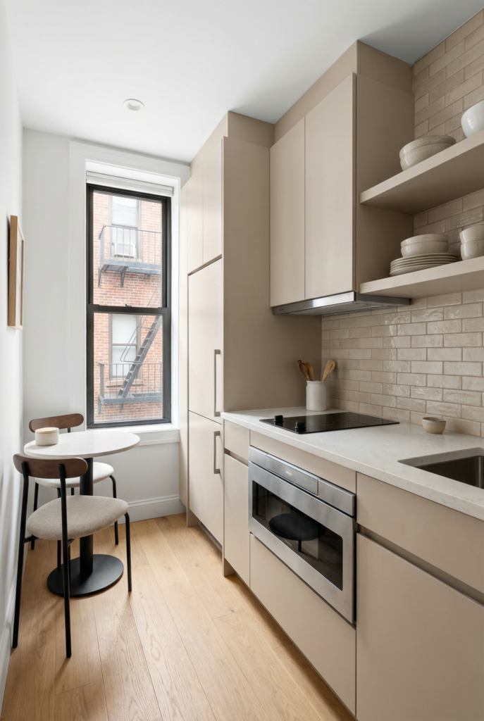
How this System Worked in my own Tiny Kitchen
My kitchen didn’t start as a kitchen at all — we remodeled what used to be a small bedroom into our kitchen zone. We opened the wall to the next room so it could breathe as a combined living room + kitchen, then had new plumbing run from the bathroom to the wall we wanted for cooking (which sounds dramatic, because it was).
The actual “kitchen” footprint is still tiny — think roughly a 67″ x 24″ countertop run — but we packed it with everything: built-in fridge, dishwasher, microwave, hob, oven, and even a washer + dryer tucked under the counter.
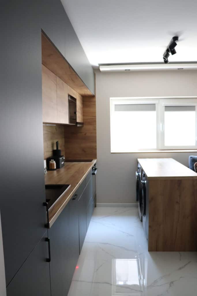
On paper, that feels like a recipe for chaos…yet it works, and it works because we didn’t rely on vibes. We followed the same five-step system: layout first (everything on one main wall with clear traffic in front), then light + finishes (dark graphite and wood fronts balanced by lighter walls/floor so the whole thing reads like one calm block), then compact appliances (right-sized and built-in so nothing bulges into the walkway), then vertical storage (extra row cabinets climbing toward the ceiling), and finally counter discipline (a strict “three-item” rule so the counters don’t turn into appliance parking).
I’m not telling you this to show off — I’m telling you so you can see that even a tiny, fully-loaded, slightly moody kitchen can still feel open and easy when layout, finishes, storage, and clutter rules all pull in the same direction.
Space saving layouts: traffic flow that maximizes space in a tiny kitchen
Space saving layouts are where you stop fighting the room. This section is about traffic flow, not decor. We are protecting your main aisle, your prep strip, and three landing zones: fridge, sink, and stove.
Once those feel easy, any small kitchen design ideas you add later will work harder.
Use your layout chooser from the reset. Galley and one wall kitchens need especially clear lanes. L and U shapes need corners to do storage, not primary prep.
Peninsulas must choose whether they are for seating or for prep at any moment, not both.
In every shape, the goal is the same. You walk normally, not sideways. You can chop without juggling things. You can open appliances without blocking the only path.
Idea 1: move the space bully out of your aisle
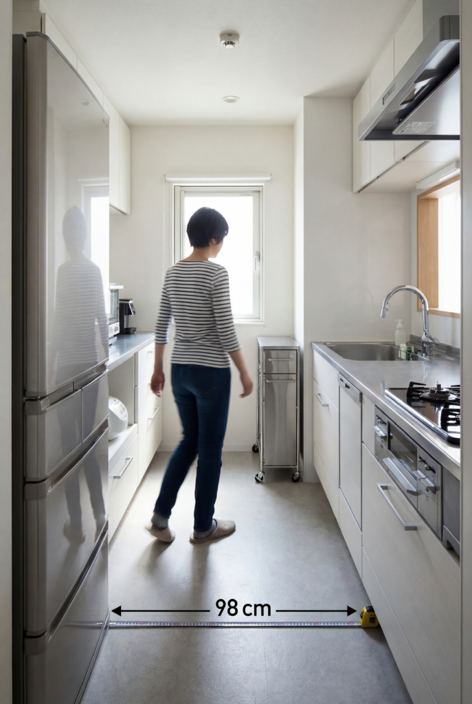
- What to do: slide the deepest table, shelf, or cart until your main path hits about 90 cm wide.
- Why it feels bigger: you stop turning sideways, so your body reads the room as wider.
- Best for: galley and one wall layouts.
- If you rent: flip the table so the narrow side faces the aisle or swap for a slim secondhand piece.
- Common mistake: planning around dining first and forcing cooking into the leftover gap.
- Measurement rule: tightest walkway in the main route should be 90 to 105 cm.
Related posts: 15 Easy Ways to Organize Kitchen Cabinets Like a Boss
Idea 2: booth seating storage instead of loose chairs
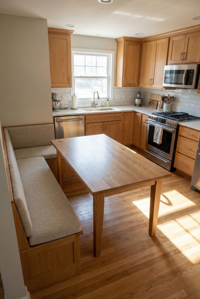
- What to do: replace two chairs with a storage bench or booth seating with lids.
- Why it feels bigger: seat backs leave the aisle and you gain hidden storage.
- Best for: L shapes and small peninsulas.
- If you rent: push your table against the wall and add one storage bench only.
- Common mistake: keeping four chairs in a space that really wants two plus a bench.
- Measurement rule: keep roughly 90 cm from table edge to nearby cabinets.
Idea 3: put trash inside the triangle
- What to do: move trash under the sink or into a slim pullout near the prep strip.
- Why it feels bigger: you stop walking the full room with dripping hands and scraps.
- Best for: all layouts.
- If you rent: use a narrow lidded can tucked beside the sink cabinet.
- Common mistake: parking trash in the only clear corner because it fits there.
- Measurement rule: trash should be within one step of your sink.
Idea 4: fridge with a real landing zone
- What to do: make sure you have counter beside the fridge on the handle side for groceries.
- Why it feels bigger: you unload in place instead of pacing, so traffic chills out.
- Best for: galley, L, and one wall kitchens.
- If you rent: slide in a slim cart or console as “fake built in” landing.
- Common mistake: tucking the fridge hard into a corner with no surface next to it.
- Measurement rule: aim for 38 to 45 cm of clear counter as fridge landing.
Idea 5: keep your prep strip out of the dark corner
- What to do: choose a straight stretch between sink and stove and treat that as your permanent 60 to 90 cm prep zone.
- Why it feels bigger: you stand square to the counter and see more of the room while you work.
- Best for: L and U shapes, especially where corner sink benefits are not relevant.
- If you rent: clear the straight run and accept that corners hold small appliances instead.
- Common mistake: pushing the cutting board into the deepest corner because it is “empty.”
- Measurement rule: protect at least 60 cm of straight, non corner counter for daily prep.
Do not do this: layout combos
Deep table or island with less than 80 cm around it, fridge doors opening right into the bottleneck, stools inside the fridge sink stove triangle. Those are the quickest ways to make a small kitchen feel smaller.
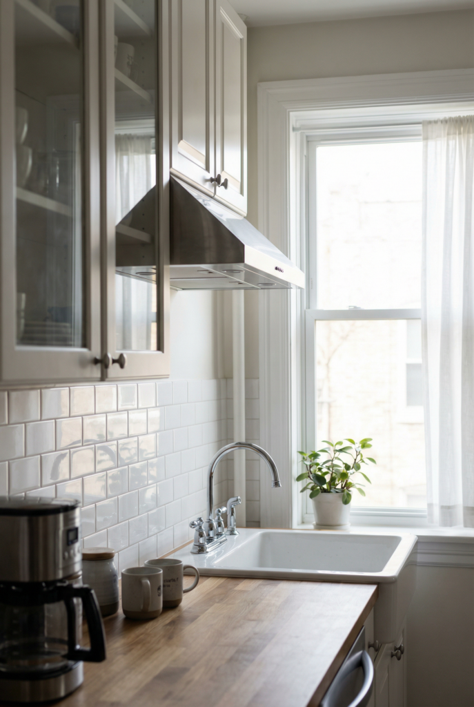
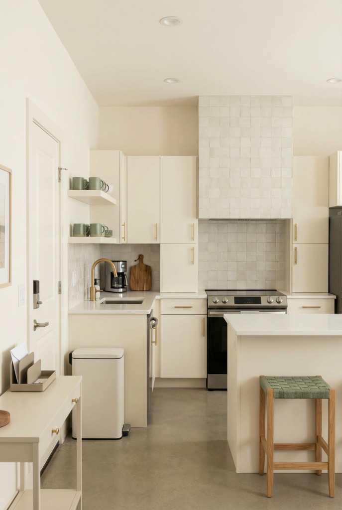
Light colors and reflective finishes
Light colors and reflective finishes are what make your eye think the room extends past the walls. This is where you use vertical design elements, simple palettes, and a little shine to stretch your small kitchen without losing character. You do not need all white. You do need calm surfaces and fewer hard breaks.
Pick one dominant light color for walls and, if you can, upper cabinets.
Add one “hero” finish such as floor to ceiling tile, a mirrored backsplash panel, or a patterned kitchen floor. Everything else plays backup.
That balance is what keeps luxury finishes in a small kitchen feeling intentional instead of loud.
Idea 6: one dominant light color
- What to do: run one soft light shade across walls and, ideally, upper cabinets.
- Why it feels bigger: fewer contrast lines mean the room reads as one larger shape.
- Best for: every layout.
- If you rent: just paint the walls and let cabinets be your accent.
- Common mistake: three wall colors in a room that is barely three meters long.
- Measurement rule: keep that color from floor to ceiling on most walls.
Idea 7: floor to ceiling tile on one wall
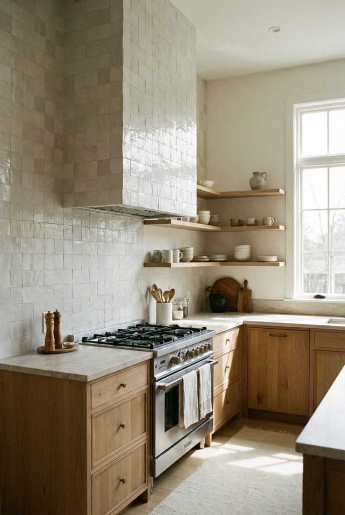
- What to do: tile a short wall or the stove wall from counter to ceiling.
- Why it feels bigger: vertical lines pull your eye up and give quiet drama.
- Best for: L and U shapes with a clear focal wall.
- If you rent: use peel and stick tile in a low contrast pattern.
- Common mistake: tiny backsplash strip, then a dark bold paint color above it.
- Measurement rule: at least 45 cm high everywhere, full height on one wall if you can.
Idea 8: mirrored backsplash for extra depth
- What to do: add a mirrored backsplash panel behind the sink or hob where it reflects natural light in the small kitchen.
- Why it feels bigger: mirrored backsplash doubles depth and brightness in one move.
- Best for: narrow galleys and one wall layouts.
- If you rent: stick a frameless mirror tile directly onto the wall.
- Common mistake: letting the mirror reflect clutter or the trash can.
- Measurement rule: even a 30 by 60 cm mirror adds noticeable depth.
Idea 9: statement light fixtures instead of tiny ones
- What to do: pick one or two statement light fixtures over the main zone or peninsula and keep the others simple.
- Why it feels bigger: a clear focal point at the ceiling organizes the whole room.
- Best for: one wall and peninsula kitchens.
- If you rent: change just the shade to something larger and cleaner.
- Common mistake: several small fussy pendants plus recessed lights plus a flush mount all fighting.
- Measurement rule: hang pendants around 70 to 85 cm above the counter.
Idea 10: reflective finishes that bounce light
- What to do: use gloss tile, polished metal, or glass near windows so they bounce natural light.
- Why it feels bigger: light travels further and shadows soften.
- Best for: any layout with a window.
- If you rent: keep glass spotless, use sheer curtains, add one glossy tray.
- Common mistake: heavy curtains and dark decor that cut off light completely.
- Measurement rule: keep the top half of the window clear of shelves or tall objects.
Do not do this: finish mix
Busy patterned backsplash plus patterned floor plus colorful kitchen appliances plus four metals. Choose one “look at me” moment and let the rest be quiet.
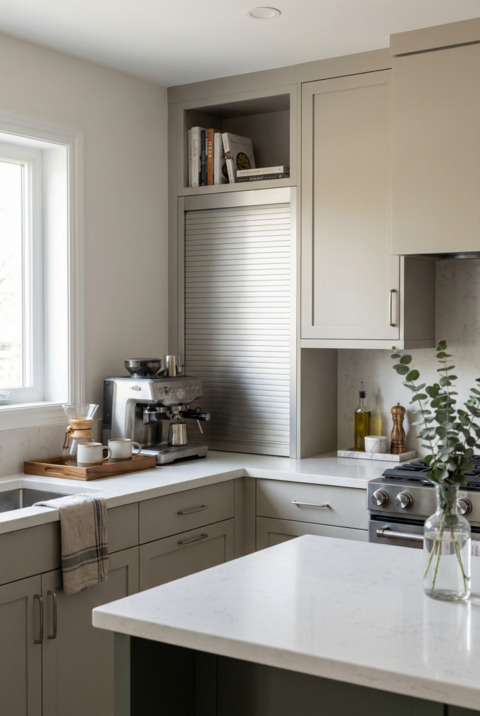
Compact appliances
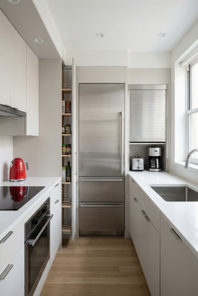
Compact appliances and smart parking stop machines from eating your floor and counter. This is not about living tiny. It is about right sizing, so you actually maximize space in a tiny kitchen and keep your layout working.
Every choice here should support your triangle and your prep strip. Cabinet depth refrigerator instead of deep freestanding. Slim pullout cabinet instead of weird gaps.
Appliance garage for small pieces so counters stay clear. You can still have fun with prismatic appliances or a colorful kettle. You just pick those on purpose.
Idea 11: cabinet depth refrigerator as first big upgrade
- What to do: replace deep fridge with a cabinet depth refrigerator when you can.
- Why it feels bigger: the fridge no longer sticks far into the aisle.
- Best for: galley and one wall layouts.
- If you rent: use a shallow console beside the existing fridge to soften the bump.
- Common mistake: choosing the largest fridge available because it is on sale.
- Measurement rule: target depth around 60 to 70 cm instead of 80 to 90 cm.
Idea 12: compact appliances that match your life
- What to do: pick a 45 cm dishwasher or slimmer range if you cook for one or two.
- Why it feels bigger: shrinking one appliance buys you extra counter or drawer.
- Best for: short L and U shapes.
- If you rent: consider a two burner hob and compact oven on a sturdy shelf.
- Common mistake: restaurant scale appliances in a kitchen the size of a closet.
- Measurement rule: keep at least 30 cm of landing counter on each side of any cooktop.
Idea 13: appliance garage vs open counter
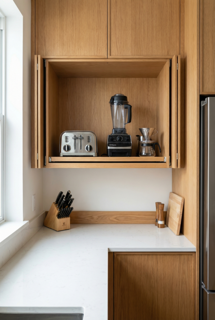
- What to do: dedicate one cabinet or cubby as an appliance garage for toaster, blender, and coffee gear.
- Why it feels bigger: counters read as prep surface instead of gadget showroom.
- Best for: all layouts.
- If you rent: repurpose a wall cabinet and add a basic pull out tray.
- Common mistake: lining every gadget along the backsplash and calling it “easy access.”
- Measurement rule: keep the garage within easy reach of your 60 cm prep strip.
Idea 14: hide laundry under the counter
- What to do: if laundry shares the room, tuck washer and dryer under the countertop or behind tall doors.
- Why it feels bigger: the kitchen reads as one long run instead of three separate zones colliding.
- Best for: apartments and one wall layouts.
- If you rent: hang a simple curtain panel to hide the machines.
- Common mistake: letting white laundry fronts be the first thing you see.
- Measurement rule: standard 90 cm counter height usually lets machines slide under.
Idea 15: edit prismatic and colorful appliances
- What to do: limit colorful kitchen appliances or prismatic finishes to one or two heroes.
- Why it feels bigger: a couple of accents feel curated instead of chaotic.
- Best for: any tiny kitchen that wants personality.
- If you rent: start with one kettle or toaster and keep the rest neutral.
- Common mistake: rainbow gadgets scattered across every surface.
- Measurement rule: group accent appliances within about 60 cm so they feel like one vignette.
Do not do this: appliance sprawl
Oversized fridge plus oversized range on a short wall, every gadget living out forever, laundry machines and fridge and pantry all exposed in one line.
Vertical storage
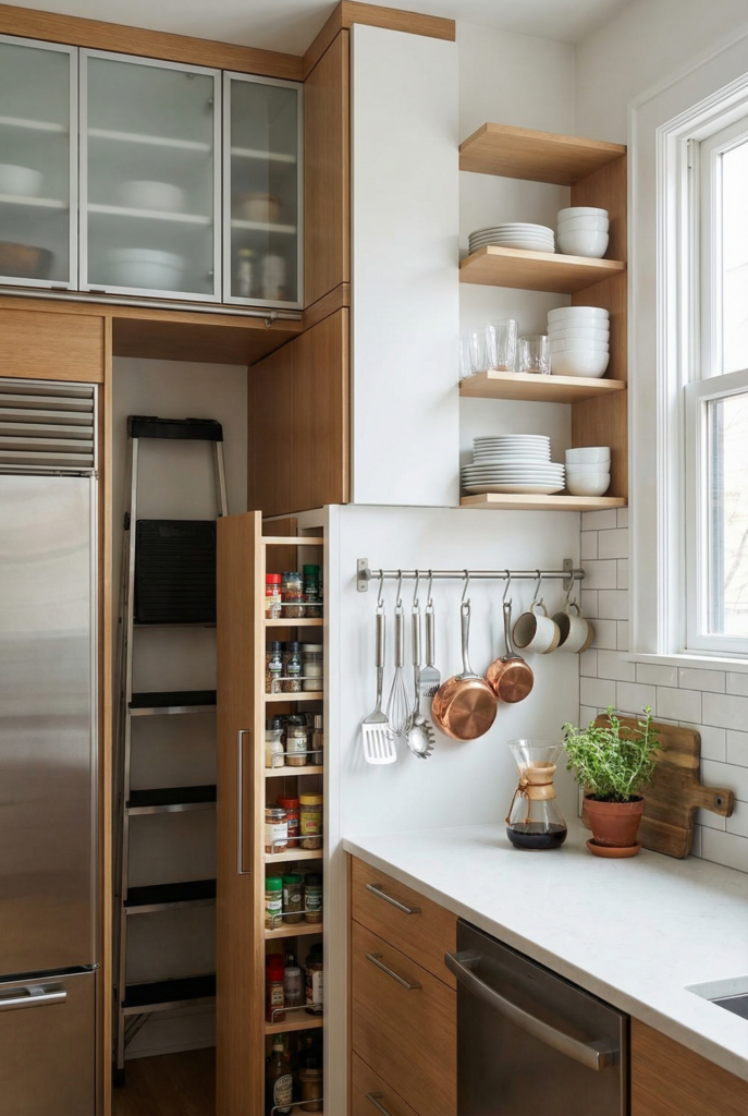
Vertical storage is where you use wall space and the fifth wall, the ceiling line, to get things off your counters. Floor space is fixed. Wall space storage, extra row cabinets, and smart hooks turn a cramped kitchen into a well used cube.
The goal is not to cover every wall. It is to pull daily items up into reach while giving your eye some empty space to rest.
Think extra row cabinets for long term storage, shallow open shelving for daily dishes, wall hooks for grab and go tools, and slim pullout cabinets in awkward gaps.
Idea 16: extra row cabinets to the ceiling
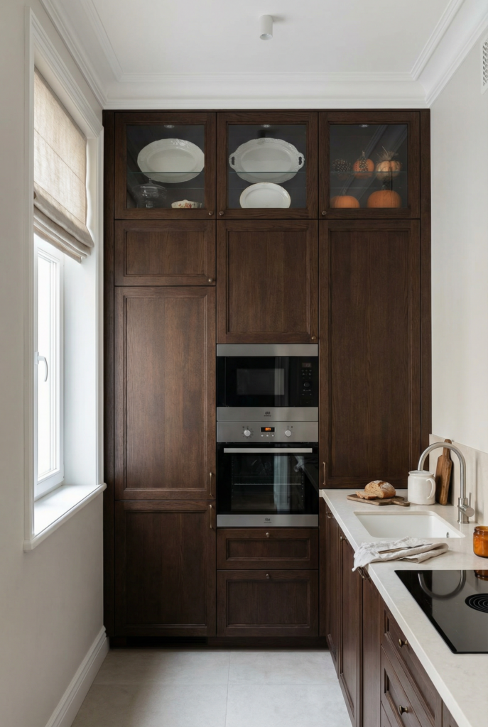
- What to do: extend uppers to the ceiling so rarely used items move up.
- Why it feels bigger: cabinets look custom and the dusty gap disappears.
- Best for: one wall and galley layouts.
- If you rent: add matching baskets above cabinets to fake extra row cabinets.
- Common mistake: decor and bottles living in the gap doing nothing.
- Measurement rule: leave only a small gap at top or none at all.
Idea 17: wall hooks kitchen rail for daily tools
- What to do: install a rail with wall hooks for utensils, cups, or small pans.
- Why it feels bigger: counters and drawers stop holding every tool.
- Best for: all layouts, especially galleys.
- If you rent: adhesive hooks or a tension rod work fine.
- Common mistake: hanging twenty items until the wall looks messy.
- Measurement rule: place the rail about 45 to 50 cm above the counter.
Idea 18: shallow open shelving or fold-away shelving
- What to do: add shallow open shelving or fold away shelving for everyday dishes on one wall.
- Why it feels bigger: shallow shelves hold plenty without feeling heavy.
- Best for: L shapes and walls near windows.
- If you rent: use a narrow freestanding unit that sits partly on the counter.
- Common mistake: deep bookcase style shelves that become clutter caves.
- Measurement rule: shelf depth roughly 15 to 23 cm for plates and glasses.
Idea 19: storage in front window without killing light
- What to do: frame the window with narrow shelves or rails so you get storage while keeping glass clear.
- Why it feels bigger: natural light in a small kitchen stays strong while items move up.
- Best for: one wall layouts with sink under the window.
- If you rent: use suction cup shelves for herbs and sponges.
- Common mistake: deep shelves and dark curtains blocking the view.
- Measurement rule: keep shelves narrow and no higher than halfway up the window.
Idea 20: slim pullout cabinet for oils and trays
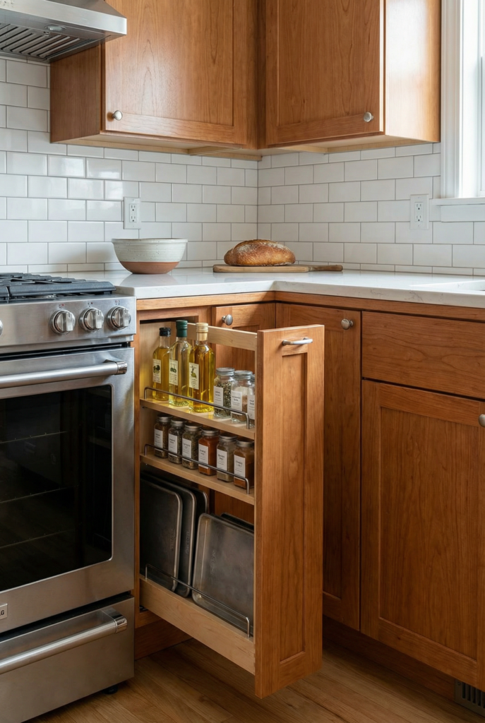
- What to do: fill narrow gaps beside stove or fridge with a slim pullout cabinet.
- Why it feels bigger: weird slivers become organized, not dusty.
- Best for: U shapes and galleys with tiny gaps.
- If you rent: slide in a narrow rolling rack you can take with you.
- Common mistake: stuffing bags or brooms into that gap until they topple out.
- Measurement rule: even 15 to 20 cm width can hold oils, spices, and sheet pans.
Do not do this: vertical overkill
Open shelving on every wall, deep overloaded shelves, and decorative items hogging upper storage while everyday dishes live on the counter.
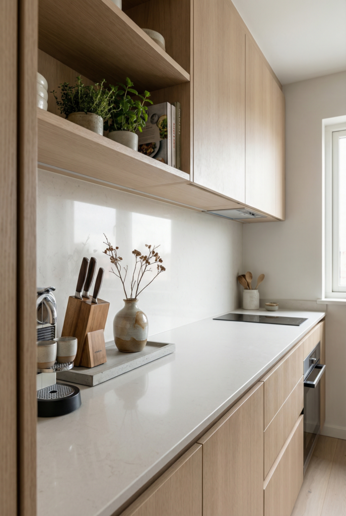
Minimal countertop clutter
Counter discipline is where you lock in all the gains. This is less about new storage and more about rules. You decide what earns the right to live on the counter and design storage around that instead of shoving things wherever there is a gap.
You are aiming for chic clever storage, not a minimalist museum. A calm coffee station, one tray of cooking basics, maybe a plant. Everything else parks in drawers, cabinets, your appliance garage, or on vertical storage. That is how small kitchen design ideas stop feeling like a one time project and start feeling like your normal.
Idea 21: three item counter rule
- What to do: pick three categories that always get to stay out, like coffee, knives, and one decorative object.
- Why it feels bigger: long stretches of visible counter make any room feel larger.
- Best for: every tiny kitchen.
- If you rent: put the chosen items on one small tray.
- Common mistake: bending the rule “just this once” every week.
- Measurement rule: keep at least 60 to 90 cm of uninterrupted prep space clear.
Idea 22: one chic cooking station
- What to do: corral oil, salt, and spoons onto a small board near the hob.
- Why it feels bigger: grouped items read as one vignette instead of clutter.
- Best for: all layouts.
- If you rent: use a cutting board and a couple of glass jars.
- Common mistake: twenty bottles and packets marching along the backsplash.
- Measurement rule: keep the whole station within about 30 cm.
Idea 23: compact drying gear
- What to do: swap a giant rack for fold away drying or an over sink mat.
- Why it feels bigger: the counter beside the sink goes back to prep duty.
- Best for: galley and one wall kitchens.
- If you rent: choose a collapsible rack that tucks under the sink.
- Common mistake: permanent drying rack that eats half your worktop.
- Measurement rule: aim for 30 to 45 cm of clear counter beside the sink.
Idea 24: non kitchen stuff gets its own zone
- What to do: give mail, keys, and chargers a small basket or wall pocket away from the main cooking strip.
- Why it feels bigger: counters stay for food, not paperwork.
- Best for: open plan rooms.
- If you rent: hang a simple file on the side of a cabinet.
- Common mistake: stacking paper beside the fridge and calling it “temporary.”
- Measurement rule: put this catchall within a couple of steps of your entry door.
Idea 25: parked vs put away appliances
- What to do: decide which compact appliances stay out and park everything else in cabinets or drawers.
- Why it feels bigger: you see backsplash and finishes instead of a row of machines.
- Best for: all layouts, especially one wall kitchens.
- If you rent: store rarely used gadgets on high shelves or in another room.
- Common mistake: letting every new appliance live on the counter forever.
- Measurement rule: aim for no more than one small appliance per 60 cm of counter.
Do not do this: clutter pattern
Countertop as general storage, new piles every week, decor with no job while everyday tools have nowhere to go. Those are the habits that undo even the best vertical storage.
Design decisions that unlock everything
Here is your pick your path moment. These decisions make the rest of your choices easier.
Choose one dominant light color, one accent, and one metal finish. Repeat them on cabinets, textiles, and hardware.
Pick one hero move only: floor to ceiling tile, patterned kitchen floor, or colorful compact appliances.
Decide which machines live out and which get parked in the appliance garage.
Decide where trash lives so it is close to prep but never in the aisle. Decide where mail and non kitchen stuff land so counters stay for food.
Once those calls are made, you can say yes or no to new ideas in seconds: does this support my path or fight it.
Do this in 60 minutes, a weekend, and 30 days
In 60 minutes you handle layout and clutter.
- Run the walkway tape test and widen your tightest spot.
- Claim and clear a 60 cm prep strip.
- Choose three countertop categories and box everything else for now.
- Add one brighter bulb or stick on under cabinet lighting.
In a weekend you tackle storage and appliance sprawl.
- Move or replace the space bully furniture so the aisle hits around 90 cm.
- Add a rail with wall hooks and one shallow shelf.
- Turn an existing cabinet into a basic appliance garage.
- Rearrange cabinets by zone so prep, cook, and clean tools live where you use them.
In 30 days you tighten the whole system.
- Plan and, if budget allows, order a cabinet depth refrigerator or other compact appliance swap.
- Paint walls or uppers in your dominant light color and add under cabinet lighting along the prep run.
- Add extra row cabinets or baskets up to the ceiling and install your one hero move, such as a patterned floor or statement light.
- Live with your three item counter rule for a month and adjust storage until it feels automatic.
FAQ: small kitchen questions that actually matter
What is the best kitchen layout for a small kitchen
The best layout is the one that gives you a clear work triangle and a real prep strip, not a specific letter. In narrow rooms, a galley with about 90 to 105 cm between counters is often the most efficient. In more square rooms, an L shape lets you tuck seating on one side and keep the long leg for cooking. U shapes work when the room is wide enough for two people to pass in the middle. One wall layouts feel good when they have a movable cart or peninsula for landing zones, not just a single line of cabinets.
How can I make a small kitchen look beautiful without clutter
Beauty in a tiny kitchen comes from cohesion and breathing room. Use that one dominant light color, one accent, and one metal, then repeat them everywhere. Pick a single hero move, like floor to ceiling tile or a patterned runner, and keep everything else calm. Clear counters and simple, repeated materials make even basic finishes feel like luxury finishes in a small kitchen.
What is the best color countertop for a small kitchen
Most small kitchens feel larger with mid to light countertops. Very dark tops can look dramatic but often cut the room in half and show crumbs. Light or mid tone surfaces bounce more light and blend into walls and cabinets instead of shouting. If you cook heavily, a speckled or lightly patterned surface hides wear while still reading bright.
What color makes a small kitchen look bigger
Colors that are light and similar in value do the most work. Soft white, warm cream, pale greige, or gentle green can all make a small kitchen feel more open, especially when you use the same family on walls and upper cabinets. Save stronger color for lower cabinets, textiles, or a rug so the main cooking zone stays light.
Where should I put items in a small kitchen
Think in zones: prep, cook, clean, storage, and serve. Prep between sink and stove holds knives, boards, mixing bowls, and small tools. Cook around the hob holds pans, oils, and spices. Clean at the sink and dishwasher gets daily dishes and glasses. Storage lives mostly in one pantry area, not scattered everywhere. Serve lives near the table or peninsula with plates and cutlery close by. When each item has a zone, counters no longer need to be your default storage.