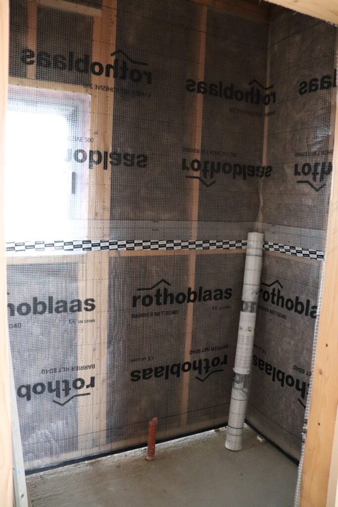
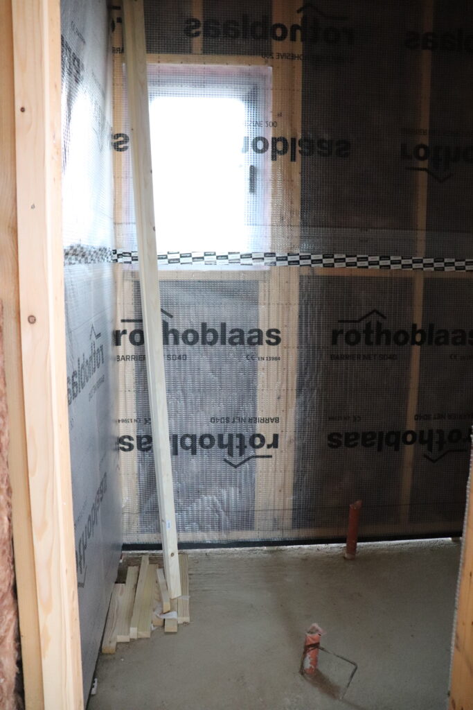
So this is our laundry room right now in the house. Rothoblaas vapor barrier, exposed pipes, a lot of “trust the process” energy. The bones are there and the decisions are coming fast and I have been in a full research spiral about paint colors for longer than I’m comfortable admitting.
Here’s the thing I didn’t understand until we started building – laundry rooms are actually one of the best places to make a paint decision. They’re small so the commitment feels manageable, they’re practical so nobody expects them to be a showroom, and they’re so consistently overlooked that any amount of intention you bring will feel like a transformation. You just need a color that isn’t builder beige and suddenly you have a room that feels like a person lives there and cares about things. That’s the whole bar.
I’ve been saving laundry rooms obsessively for months – this is what building a house does to you, by the way, you develop extremely specific Pinterest boards for rooms you never once thought about before in your life – and I keep circling back to two directions: sage green or warm white/cream. And because I couldn’t actually visualize either one in our specific space yet, I generated a few AI versions of what our laundry room might look like in different colors. Which helped. A lot, actually.
I’m sharing everything here – the colors, the undertone notes, the mockups – in case it helps you. AND because I need you to tell me what you think in the comments. Sage or cream. I genuinely cannot decide.
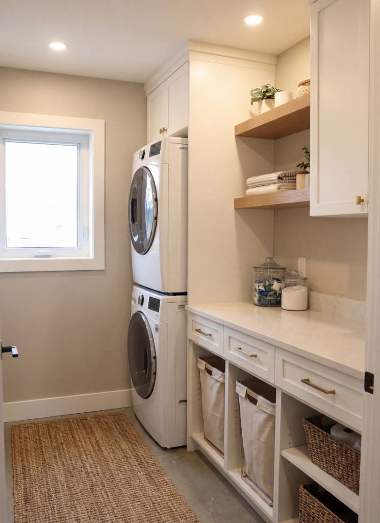
Warm Whites and Creams – for a clean but not sterile look
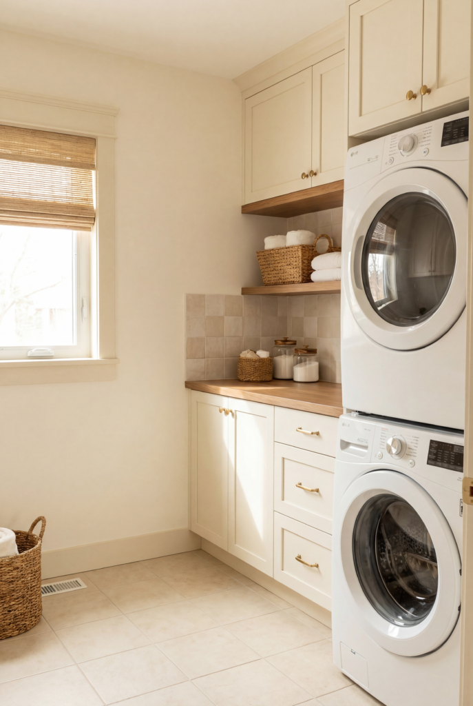
This is one of the two directions I’m seriously considering for our laundry room and I keep coming back to it because there is something so quietly satisfying about a warm white space that feels clean without feeling cold. The difference between a warm white and a cold white in a small room is ENORMOUS – one feels like a hospital utility closet and one feels like a very organized little room that belongs to someone who has their life together – and the entire difference lives in the undertone.
What you want is yellow or pink in the base, not blue or gray. Benjamin Moore White Dove is the classic for a reason – it reads white in a photo and warm in person, which is exactly what you want. Chantilly Lace is crisper and works beautifully if you have a lot of natural light, but in a darker laundry room it can go cold fast and then you’re stuck with it. Sherwin-Williams Alabaster is another one I keep seeing in the spaces I love most – it has this slightly toasty quality that makes a room feel finished rather than freshly primed, and I mean that as the highest compliment.
This direction is specifically for you if you have wood shelving or warm-toned hardware, because a cool white will fight with it in a way that’s hard to name but immediately noticeable and very annoying. It’s also the right call if your laundry room connects to another space – a mudroom, a hallway – and you want continuity rather than a jarring transition.
What I’d style it with: a washable striped runner in cream and natural, woven rattan baskets, simple matte black wall hooks, a framed linen print or botanical illustration, and – if you have any counter space at all – a small lamp. I know that sounds extra for a laundry room. I stand by it completely. A laundry room with a lamp is a completely different emotional experience than a laundry room without one and I cannot explain the science behind this but it’s true.
Soft Greiges – for a cozier more upscale look
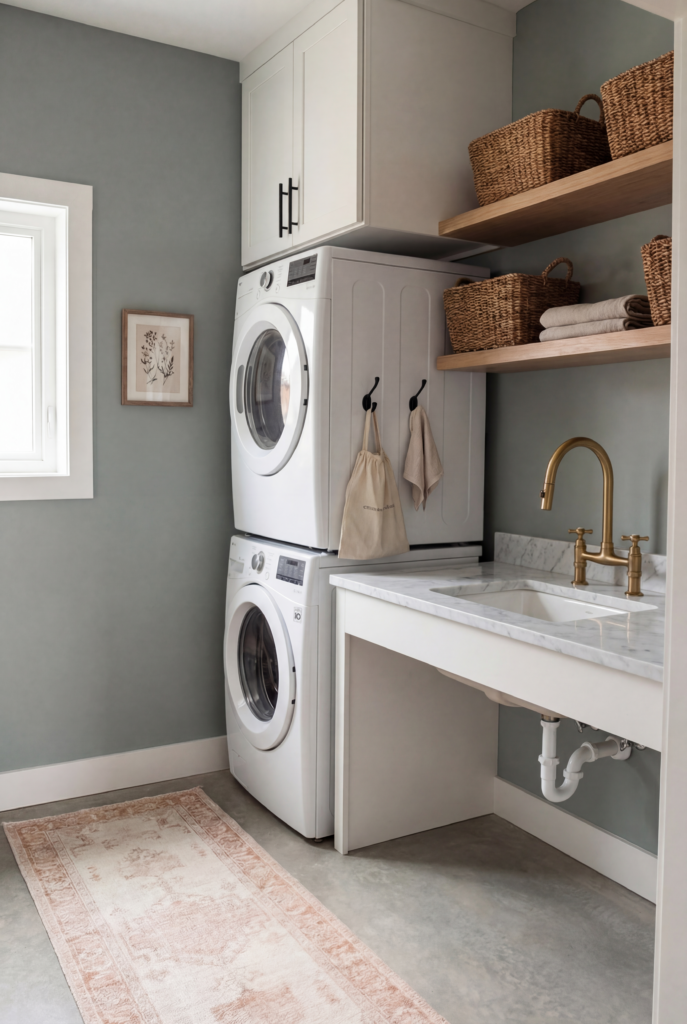
If you want something that feels elevated and intentional but you are not ready to commit to an actual color, greige is your answer. The right greige looks like you hired a designer. The wrong greige looks like you couldn’t decide and the paint dried before you figured it out.
The key is that it needs to lean one direction – more gray or more beige – because a true 50/50 can go muddy under artificial light, and laundry rooms often have a lot of artificial light, and muddy is not it. Sherwin-Williams Agreeable Gray is the most popular paint color in America and it got there because it leans slightly warm, reads neutral in almost every light situation, and pairs with literally everything.
Benjamin Moore Pale Oak is warmer and slightly more beige-forward, which makes it feel cozy rather than gray-adjacent. Sherwin-Williams Accessible Beige has more depth without going moody – good if you want something that reads as a color without announcing itself.
This is specifically for you if you have white cabinets. Greige walls with white cabinets is a combination that has never once looked bad in any space in the history of interior design and I’m including that as a factual statement with full confidence. Also the right call for mixed light situations – some natural, some fluorescent – because greige is forgiving in a way that warmer creams and cooler grays simply are not.
What I’d style it with: a woven seagrass runner, lidded linen hampers in off-white or natural, brushed brass cabinet hardware (swap the hardware first, always swap the hardware first, it takes twenty minutes and costs almost nothing and is the single most effective upgrade you can make before or after painting – you’re welcome), floating wood shelves, and matching ceramic or glass canisters for your detergent because decanting your laundry supplies into something pretty is an activity I fully endorse and will not apologize for.
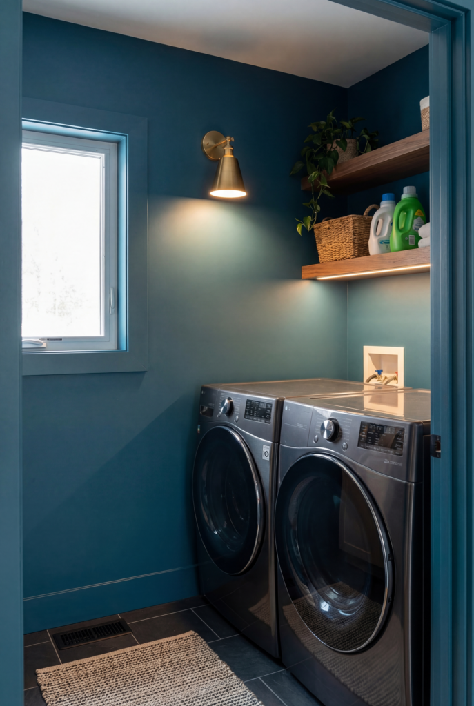
Muted Sage and Gray-Greens
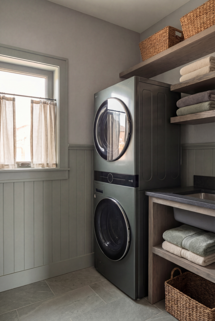
Okay so this is the other option I keep coming back to and when I say sage I need to be very clear that I do not mean the bright slightly yellow-green sage from 2019 that I bought throw pillows in and deeply regret. I mean the muted, dusty, slightly gray sage that looks like it belongs in a French farmhouse or a very well-curated British kitchen and that photographs like an absolute dream.
The undertone situation here is CRITICAL. You want gray in there – enough gray that the green reads sophisticated rather than loud – and you do not want yellow, because yellow-based greens under artificial light will look like old avocado appliances and that is genuinely not what any of us are going for. Benjamin Moore Saybrook Sage is reliable – gray-leaning, dusty, quiet in the best way. Sherwin-Williams Evergreen Fog became popular for real reasons – it’s complex and changes with the light in a way that feels expensive.
And Farrow and Ball Mizzle is the one I personally cannot stop thinking about – it reads almost neutral until the light shifts and then it’s suddenly and beautifully and unmistakably green, and I find that deeply exciting in a way that is probably disproportionate but I don’t care.
Now – and this is important, and it’s actually relevant to our specific situation – these muted sage colors genuinely need natural light to do their thing. In a windowless laundry room, that complexity I’m describing just doesn’t happen. The color sits flat. A little sad. Not what anyone wanted and not what the paint chip promised. This is actually one of the reasons I keep coming back to sage for our laundry room specifically, because we have a window – a real window with actual natural light – and I know the light will do the work of showing off the color as the day changes in a way that a windowless room simply cannot. If your laundry room has no window, I would genuinely steer you away from the muted complex greens and toward either the warm whites (which are forgiving and work hard under artificial light) or, counterintuitively, going all the way dark and committing to it fully – because a windowless laundry room painted in a deep moody color with really good warm lighting installed feels intentional and cozy rather than just dark and forgotten, which is the limbo that medium tones tend to create in rooms without natural light. The middle ground – medium sage, medium greige, anything that needs light to read correctly – is actually the worst choice for a windowless situation because it ends up feeling like none of the things it was supposed to be.
Anyway. This direction is specifically for you if you have white cabinets, white appliances, or white tile, because the contrast between a muted sage wall and crisp white surfaces is the kind of combination that makes a small practical room feel genuinely designed. This is the direction I keep landing on for our laundry room. And then I talk myself back into cream. And then I go back to sage. It’s a whole thing. (If you have done a sage green laundry room I genuinely need to hear from you in the comments.)
What I’d style it with: a washable cotton runner in cream or soft terracotta – the warmth plays so well against the cool green – black iron wall hooks, woven water hyacinth baskets, framed vintage botanical prints in simple black frames, and matte black cabinet hardware. Not chrome, not brass – black – because it grounds the softness of the green in a way that feels considered rather than accidental.
Dusty Blue-Grays
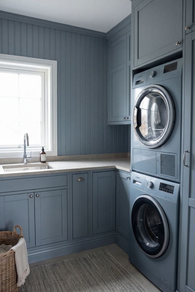
This one seems counterintuitive – blue in a small dark room? – but the right dusty blue-gray does something almost no other color does in a laundry room, which is make the space feel genuinely calm. And a room where you do laundry feeling calm is a gift you can give yourself for almost no money, which is SUCH a good deal.
Dusty is the operative word. Not bright blue, not navy – something that sits at the intersection of blue and gray with enough white to keep it from feeling like a cave. Benjamin Moore Smoke is a gorgeous gray-blue that feels sophisticated without trying too hard. Sherwin-Williams Rainstorm is slightly deeper and more committed but still very livable. And for a windowless laundry closet specifically – paint all four walls AND the ceiling the same color, install warm light, and suddenly the fact that there’s no window isn’t a flaw you’re apologizing for, it’s just the room being exactly and intentionally what it is. That’s a move. That works.
What I’d style it with: a navy or natural stripe runner, white ceramic wall hooks, cream woven baskets, a simple framed piece of art in a black frame, and if you have open shelving – white painted shelves rather than wood, because wood can go muddy against cool blue and white will pop perfectly.
The Moody Dark Option
I’m including this because the dark laundry rooms I’ve been saving are some of the most beautiful small spaces I’ve seen and more people should know it’s an option. Farrow and Ball Hague Blue – a deep teal-navy that manages to feel both traditional and contemporary at the same time and I genuinely don’t understand how it pulls that off. Sherwin-Williams Iron Ore – deep charcoal with just a hint of warmth, reads almost black but not quite. Benjamin Moore Black Forest Green with brass hardware and natural wood is a combination that makes me genuinely emotional and I’m not embarrassed about that.
This is for you if you are ready to fully commit and not apologize for it. Dark walls, crisp white accents, warm brass hardware, natural wood. Nothing muddling it. All the way in.
So Where Am I Landing?
Honestly? Still stuck between the sage and the warm cream. The sage feels more exciting and more me-right-now, and the cream feels more timeless and more forgiving, and both of those things matter and I cannot figure out which one matters more for a laundry room specifically. The sage would be beautiful with the white cabinets we’re planning. The warm cream would carry through from other spaces in the house more naturally. Having a window – which I now realize is such a gift after going down this research rabbit hole – means either direction can actually work, which is maybe the problem, because if one of them was clearly wrong I’d know what to do.
A few things I know for certain regardless of which way I go: sample everything in the actual artificial evening light because that’s the one that will betray you, hold a white piece of paper next to every swatch to catch the undertone before it surprises you on the wall, and swap your hardware before you do anything else because it costs almost nothing and changes absolutely everything.
But seriously – sage or cream? Have you done either in a laundry room? Tell me everything. I genuinely need it.
What is the most popular laundry room paint color right now?
Honestly, the muted sage greens are having a serious moment – Sherwin-Williams Evergreen Fog specifically keeps showing up in every laundry room I save and I don’t think that’s a coincidence. But if you want something more timeless and less trend-dependent, Agreeable Gray and White Dove have been the reliable answers for years and they’re reliable for real reasons. Popularity matters less than undertone though – the most popular color in the wrong light in your specific room is still the wrong color.
What color makes a laundry room look bigger?
Warm whites and soft creams will always make a small room feel more open – but the warm part is non-negotiable, because a cool white in a small laundry room just reads stark rather than airy. The other option that nobody talks about enough is painting the ceiling the same color as the walls, which makes the room feel taller and more intentional rather than like a box with a white lid on it.
Does it matter if my laundry room has no windows?
It matters a lot, actually. The muted complex colors – sage greens, dusty blue-grays, anything with nuance – need natural light to show their complexity. In a windowless laundry room they go flat. Your best options without a window are warm whites with strong yellow or pink undertones, or going fully dark with really good warm lighting installed. The medium-tone in-between colors are genuinely the worst choice for a windowless situation and I wish more people said that out loud.
Is it worth decorating a laundry room at all?
Yes. A hundred percent yes. It’s small, so everything is cheaper and faster. It’s a room you’re in every single day. And because the bar is so low – because almost nobody treats their laundry room like a real room – the payoff for even small effort is completely disproportionate. A runner, some hooks, the right paint color, and suddenly it’s a room you don’t dread walking into. That’s worth it.

Leave a Reply