Decorating with just three colors might sound limiting, but it’s actually a great way to create a stylish and pulled-together look. Here are some simple tips to help you pick your palette and make your space feel balanced and beautiful.
Ever stand in the paint aisle, totally overwhelmed by all those swatches? Same.
You can make your whole space look put-together just by nailing how to decorate with only three colors—no wild painting skills or endless options needed.
When you stick with a simple, three-color palette, your rooms feel chill, modern, and waay more cohesive.
This is one of my favorite 3 color home decor ideas because it makes decision-making so much easier once you know what tones you vibe with.
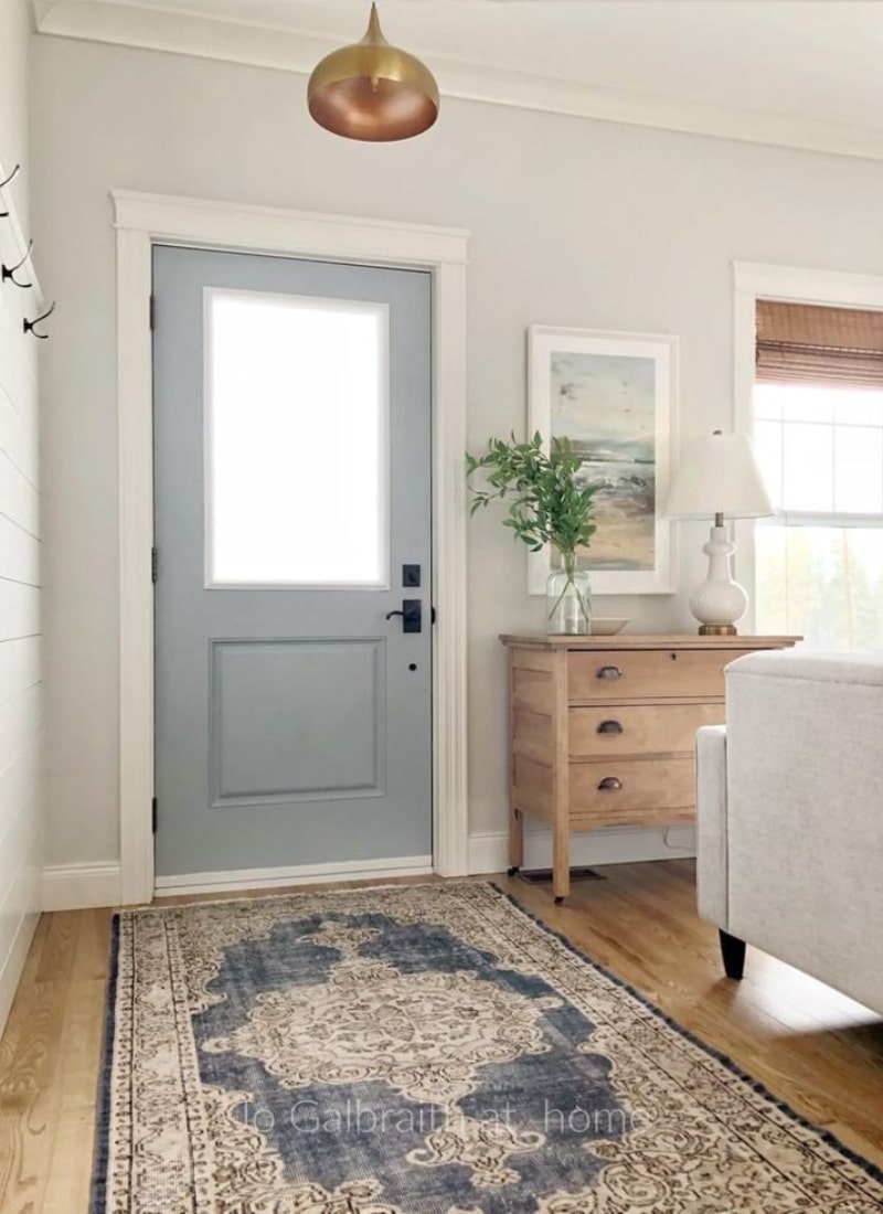
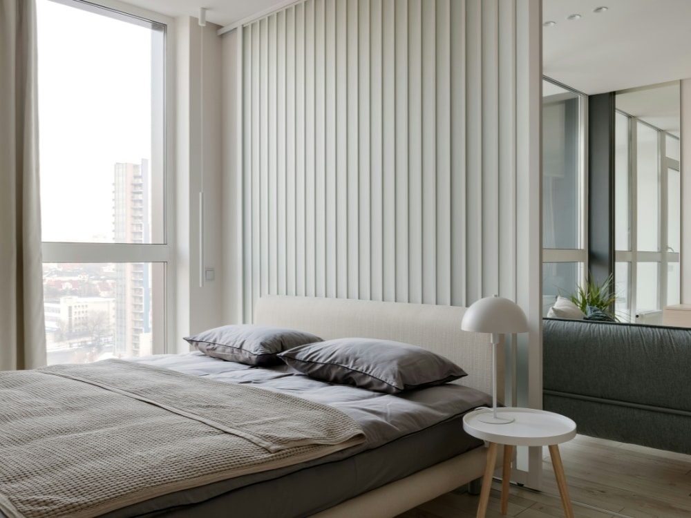
Especially when combining these 3 fellows – grey, white and black, absolutely perfect combination.
Plus, you get to play with textures or add accents without your space turning into a color circus.
If you’re into minimalist decor with three colors or just want to avoid a big decorating headache, you’re in the right spot.
I’ll show you some three-color decorating tips, including how to layer neutrals and bolds for major style points.
Ready to see how the three-color rule in home decor can change up your whole place? Let’s get into it!
What Is the Three-Color Rule?

The three-color rule is a simple trick from interior design that helps you put your room together without things looking random or cluttered.
Basically, you pick just three main colors for any space—think of it as your very own style recipe. As shared on Sara’s blog about 60-30-10 rule.
The thing is you have to choose a dominant color that leads the way, then add a secondary color to back it up, and finish with a small pop of something extra as your accent.
People have been using the 3-color rule for everything from bedroom design, living rooms, kitchens bathrooms, laundry rooms and basically everywhere in your home.
Why Limit Yourself to Three Colors?
Having a limited palette means your eyes know where to look, and your space doesn’t feel kind of all over the place.
It totally cuts down on visual noise, so every part of your room gets to shine.
Decorating with a limited color palette makes mixing and matching so much easier, especially when you’re not sure about which direction to take.
Trust me—if you want cohesive color schemes for the home, fewer colors keep things feeling planned and chill, not mismatched and crazy busy.
Plus, using a three-color palette for living rooms is like the go-to “cheat code” for everyone who wants a cute space without stressing over rules for decorating with color.
How to Pick Your Three Colors
Start with one color you’re obsessed with (maybe navy, forest green, or just a soft white). I’m totally in love with beige right now, with of course black details.
This will be your main vibe for the room.
Next, find a secondary shade that plays nice—could be a lighter or darker version, or a neutral like gray or beige.
Your third color plays as your accent, the “fun” color—something you use sparingly for pillows, decor, lighting fixtures or what ever you like.
If you’re stuck, colors likes black, white, and a bold always looks sharp, it doesn’t matter the room size.
You still get to play with how to layer textures with fewer colors—think velvet, wood, linen—which means even with three shades, your space can feel dynamic and not flat.
Related posts: How to Choose the Best Sofa Color for Your Living Room? {16 Ideas}
Working with Neutrals and Accent Shades
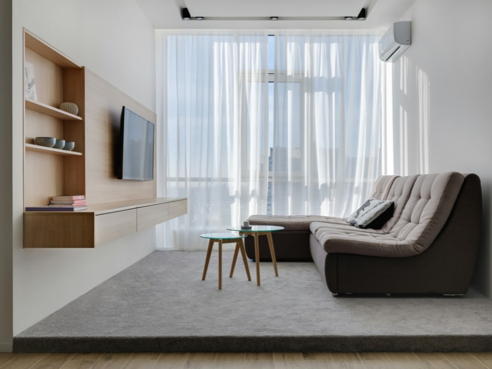
Neutrals are the backbone of any room—think white walls, a soft grey sofa, or touches of black metal.
They help ground a space and make it feel fresh without being too stark.
When you start to layer in an accent shade, it totally changes the energy.
An accent color should be something you actually love, not just what’s “in” this month.
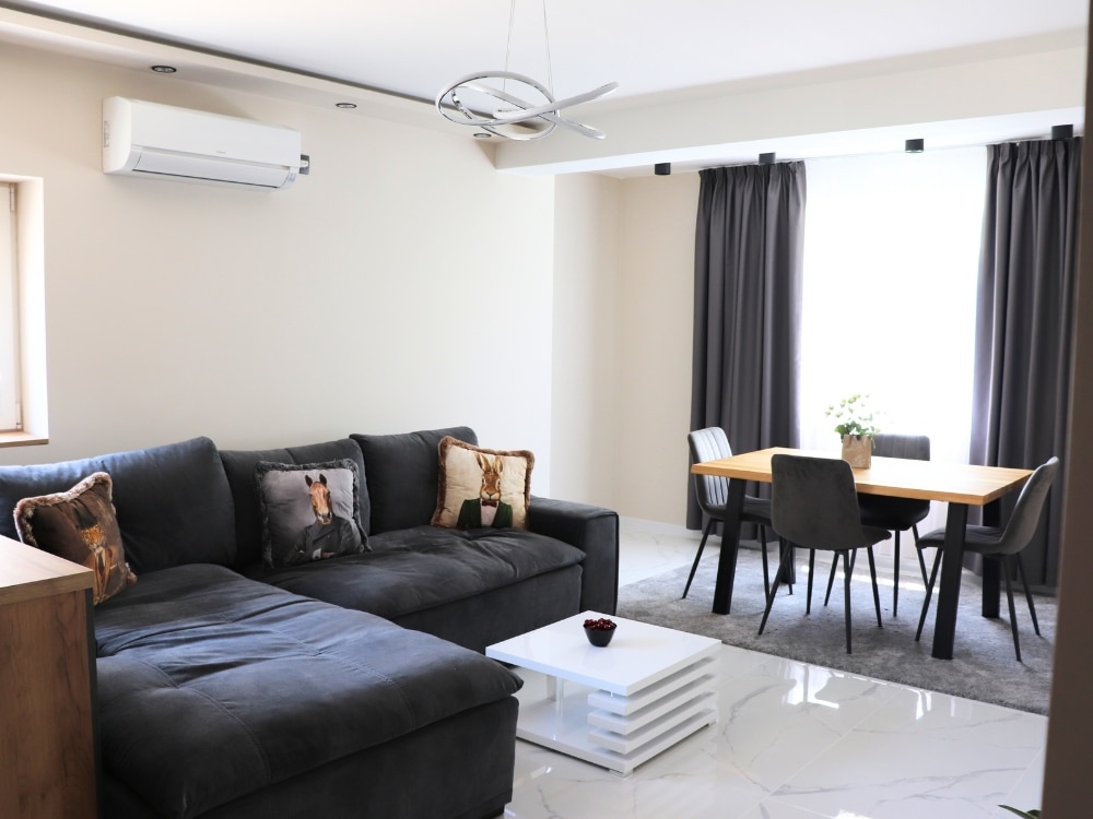
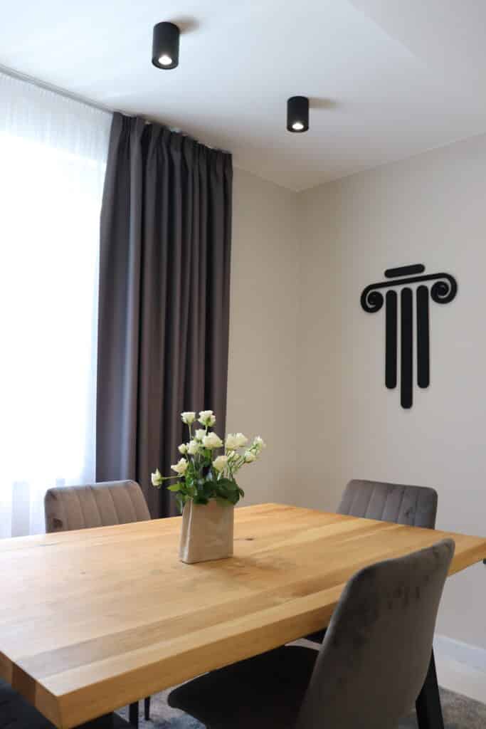
My living room is 4x6m, however I combined beige, white with grey/black details (lighting fixtures, handles, the sliding door rail) and immediately felt super cozier and calm.
You can even sneak in a little color harmony by picking an accent that’s opposite your neutral tones on the color wheel; it just looks right and gives off those cohesive color scheme vibes.
I’ve been following Emily’s blog for quite a while and she shares great tips on choosing your color palette.
Muted Colors
Muted colors are hands-down the best friends of minimalist decor with three colors, especially if you want a soft, “lived-in” vibe.
These are like shades that look like someone added a touch of grey or mixed them with something creamy.
Think faded navy, sage green, or a gentle mauve.
They blend in easily with other neutrals, which is awesome if you like to swap out decor seasonally.
Try using muted tones for bigger things like rugs or curtains and throw your accent shade on pillows or small accessories.
Whites, Blacks, and Greys (My Fav)
Honestly, you can NEVER go wrong with decorating with black, white, and one color.
It’s the ultimate “less is more” look, but it’s not boring if you do it right.
I’ve mixed beige walls, a sleek black details, and touches of grey bedding for the coziest little bedroom.
Check out more about my apartment renovation.
Using textures also helps, like a gray curtains, velvety gray stools or the gray rug on marble tiles (simply perfect)
If you keep your main pieces neutral (sofa, bed, walls), it frees you up to play with shapes, finishes, or that accent color you’ve been dying to try.
If you’re curious about best three-color combos for small spaces, it’s hard to beat the mix of white, grey, and one bold or muted accent.
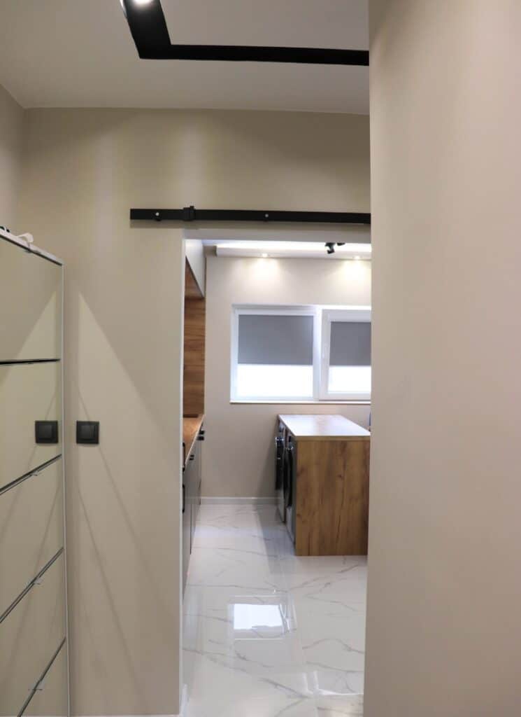
Don’t forget about the wood details too!
The whole vibe feels chic, easy, and—dare I say—effortless.
Dominant, Secondary, and Accent Colors
This is basically the “secret sauce” for how to decorate with only three colors.
Now you know the 60-30-10 rule as mentioned before-use it!
About 60% of your room (walls, main furniture, rugs) should be your dominant color, 30% your secondary, and 10% your accent.
Visualize this like a pie chart—dominant takes the biggest slice.
Accent colors are super fun for things that catch the eye but don’t overwhelm—think throw pillows, art, lamp shades, fixtures, handles, faucets and many more!
You can get super creative here, especially with your 10% accents.
I used to run an Instagram page in the home decor and architecture niche (which I later sold), and a friend of mine created a black 3D logo that I used as wall accent/art.
But if you’re into home decor that feels cozy, maybe go with a soft gray as your dominant, clay as your secondary, and then a bold navy or forest green as your splashy accent color.
Using Color in Furniture and Decor
Picking furniture in your three shades is actually easier than you think.
If you’re trying out minimalist decor with three colors, stick with sofas or beds in your dominant color (like for example a creamy white).
Your secondary can show up in side tables, media stands, or the headboard.
This is where those three-tone decorating tips really shine!
You don’t need to buy a rainbow—sometimes keeping it tight is way more rewarding.
Layering in decor with just three shades keeps things from feeling all over the map, and makes secondhand or hand-me-downs easier to work into your space.
Rust, Camel, and Ivory
If you’re stuck on how to decorate with only three colors and still look chic, this combo is for you.
Rust and camel throw off warm, cozy vibes, while ivory keeps things light and balanced.
Try rust throw pillows, a plush camel rug (super durable for pets, FYI), and a big ivory sofa.
Play with art, vases, and woven baskets in these three tones for a cohesive color scheme for the home that feels so put together.
Related posts: What Color Curtains Go with Brown Furniture? Easy Styling Tips
Shades of Brown with Neutrals
Working with lots of browns plus other neutrals is a classic move. It feels grown-up in a cool, relaxed way.
Picture light tan walls, brown leather chairs, and maybe a grey or cream area rug.
If you’re new to three-tone decorating, you really can’t mess this up.
Mixing shades of brown with neutrals lets you layer textures without needing a ton of colors.
I really like how bedrooms look with just browns, grey, and a little off-white—so good.
Add some natural wood shelves, a fuzzy blanket, and maybe a ceramic vase.
And suddenly, you’ve got color harmony in room design that’s cozy, unfussy, and feels kind of luxe without trying too hard.
Making Samples Work for You
Testing paint colors on your walls is honestly a game-changer.
It’s always good to put your paint sample up on different walls, and use a plain white border around it so your old paint doesn’t mess with how you see the new shade.
Paint samples let you spot which colors might be too warm or too cool next to each other, especially if you’re working with a limited palette.
This is color theory in action—without the confusing classroom stuff.
Here’s my favorite hack: Pay attention to the coverage.
Some paints are patchy and you don’t want to be surprised later.
Even neutrals—like a pale gray—can look completely different in sunlight vs. lamplight, so don’t skip this step.
Be Careful Not Overpowering with Accents
Accent colors are where a lot of us get way too excited—been there, done that, bought the neon throw pillow..
But in the world of 3-color home decor ideas, that third color? It’s just for a pop, not a takeover.
- Follow the 60-30-10 rule: Let your main color steal the show (about 60% of the room), support it with your secondary color (30%), and let your accent color hang back at just 10% for balance.
- Keep accents small: Think vases, picture frames, or an accent chair. Maybe a lamp or two. Don’t splash your accent color all over your curtains, rug, and sofa at once—trust me, it goes from cute to chaos fast.
- Rotate seasonally: Change out small accessories as the seasons change, but don’t bring in a whole new color unless you want to totally rethink your color harmony in room design.
These little three-color decorating tips keep the look bold but never busy.
Reader-Favorite Three-Color Combos
Here are some reader-fave color mixes that totally work for minimalist decor with three colors, apartments, or anyone sick of matchy-matchy sets:
| Palette | Feels Like | Pro Tip |
|---|---|---|
| Navy, Mustard, White | Chill & Retro | Try white walls, navy sofa, mustard throw pillows |
| Sage, Pink, White | Spring Fresh | Pink art pops on sage walls |
| Black, White, Emerald | Modern, Bold | Use emerald for vases or lamps, not big furniture |
Mixing neutrals with one bold—like black, white, and green—looks super “put together” even if you’re on a budget.
Apartment renters, this is for you: small spaces feel less cluttered with only three main shades on the go.
And yeah, layering in different fabrics or a metallic accent totally counts as how to layer textures with fewer colors.
How to decorate with only three colors? Just pick a vibe, stick to your favorite combo, and add personality through small pieces (think art, vases, or throw blankets).
Simple, cute, and way less stressful.
FAQ (Frequently Asked Questions)
What’s the secret behind the rule of three in interior design?
The secret is that your eyes love odd numbers, especially three. It adds balance and makes rooms feel more interesting compared to using just one or two colors.
Most designers agree that the three-color rule in home decor helps you avoid a space that feels too flat or chaotic. It’s one of those easy-but-true three-color decorating tips that works every single time.
How do I choose the right three colors for my living space?
First, check what you already own—I’m always surprised by how many things I already have in a color family.
Picking one main neutral, a second color, and then an accent is solid, especially in a three-color palette for living rooms.
Explore the rule of three and browse some color theory in interior design inspo online.
What’s the best approach to decorating a room with only three hues?
Start out with the 60-30-10 color rule—think 60% main color, 30% secondary, 10% accent. Rugs, sofas, and walls can be your “big” color; chairs or curtains for the “medium,” and then toss pillows or vases for the “pop.”
If you’re into minimalist decor with three colors, swap in different textures and patterns to keep it interesting.
Even decorating with black, white, and one color can totally work with some layered materials or statement art.
Could you explain how to incorporate the 3-5-7 rule when using three colors?
When you use the 3-5-7 rule, just group items in odd numbers—like three candles or five pillows.
Stick to your three colors, but don’t stress about everything matching perfectly.
It should feel balanced, not forced.
I like to start with soft beiges or greys as the main color.
Then I’ll toss in a few accent pieces in a bold tone. That’s how you get that home color styling with fewer colors—it feels stylish but not overdone.