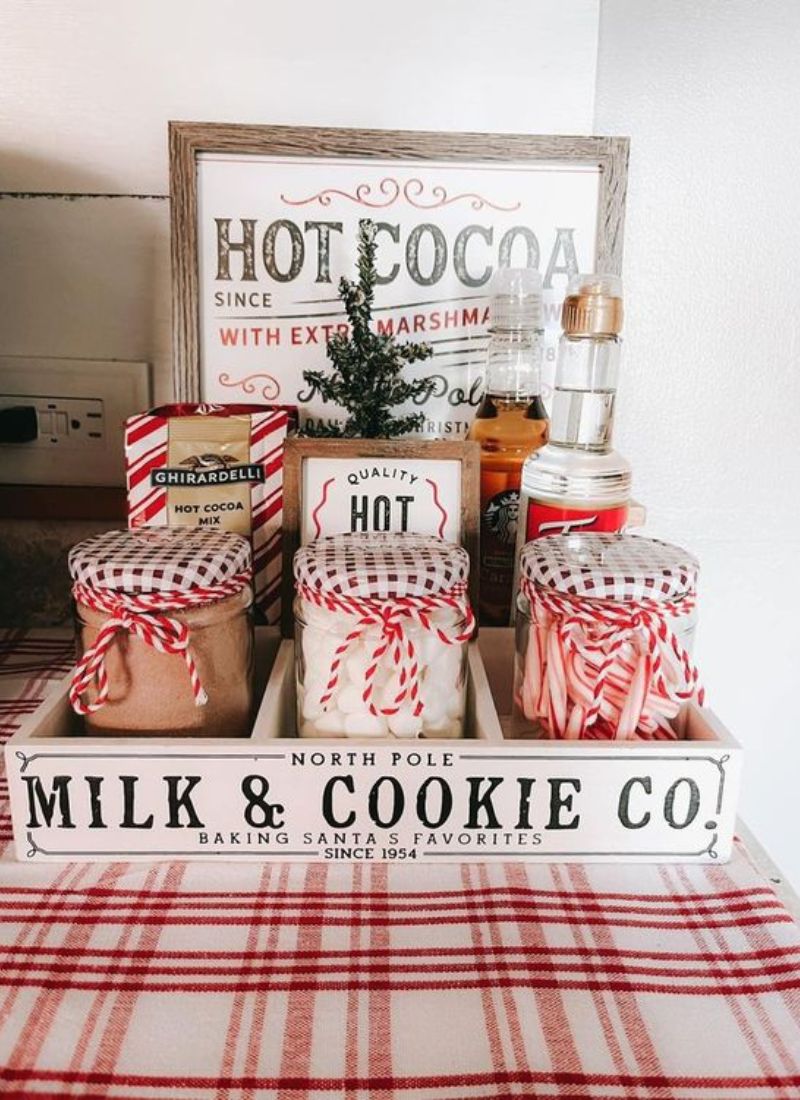
You’re about to read a cozy, real-world guide to Eclectic Maximalist Decor color mixing, with palette recipes, a simple pattern cheat sheet, and a no-shopping fix-it flow for when the room starts feeling… loud.
It was 7:18 p.m., I had a lukewarm coffee I kept forgetting to drink, and my dog was aggressively nesting into a throw pillow like he pays rent. I stared at my living room and realized something: I love color, but I do not love chaos that feels accidental.
If you’re trying to do eclectic maximalist decor, you already know the problem. You want the room to feel alive and collected and kind of unhinged in the fun way, not like you panic-bought every pillow in the clearance aisle.
So let’s talk about how people actually mix color right now, in real homes, with real budgets, and real “why is this lamp suddenly yelling at me?” moments.
I’m going to give you examples you can steal, plus the little rules I follow when my brain is begging for one more weird pattern.
Quick Start Box: Do This First So You Don’t Spiral
10-minute version (aka: I have guests in 20 minutes and regret everything):
- Pick your “bossy” color in the room right now (the one you’d defend in court).
- Find 2 things that already repeat it, even tiny: book spine, candle, art detail, vase.
- Remove 1 random color that is not helping (yes, even if it’s “cute”).
- Corral the small stuff into one spot: tray, bowl, stack of books, whatever. Instant calm.
- Turn on only lamps for a second and see if anything feels weirdly icy or muddy.
1-hour version (aka: I’m in my feelings and I need the room to match):
- Walk the room and pick 1 bossy color + 1 supporting color + 1 neutral. Write it down like a tiny contract.
- Do a quick “color map” in your head: big color goes on big things, small color goes on small things.
- Move accents into zones: one main scene, two small echo zones (so it looks intentional).
- Check patterns for scale: one big, one medium, one small, plus one solid to breathe.
- Do one repetition pass: if a color shows up once, either repeat it twice or remove it.
Building a Bold Palette Without Spiraling
Start with a color palette you can describe in one breath, then let yourself go wild inside it. If you can’t say it simply, you’ll keep adding “just one more” color until your room looks like a pack of highlighters exploded.
Here’s what works in real life: pick one “bossy” color, one “supporting actor” color, and one neutral that keeps the peace.
- One “bossy” color
- One “supporting actor” color
- One neutral that keeps the peace
Palette Recipes I Actually See Working (with where each color goes)
You know how some rooms feel loud but not stressful? It’s usually because the colors have jobs. Like, they’re clocking in.
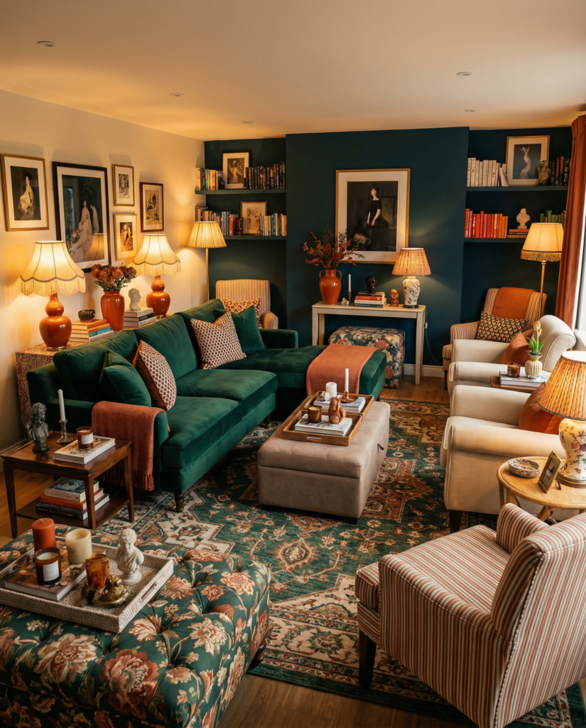
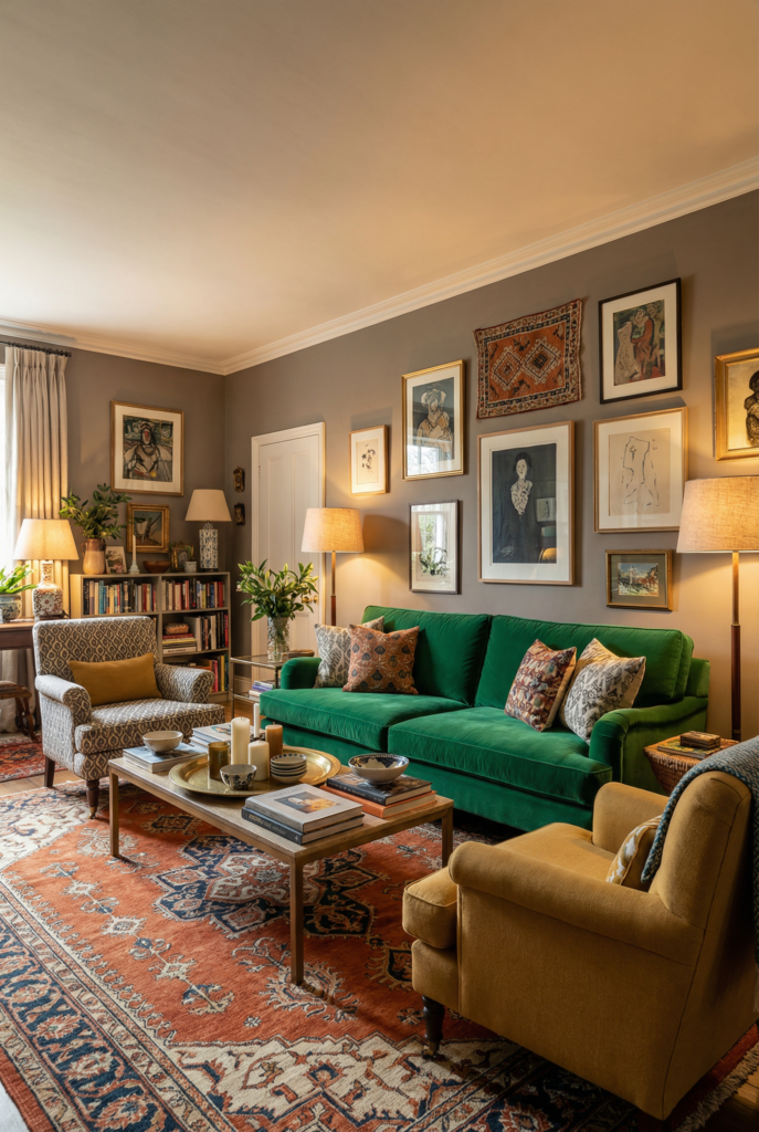
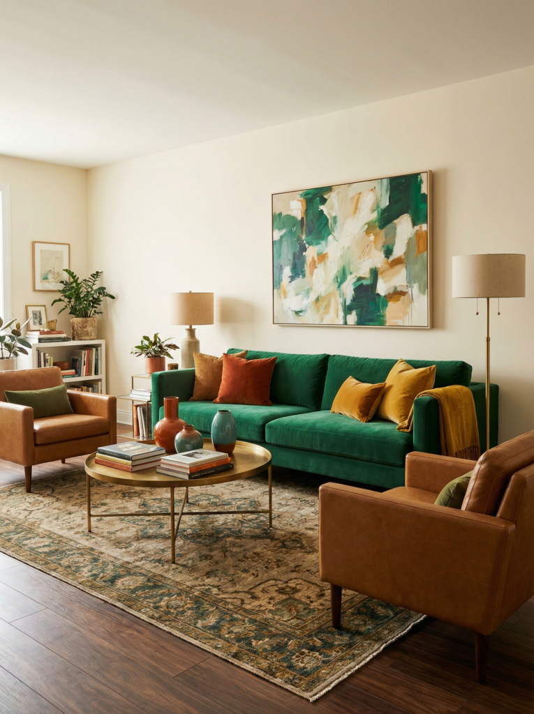
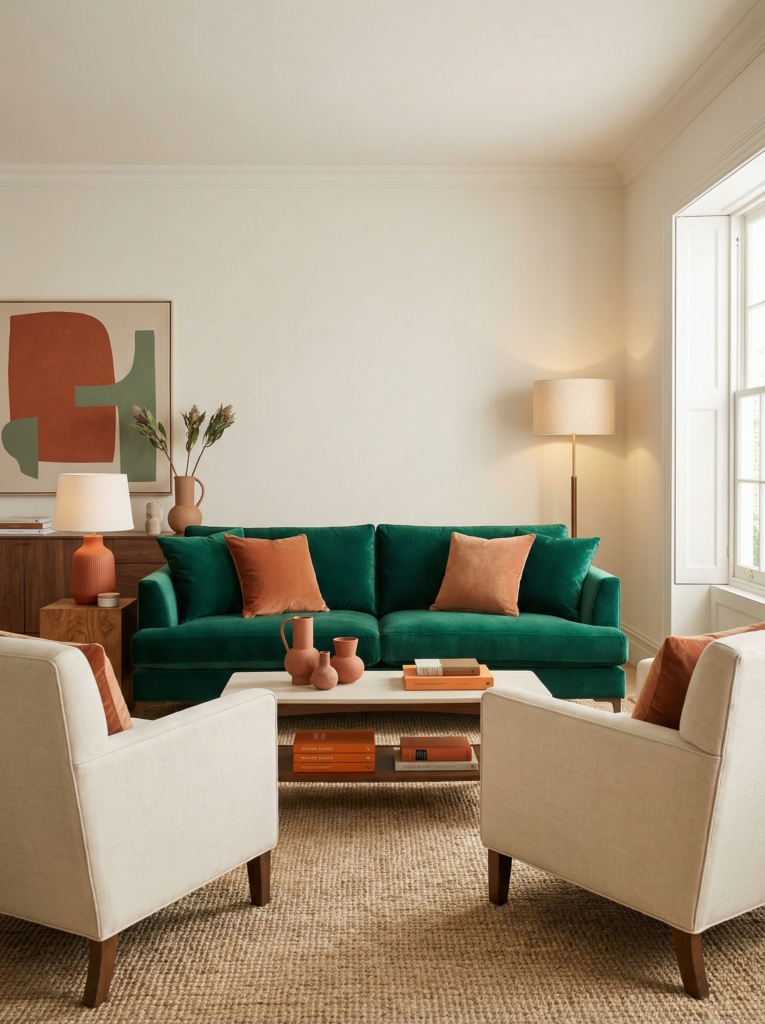
Recipe 1: Emerald + Rust + Warm Cream + Brass
- Walls: warm cream (or a creamy off-white if you’re renting and emotionally fragile)
- Sofa: rust, camel, or warm brown (leather counts)
- Rug: vintage-style with emerald threaded through it
- Art: one big piece with green plus a little warm red or ochre
- Common mistake: making the green the wall color and the sofa color. Then it goes full swamp if your lighting is warm.
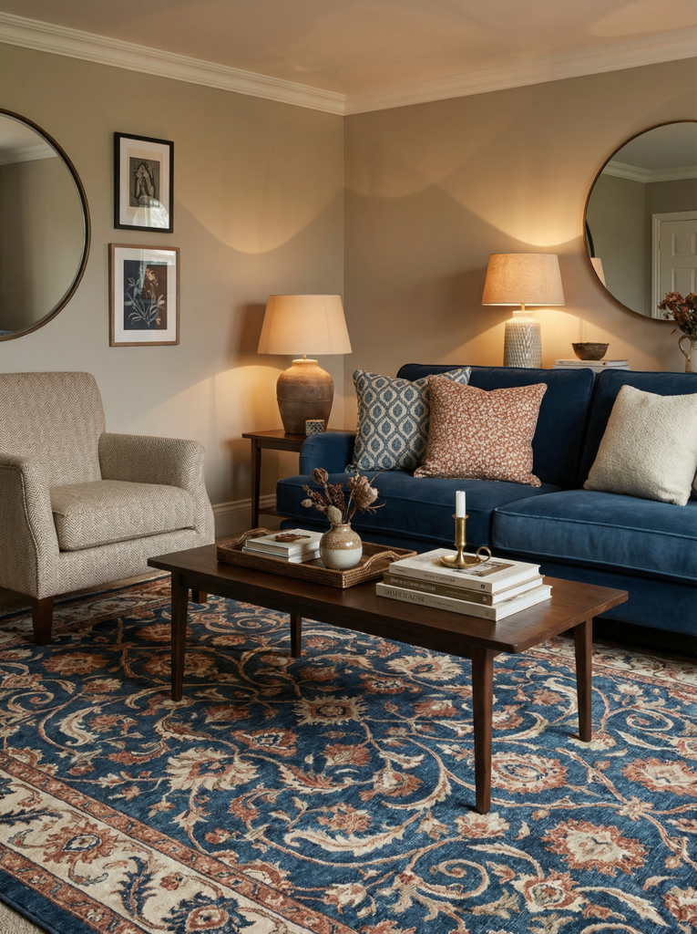
Recipe 2: Cobalt + Caramel + Soft Gray-Green + Black
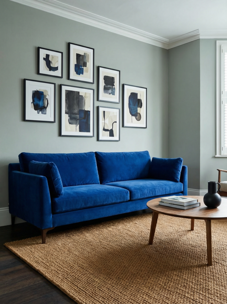
- Walls: soft gray-green (or keep walls neutral and do the green on trim, if you’re brave)
- Sofa: cobalt (or cobalt in a big rug if you refuse to commit)
- Rug: caramel, tan, or a warm neutral that calms the blue down
- Art: black frames with one or two blue hits inside the art
- Common mistake: adding more cool colors because “they match,” then the room starts feeling chilly at night.
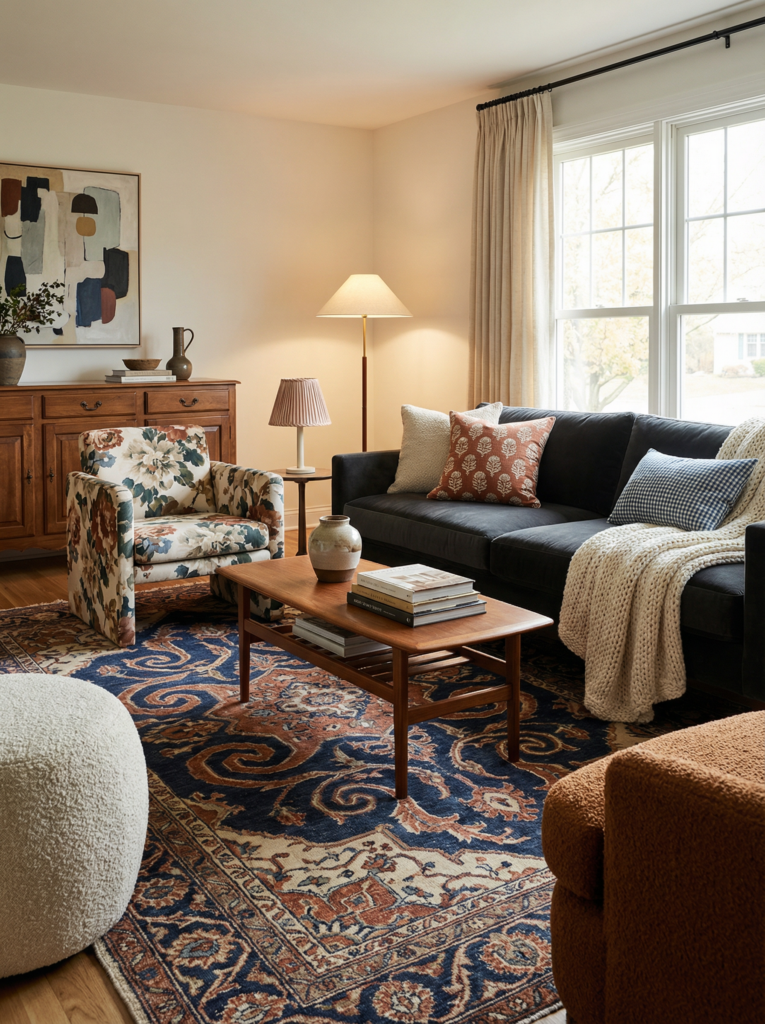
Recipe 3: Plum + Blush + Walnut + Cream
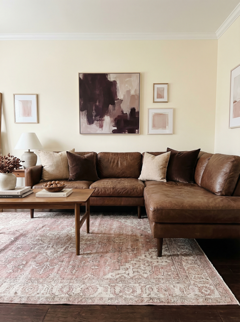
- Walls: cream (plum walls are gorgeous but you need the right light, and I do not gamble like that casually)
- Sofa: walnut leather, warm neutral linen, or a deep brown velvet
- Rug: blush and cream, preferably with a little grit so it’s not baby shower vibes
- Art: one large piece with plum, plus smaller prints with blush tucked in
- Common mistake: choosing a blush that’s too sweet. Go dusty, not candy.
Recipe 4: Teal + Mustard + Ivory + A Little Bit of Red
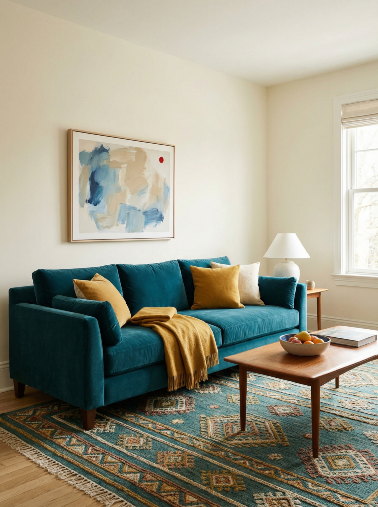
- Walls: ivory
- Sofa: teal (or a teal chair if you’re easing in)
- Rug: patterned rug that includes teal plus warm tones
- Art: one piece that has a tiny red note, like a spice sprinkle
- Common mistake: using mustard on huge surfaces when the room is already warm. It can get heavy fast.
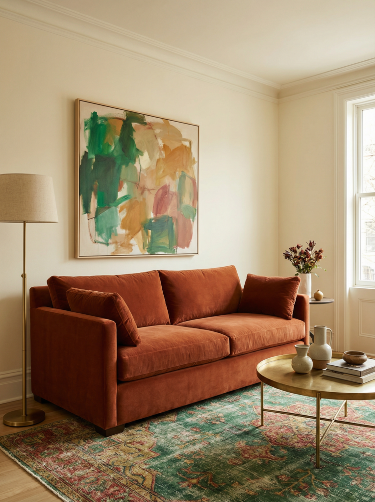
Recipe 5: Terracotta + Olive + Cream + Mixed Metals
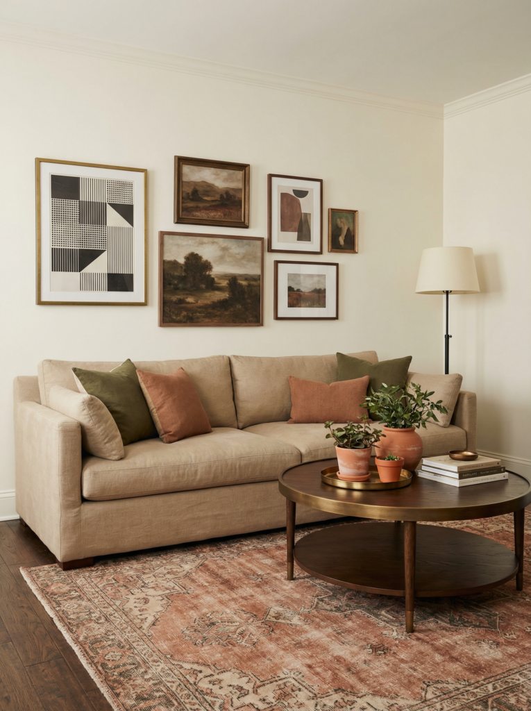
- Walls: cream
- Sofa: warm neutral, or olive if you want drama without neon energy
- Rug: terracotta-heavy vintage rug, or a natural fiber rug with terracotta layered on top
- Art: lots of earthy tones with one crisp modern shape to keep it fresh
- Common mistake: going too muddy with olive + brown + beige and forgetting one crisp contrast moment.
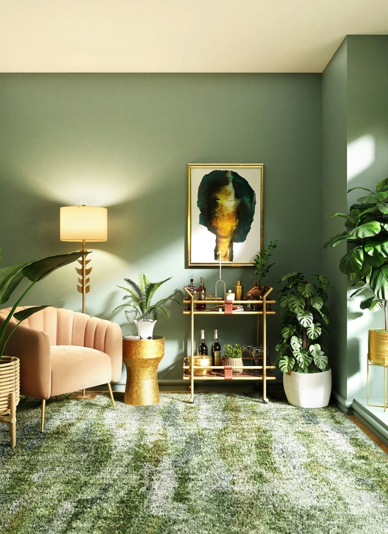
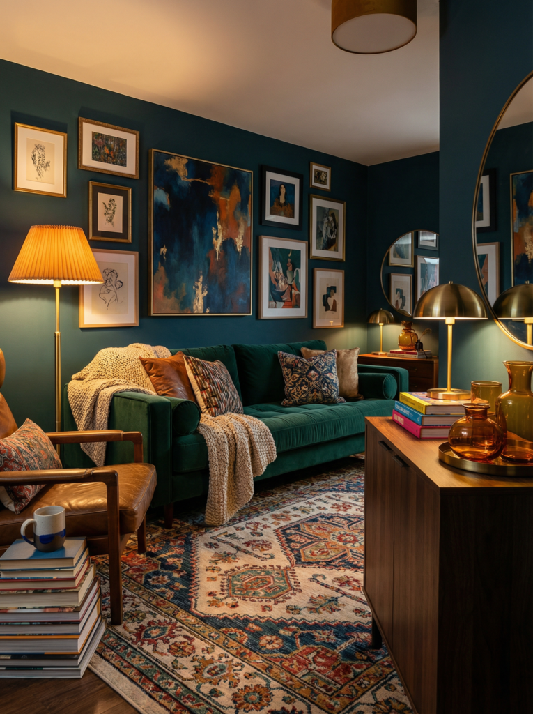
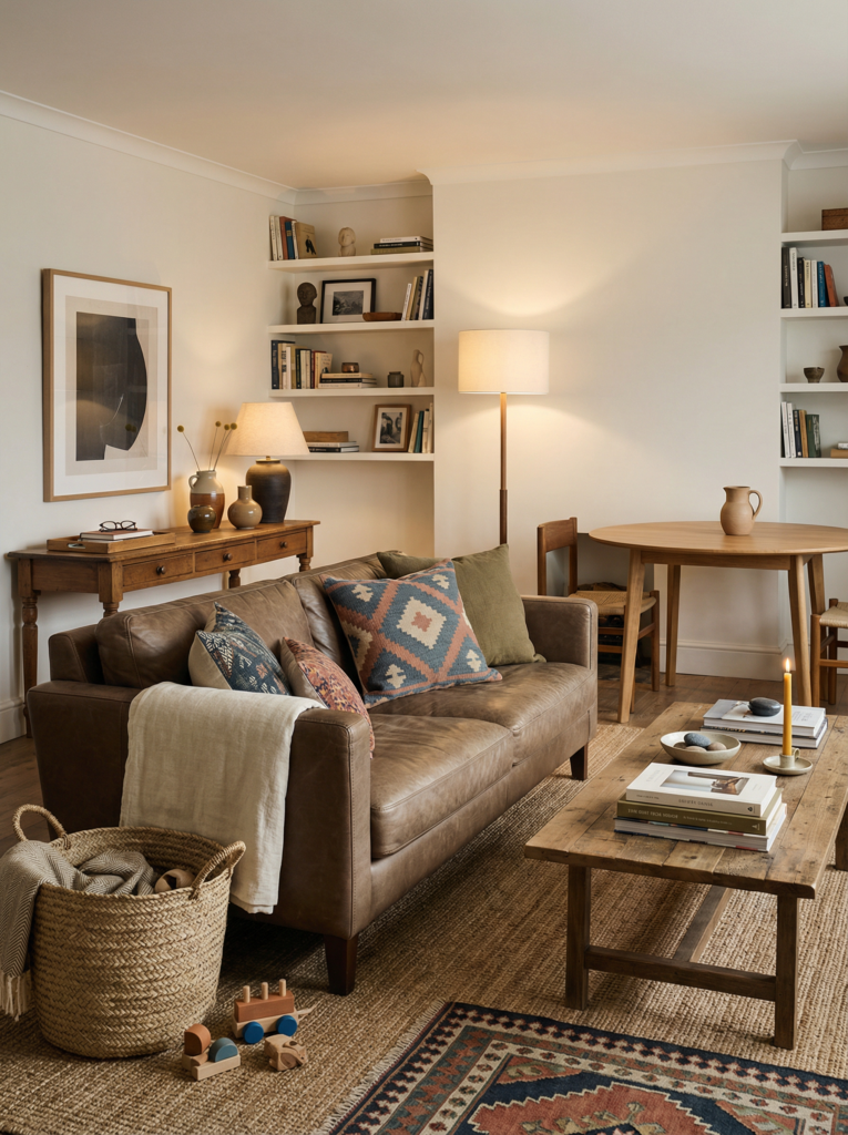
The bossy color is your bold colors moment, the one you’d happily paint your nails at 11 p.m. on the couch. I see people doing rich jewel tones a lot because they feel deep and cozy, not neon-arcade.
- Emerald velvet curtains with a rusty terracotta rug and warm cream walls
- A cobalt sofa with caramel leather and soft gray-green trim (trim is underrated, but it’s also where you can accidentally ruin your weekend)
If you want colorful walls, commit to a shade that has a little dirt in it, not a pure candy color. It photographs better and it’s kinder at night. Then add contrast in design on purpose, like glossy ceramics against matte paint, so the room feels intentional.
The easiest cheat is to anchor color in one big thing you cannot ignore, like bold upholstery. That can be a sofa, a headboard, even dining chairs. Then you echo it in two or three smaller places so it looks planned, not random: a single vase, a stripe in a rug, a tiny edge in a piece of art.
People who do maximalist style well almost always repeat their main color in different textures, not just more of the same fabric.
And yes, this is interior design, but it’s also emotional regulation (because why does a too-bright pillow make me feel personally attacked). If you want an actual “start here” moment, look at your room at night with only lamps on.
If the colors feel muddy, add one clear warm note, like brass or ochre. That’s one of the only interior design tips I’ve never regretted.
Pattern on Pattern Without the “Messy Room” Vibe
Mix layered patterns by varying scale and keeping at least one pattern “quiet.” If every pattern is loud, your eyes don’t know where to land, and suddenly your cute space feels like a visual group chat.
Here’s what people do when it looks good: they pick one hero pattern with movement, like a big floral, a bold stripe, or a vintage rug, then they layer smaller patterns that share one color with the hero.
- One hero pattern with movement, like a big floral, a bold stripe, or a vintage rug
- Smaller patterns that share one color with the hero
Pattern Cheat Sheet
The formula:
- 1 large pattern: the scene-stealer (rug, curtains, big chair)
- 1 medium pattern: the sidekick (throw, second pillow, upholstered ottoman)
- 1 small pattern: the texture-y detail (tiny pillow, lampshade, small print)
- 1 solid: the exhale (sofa, blanket, big pillow, or even just plain curtains)
What “quiet pattern” means (because it sounds fake but it’s real):
A quiet pattern is a pattern that reads almost solid from across the room. It’s usually small-scale, low-contrast, or tone-on-tone. Think: tiny stripes, subtle checks, soft speckles, faded botanicals, anything that gives movement without yelling.
For example, a large ikat rug in indigo and tan, then a tiny gingham pillow that also has indigo, then a throw with a micro print that reads almost solid from across the room.
This is where vibrant prints can absolutely work, but they need a hierarchy. I also love mixing patterns across eras, like a traditional rug with modern art above it, because the contrast makes everything feel fresh.
And if you’re working with mismatched furniture (the real-life version of “I moved three times and now I own this chair”), patterns help it feel curated instead of accidental. The key is deciding what you want to feel calm: maybe the sofa is solid, or the curtains are plain linen, so the rest can party.
Now the part no one says out loud: you need to mix textures too, or the patterns can look flat and cheap. Add textured fabrics like bouclé, mohair, chunky knit, or washed linen so your patterns have depth.
I’ve watched people nail this by pairing a slick printed pillow with a nubby throw, then grounding the whole thing with wood and a little metal. It’s one of those layering techniques that reads subtle in person but huge in photos.
Also, tiny real detail: if you have kids, choose at least one pattern that hides toothpaste smears (ask me how I know). I once bought a pale cream pillow for “balance” and it lasted exactly two days. Dynamic spaces are cute until someone wipes yogurt on your “neutral.”
Creating Harmony Through Repetition
Creating harmony through repetition means you repeat the same few ideas, not the same exact objects.
It’s the difference between a room that feels collected and one that feels like you’re storing your personal collections in every visible corner.
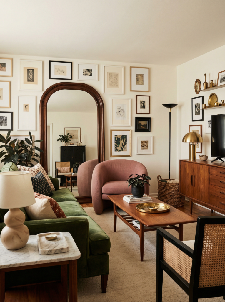
This is where eclectic maximalism shines when it’s done well. You can have vintage decor, modern art, and random thrifted treasures living together, but you need a couple of repeated threads.
- Warm wood, black accents, and soft curves
- Brass, dark green, and a specific shade of pink that shows up in tiny places
One of my favorite real examples is a room with a gallery wall where every frame is different, but the mats are all the same creamy white. That one repeat makes it look like a real art gallery wall, not a collage that happened during a 2 a.m. scroll spiral.
Another example I keep seeing: people repeat one material, like rattan or marble, in little hits across different zones. It’s so simple, but it makes the whole thing feel like cohesive design instead of a bunch of unrelated decisions.
Also, repetition is how you make statement pieces feel like they belong. If you bring home a giant sculptural lamp or a weird vintage chair, you can support it by echoing its shape or color elsewhere.
A curvy lamp looks better when there’s another curve somewhere, like an arched mirror or rounded pottery. A super graphic painting looks calmer when there’s one other graphic moment in the room, like a striped pillow.
This is how curated decor is built, in tiny decisions that add up.
Accent Placement for Cohesion
Accent placement for cohesion is basically: put your bold moments where the room already has a reason to look. If you scatter accents evenly like confetti, nothing feels special and everything feels busy.
Think in zones. People do this naturally in maximalist interiors, even if they don’t call it that. There’s usually a “main scene” zone, like the sofa wall, the bed, or the dining area.
That’s where you can go big with color and art.
Then you create two smaller echo zones, like a reading chair corner and a console table moment, where you repeat the same colors in quieter ways.
- A “main scene” zone, like the sofa wall, the bed, or the dining area
- Two smaller echo zones, like a reading chair corner and a console table moment
This is also where unique lighting does a ton of work. A colored glass lamp, a pleated shade, a sculptural sconce, those can carry color without adding another textile pattern.
If you want a very specific example: a navy sofa plus a red patterned rug can feel too intense until you add a little bridge color, like a warm tan throw and a brass lamp. Suddenly it feels like home decor, not a design experiment.
I also love using “accent containers” so the color feels contained, not chaotic. Trays, book stacks, a single shelf, a console vignette. You can change them without repainting your life.
And if you’re following decor trends right now, you’ll notice people are bolder with art and softer with everything else. That’s smart.
Fix-It Flow for “Why Does This Room Feel Messy” (No Shopping, Promise)
Step 1: Do a 3-minute reset.
- Take every small loose item off the main surfaces (coffee table, console, dining table).
- Put them in a basket or a laundry bin temporarily. This is not a moral failing, it’s staging for your brain.
Step 2: Ask one question.
- Is the mess mostly stuff, or is it mostly visuals?
- If it’s mostly stuff: go straight to Step 5.
- If it’s mostly visuals: do Step 3 and 4 first.
Step 3: Kill one random color.
- Find the color that appears once and only once and feels like it wandered in.
- Remove it from the room for now (closet it, swap it, move it to another room).
- If you miss it later, it can come back with a buddy color.
Step 4: Add one “exhale” solid.
- Plain throw on the sofa.
- Solid pillow.
- Simple blanket folded over a chair.
This is how rooms stop feeling like a visual group chat.
Step 5: Make 2 zones on purpose.
- One “display” zone: the stuff that makes you happy to look at.
- One “contain” zone: tray, bowl, box, basket. Not hidden, just contained.
Step 6: Do the repetition check.
- If a color shows up once, either:
- Repeat it twice with what you already own (books, art, textiles), or
- Remove it.
Step 7: Pattern sanity check.
- If you have 3 loud patterns fighting, make one of them quiet by swapping one pillow or throw for a solid you already have.
Conclusion
If you’re mixing color in a maximalist home, the magic is not “more.” It’s “more, but connected.”
Pick a simple base palette, layer patterns with a clear hierarchy, repeat your favorite threads, and place accents where the room already wants attention.
Then live in it for a week before you declare it a failure. Lighting changes everything. Mood changes everything.
Sometimes you just need to swap one pillow and drink your coffee while it’s still warm (I never do, but I believe in the idea wow).
My one lingering problem is still that overhead light. One day I’ll fix it. Maybe. For now, I’m focusing on what feels good at 8 p.m. with lamps on and everyone finally calm. That’s the real test.
FAQ
What Is Eclectic Maximalism?
It’s the mix of many styles, colors, and objects, but with some underlying logic. It looks layered and personal, not random.
What Are Eclectic Colors?
They’re usually not just one palette family. You’ll see warm and cool together, plus a neutral thread that keeps the room grounded.
Is There a Difference Between Messy and Eclectic?
Yes. Messy looks accidental and unedited. Eclectic looks intentional, even if it’s playful and imperfect.
What Does an Eclectic Room Look Like?
It usually has a mix of eras, art, patterns, and textures, plus a few repeated elements that tie it together. It feels collected, not copied.