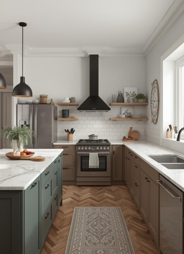
Most nights you’ll find me in my own kitchen, waiting for the pasta water to finally simmer, scrolling Scandinavian kitchens on Instagram like it’s an actual side gig. My coffee mug from this morning is still on the counter, a few dishes are definitely not where they belong, and I’m over here zooming in on cabinet colors in strangers’ houses.
This week I fell into a serious rabbit hole and kept noticing one thing. The color palettes are actually really simple. Calm. Repeated. And yet every space feels different and wildly pretty.
So I thought I’d walk you through what I’m seeing over and over in Scandinavian kitchen design, using ten insanely good real kitchens as our color tour.
You might not be ready to gut your space tomorrow, but you can absolutely steal some of these palettes for paint, tile, wood, or even just accessories.
1. Warm Neutrals Or Cool Whites: Pick Your Team
When you start saving Scandinavian kitchens, it becomes really obvious that there are two big camps: the creamy, oat-milk people and the crisp, gallery-white people. Both are beautiful, but they change the whole mood of the room.
The cozy, warm neutral crew
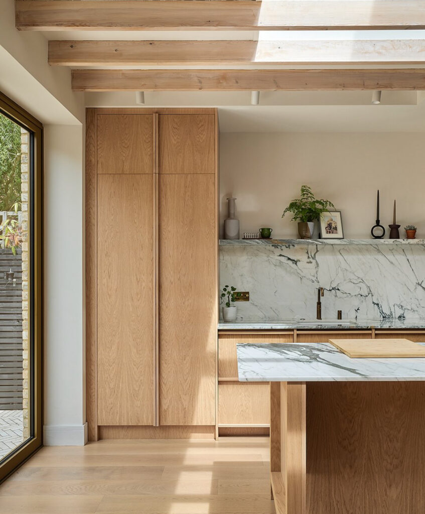
Leigh’s light oak kitchen in Chiswick, designed by Nordiska Kök, is the warm team at its best. The cabinets are this soft, white-pigmented oak, the floors are honeyed, and then that giant marble backsplash slides in with those charcoal veins. The skylight and exposed beams make everything glow like late-afternoon sun all day. It feels like somewhere you’d drink tea and then forget to leave.
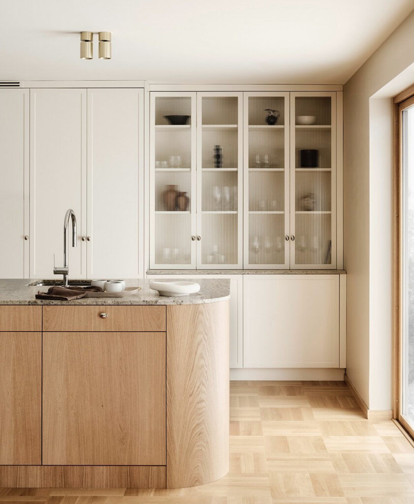
You will see the same vibe in their timeless shaker kitchen in Halmstad. That one has a curved oak island parked in front of tall, creamy cabinetry with fluted glass doors. It’s all beige and sand and oat, but because the shapes are so good (round corners, simple knobs), it doesn’t feel flat or blah. It’s like a linen dress version of a kitchen.
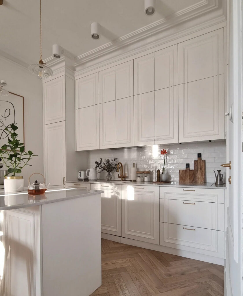
Keephousing’s all-cream kitchen leans even more classic. Think detailed doors, shiny subway tile, brass hardware and a herringbone wood floor catching the light. The color is technically “white”, but it’s a warm white, so the whole space reads soft and welcoming instead of snow-storm sterile. This is the kitchen where someone is always offering you tea and cake at 3 pm.
CS Joinery’s oak kitchen lives in the same family. All that natural oak cabinetry, white counters and a pale backsplash make the room feel calm and timeless. Because everything is warm, even the stainless bits behave themselves instead of screaming “appliance showroom”.
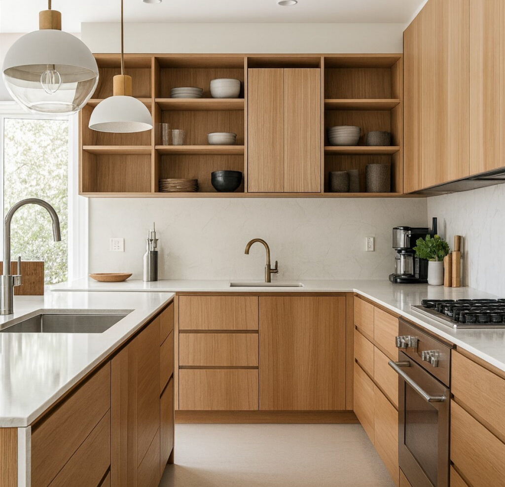
What these warm-neutral spaces have in common:
- Wood that leans golden or sand, not gray
- Off-white paint and stone with a little warmth in them
- Brass, beige or taupe metals instead of icy chrome
If your house already has warm floors or you live somewhere that is cloudy nine months of the year, this palette will be your best friend. It is extremely forgiving when there are toast crumbs everywhere. Ask me how I know.
The crisp, cool white team
On the other side, we have the cooler whites. They still feel Scandinavian and minimal, but a bit more “architect’s sketch” and a bit less “cabin with candles”.
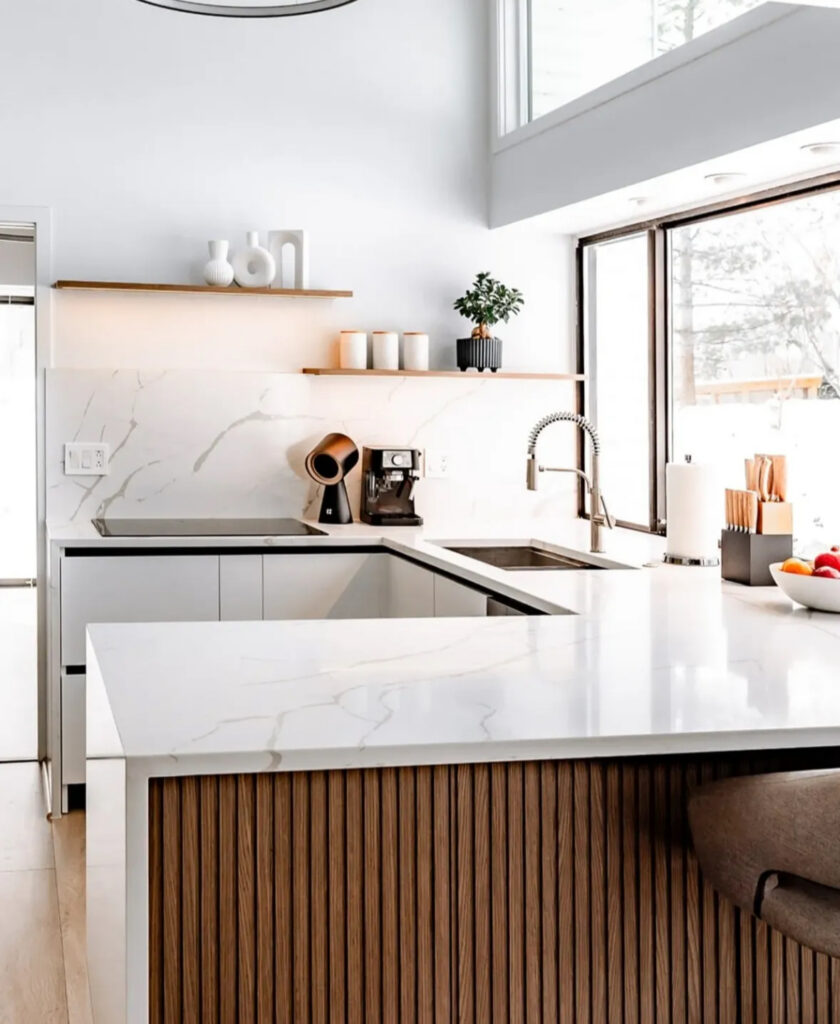
The Rochester kitchen by Cornerrenovation is a perfect example. The Dekton-style waterfall counter is a bright, almost icy white, floating over a ribbed oak island. The walls and backsplash are clean white with thin marble veining, and the huge window pulls in cool daylight. It still has wood and warmth, but the white is the main character.
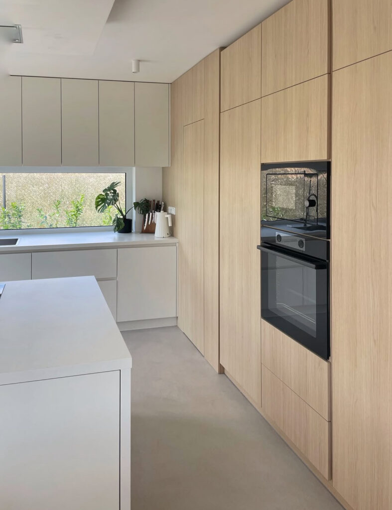
Hometure_cz’s kitchen is another cool kid. The upper run of tall, pale wood cabinets sits next to a long, low stretch of perfectly handleless white cabinetry and island. The counters and floors are light and neutral and there is almost no visible clutter. It looks like the type of place where the coffee machine is hidden behind a door and they definitely remember to descale it on schedule, unlike some of us.
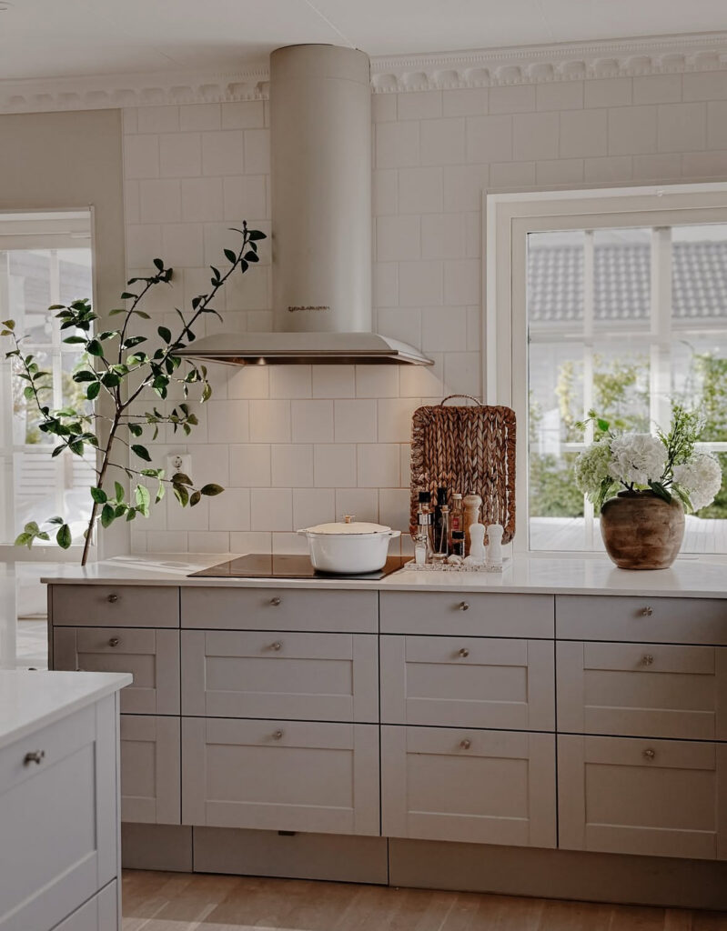
Sarah Strath’s kitchen sort of sits between the two, which is why I love it. Her cabinets are a soft greige, the tile is white, but the overall feeling is fresh instead of creamy. Then she adds a huge branch in a vase and a pot of hydrangeas and suddenly the whole room is alive.
If you like the idea of a bright, modern kitchen that still feels friendly, cooler whites can work, you just need:
- Plenty of natural light or really good artificial lighting
- A bit of warmth somewhere (wood floors, oak chopping boards, a woven tray)
- To commit to keeping surfaces fairly clear so the lines stay crisp
Confession: I don’t actually have a white kitchen at all. Mine is that graphite-and-wood combo I talked about in my own renovation, because I’ve always been a fan of darker, outside-the-box colors. But I completely get the obsession with bright white spaces – when I was writing about Josie’s Victorian flat Reno with lovely white kitchen, those images basically moved into my brain rent-free. So if you’re dreaming in white while standing in a very not-white kitchen, you’re in good company.
2. Muted Color Crush: Sage, Greige And Gentle Wood
If fully white or wood kitchens feel a little too neutral for your soul, the other big Scandinavian color move is muted color. Think sage, smokey blue, mushroom greige. Color that almost behaves like a neutral.
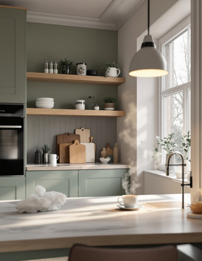
Vlasconstruction’s renovated Utrecht townhouse kitchen is textbook. The lower cabinets are this beautiful matte sage, the shelves are pale birch, and the wall behind them is a slightly deeper green. There is steam rising from a cup of coffee in the photo and you can practically hear quiet rain outside the window. The color combo is soft but still brings a lot of personality.
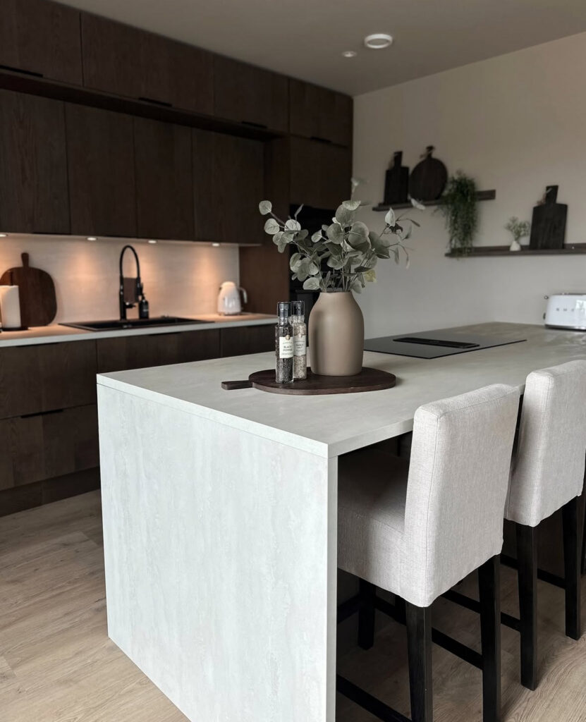
Home by Stine shows a moodier version. Her cabinets are a deep, chocolatey wood, the counters are pale, and the island is wrapped in a light stone. The palette is still limited and calm, but the darker wood gives the whole room this cocoon feeling. It is “glass of red wine while something slow-roasts in the oven” energy.
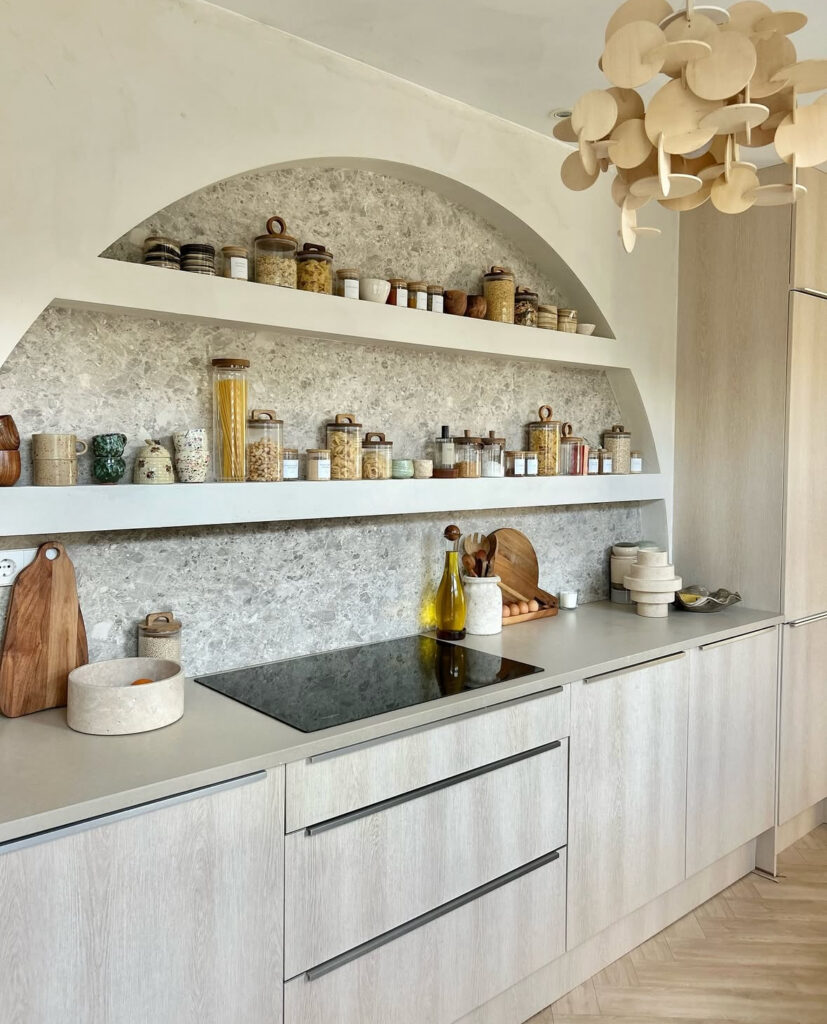
Hetkijkhuis does something really fun with muted color too. The cabinets are a light, almost greyed oak. The backsplash is a speckled stone, and then she carves out this big arched niche, filling it with two long shelves of jars and cups. The colors are oatmeal, stone, caramel and a little green from the ceramics, plus the most incredible sculptural wooden pendant overhead. It proves you can stay neutral and still have a lot of visual interest through texture and shape.
If you want to try a soft color in your own kitchen without freaking out future-you, a few tricks:
- Treat sage, blue-grey or warm greige as your “neutral” for lower cabinets, and keep walls and upper cabinets light
- Pair muted colors with natural wood, rattan or linen so it feels organic, not trendy
- Repeat the color in tiny doses elsewhere: a tea towel, a mug, a plant pot, so it looks intentional
The nice thing about these palettes is they still read very calm and minimal, but they hide mess slightly better than pure white. That might not sound like a big thing until you see the amount of peanut butter that can end up on a cabinet door.
3. Let Cabinets, Tile And Counters Talk To Each Other
The third big pattern I see in Scandinavian kitchens is how intentionally people use contrast between cabinets, tiles and worktops. It is not random. There is usually one show-off moment, and everything else is quietly supportive.
When the stone is the star
In Leigh’s Nordiska Kök kitchen, that huge slab of marble with the dramatic veining is clearly the star. The cabinets and walls are purposefully quiet: light oak, pale walls, slim pulls. Even the little shelf that runs along the backsplash stays almost empty, just a few plants and simple candleholders. The message is “please stare at this stone”.
Cornerrenovation in Rochester does something similar with their marble-look backsplash and counters. The stone wraps around the L-shaped counter and drops down the island. Because the cabinets are frameless and pale, and the accessories are minimal, the whole kitchen feels like one big, sculptural block of light.
Hetkijkhuis makes the stone niche her focal point. All the jars, pasta, spices and ceramics could feel busy, but because the background is a consistent grey stone and the cabinets and counters are so soft and simple, it reads like an art installation of everyday things. I weirdly want to label my lentils now.
If you have a stone you love and want it to be the main event:
- Keep cabinet color simple and let the veining provide the drama
- Choose a backsplash that is either the same material or extremely quiet
- Limit countertop clutter so you can actually see it (note to self)
When the cabinets lead
Sometimes the cabinets are the showpiece instead.
The Nordiska Kök shaker kitchen with the curved island is all about those doors and the shape of the island. The stone is light and speckled, the walls are barely darker than the cabinets, and even the hardware is tiny. Your eye goes straight to that gentle curve.
CS Joinery’s oak Nordique kitchen is also cabinet led. All those vertical lines of wood grain, the open shelves, the framed boxes around the uppers. The counters and backsplash are almost the same pale tone, so the wood feels rich and warm without getting busy.
Hometure.cz’s kitchen is a masterclass in “cabinets as architecture”. The tall oak wall, the slim white run below the window, the white island. There is almost no visible tile at all. The whole room feels like one built-in piece of furniture.
If your cabinets are going to be the main color move:
- Pick a worktop that is close to your wall color so it visually disappears
- Keep backsplash material really simple (even just painted plaster)
- Let hardware and lighting be subtle so the lines of the cabinetry can shine
When tile or pattern wants a moment
Sarah Strath leans into her glossy white subway tiles. They bring a little sparkle and movement into what could be a very plain color palette. The cabinets and counters are quiet, but those repeating rectangles of tile and floor keep things interesting.
If you fall in love with a patterned tile or an interesting layout, your safest move is to keep cabinet and countertop colors calm and a bit desaturated. Let the pattern have the spotlight.
Here is how I’d reverse-engineer a color palette from all these kitchen inspirations without losing my mind or spending 400 dollars on tester pots. Not that I have done that. Ahem.
Step 1: Start with your wood
Look at the wood you already have and the wood you know you want. Floors, beams, existing furniture you refuse to part with.
Is it yellowy and warm, like the parquet in Keephousing’s kitchen or the island in Nordiska Kök’s shaker space?
Or is it cooler and more pale, like the oak in Hometure.cz’s and CS Joinery’s projects?
Your wood tone is basically your first color. Once you know if it is warm or cool, it will narrow your whites and stones a lot.
Step 2: Decide if your walls are creamy or crisp
Use the warm vs cool notes from the first section. When I was choosing ours, I literally painted Bristol board sheets with different colors, taped them around the kitchen, and lived with them for a week. You will feel ridiculous, but it is cheaper than repainting all your cabinets.
Creamier walls will love warm wood, brass and sage. Crisper whites tend to play nicer with grey stone, black hardware and sharply modern shapes.
Step 3: Pick one “soft color” if you want it
If sage, greige or muted blue makes your heart happy, use it either on:
- Lower cabinets
- A pantry wall
- Or in a small dose like a backsplash or island
Vlasconstruction’s sage lowers plus birch shelves are a good blueprint. So is Sarah Strath’s greige cabinetry against white tile. Try to keep this muted color as the only strong hue, and repeat it in smaller moments.
Step 4: Layer in texture before adding more color
Scandinavian kitchens rarely rely on a lot of different colors. They rely on textures.
Some ideas you can steal immediately:
- A single leafy branch in a simple vase like Sarah Strath
- A tray of everyday oils and grinders
- A cluster of wood boards leaning casually (but actually very intentionally) by the backsplash
- Open shelves with mostly white and wood objects
The goal is a clutter-free kitchen that still feels like humans live there, which is a balance I personally have not yet perfected.
5. Tiny Real-Life Things I Noticed (That Might Help You Too)
This is the part where I stop pretending to be purely aesthetic and admit the mundane stuff I kept noticing in these images.
- Everyone has good lighting. Pendants with warm bulbs, spotlights on rails, under-cabinet lights. Even in the super minimal spaces, lighting is doing a lot of work. As someone with unresolved boob-light trauma in my own kitchen, I am very sensitive to this.
- Most of these kitchens hide their heavy clutter. The coffee machine shows up in maybe two of the ten, and even then it’s tucked into a corner. Deep drawers, tall pantries and appliance garages are doing the storage heavy lifting so the counters can breathe.
- Black is used like eyeliner, not foundation. A black faucet here, a dark bowl there, the frame of a window. It sharpens things just enough without dragging the mood into “industrial loft”.
- Plants look extra good against soft color. That one branch in Sarah Strath’s kitchen, the little tree in the Cornerrenovation space, and the herbs in the Utrecht kitchen all stand out beautifully because the backgrounds are muted.
I am absolutely not planning to decant my pasta into matching jars like Hetkijkhuis, because that is a level of organization I will never reach, but I might steal the idea of one pretty open shelf with just my favorite mugs. Baby steps.
What is a Scandinavian style kitchen?
To me, a Scandinavian kitchen is light, simple and functional, with a lot of natural materials. Clean lines, minimal ornament, pale colors, and usually some combination of wood, stone and white. It is not about having zero stuff, but about editing so only the useful and beautiful things are visible.
What colors work best in Scandinavian kitchens?
Soft whites, warm beiges, greige, pale oak, and muted greens or blues are the core palette. You’ll usually see one main neutral (like cream or white), one wood tone, and then maybe one gentle accent color. Black shows up in small doses through hardware, fixtures or a bit of furniture.
Can you mix mid-century modern with Scandinavian?
Absolutely. In fact they are very good friends. A lot of Scandinavian spaces already nod to mid-century design with simple cabinet fronts, warm wood and clean-lined furniture. Think: a pale oak kitchen like CS Joinery’s, then add a vintage teak dining chair or a simple globe pendant and it all blends nicely.
What trend is quietly replacing modern farmhouse kitchens?
From what I’m seeing, the softer side of Scandinavian and Japandi is slipping in where modern farmhouse used to be. Less shiplap and black barn doors, more smooth plaster, light oak, simple shaker doors and calming colors. You can totally transition a farmhouse kitchen by toning down the contrast, simplifying hardware and sneaking in these Scandinavian palettes.