Black and white bedroom decor can look insanely chic, but it can also swing cold and “hotel lobby” fast if the balance is off. This guide gives you simple ratios, placement rules, textures, and lighting tweaks so the contrast feels cozy, not clinical.
In my head, a black and white bedroom is always perfectly chic. The sheets are crisp, the art is graphic, and there is zero visible laundry.
In real life, my first black and white bedroom decor attempt looked like a mattress showroom. Too white, too shiny, and somehow weirdly stressful. I remember lying there at 11.23 pm thinking, “How did I make something this simple feel so harsh?”
If your own room feels cold, flat, or more like a product photo than a place you actually sleep, you are so not alone.
Black and white is powerful, but it is also unforgiving. The good news is that it is almost never about tearing everything apart. It is about ratios, texture, lighting, and where the “ink” sits compared to the “paper.”
So let’s make your bedroom feel intentional and cozy instead of accidental and stark. I’ll share a contrast cheat sheet, twenty stealable ideas, and then five simple modules you can slide up or down: balance, texture, pattern, lighting, and accessories.
Why Your Black and White Room Feels Harsh
If your room feels harsh, it usually is not because black and white is “too much.” It is because everything is high contrast, very smooth, and lit like a store. Your eyes might love the graphic look. Your nervous system does not.
The usual villains: lots of bright white, big chunks of solid black with nothing warm nearby, very little texture, and one overhead light that is way too bright and cool.
Put all of that together and your bedroom starts to feel like a fitting room at 7 pm on a Wednesday, when you are already tired and your jeans suddenly feel like a bad idea.
Three quick questions to ask yourself:
- Is the black scattered all over in tiny bits instead of grouped in a few calm zones?
- Are your main surfaces all smooth: paint, plain cotton, flat rug?
- At night, is there basically one ceiling light on and nothing else?
We are going to fix all of that. The ratio cheat sheet below will give you the “how much” and the modules later will cover where to put things and what to actually buy or move.
Contrast Balance Cheat Sheet
Think of your bedroom like a pie chart: light surfaces, dark elements, and warm accents. That is it. You are just deciding how big each slice is.
If your room looks like someone dragged the “contrast” slider to 100 percent, we will nudge more of the pie toward light and warm. If it feels flat and boring, we will boost the dark slice a bit and place it more deliberately.
Here is a friendly starting point:
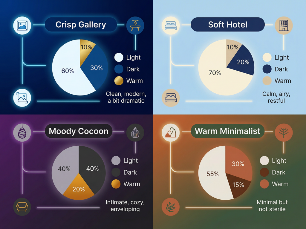
Pick one row that feels like your personality. That is your base ratio. Everything else in this article is basically “how to place those slices in a way that makes sense.”
Quick win: sketch your room on a scrap piece of paper, label each big thing as light, dark, or warm, and see which row you are closest to. Adjust one category first, usually “warm,” before you go chasing rugs.
20 Black and White Bedroom Ideas You Can Actually Steal
Think of this like a try-on room. No renovating, no new mortgage, just mix and match. I’ll keep it snappy so you can skim, save, and come back when you are standing in front of your bed at 10 pm wondering why it still feels off.
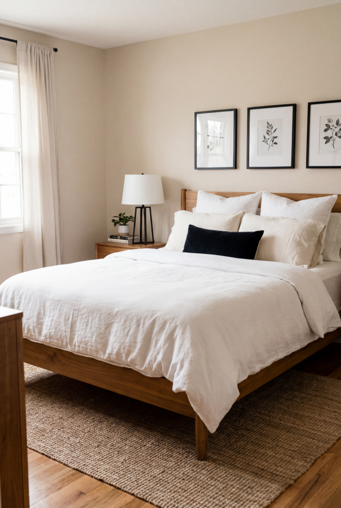
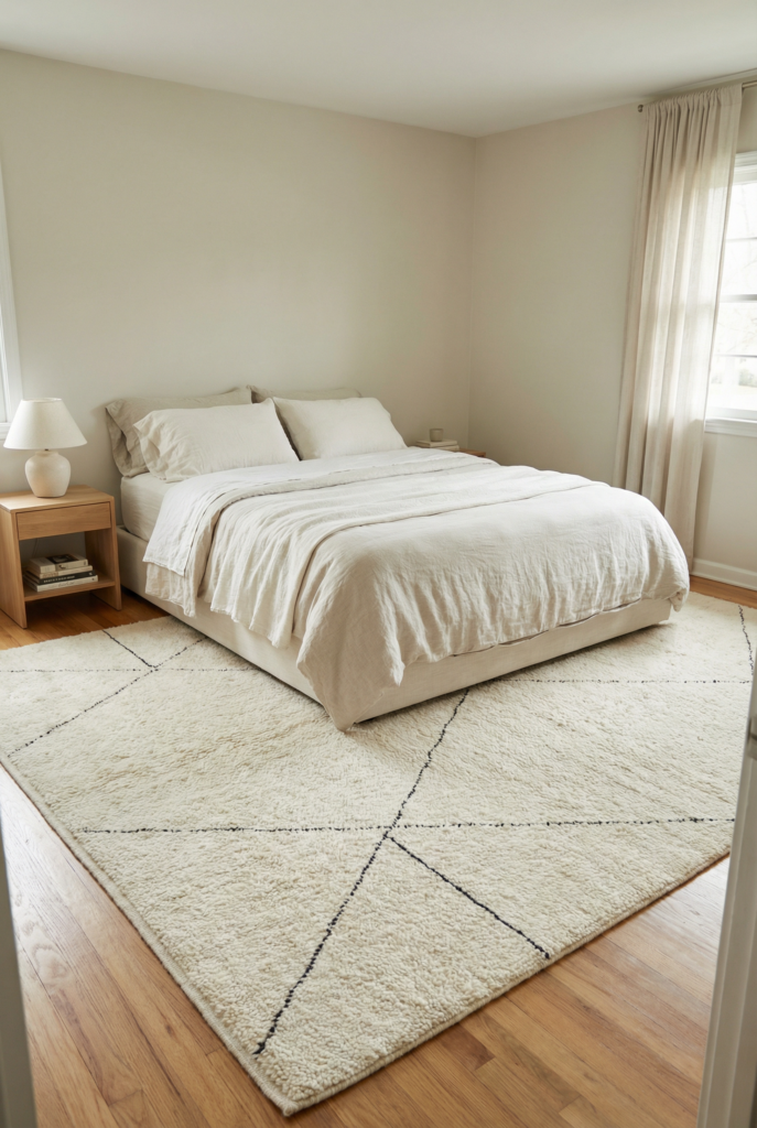
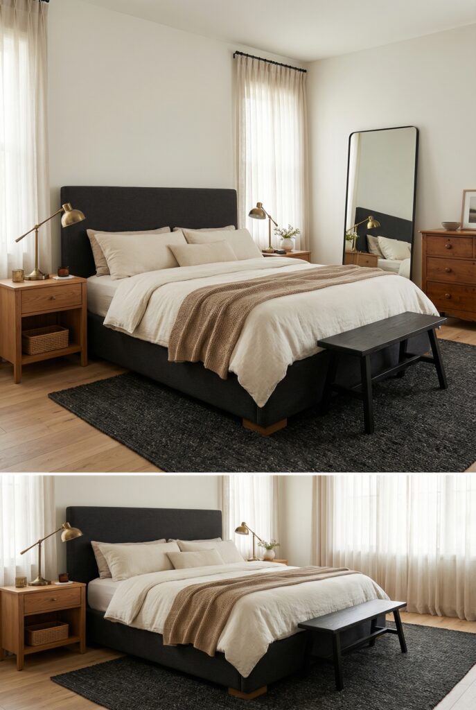
Soft contrast starter bed
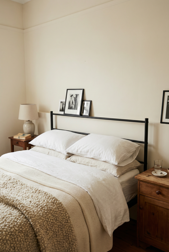
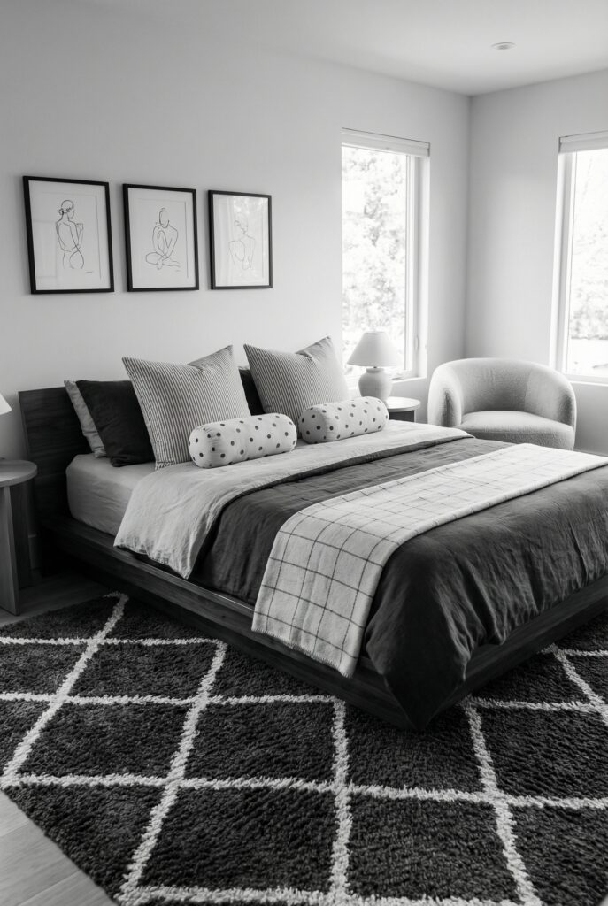
White walls, black metal bed, warm wood nightstands, one nubby throw at the foot. Black is contained in the frame, wood softens all that white. Best for: budget friendly refresh and first apartments.
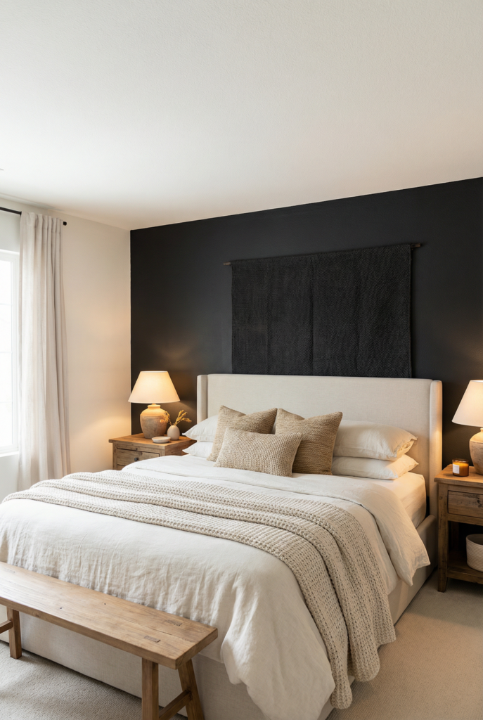
Moody wall, light everything else
Deep charcoal behind the headboard, other walls light, bedding and curtains pale. Cozy cocoon around the bed, not around your whole life. Best for: moody bedrooms that still feel breathable.
Hotel bed layering at home
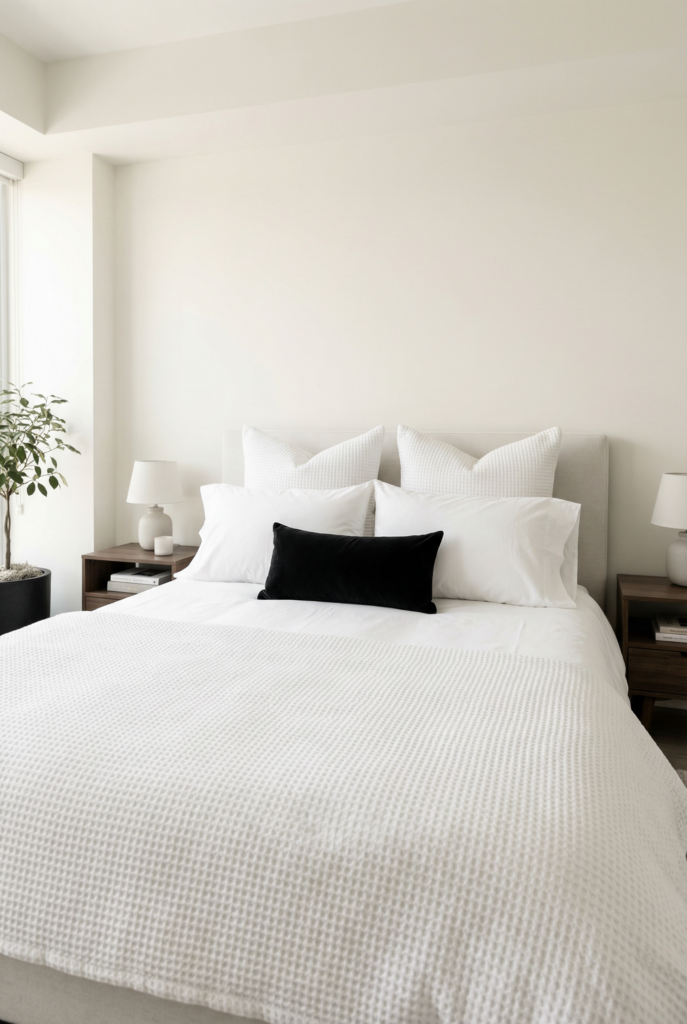
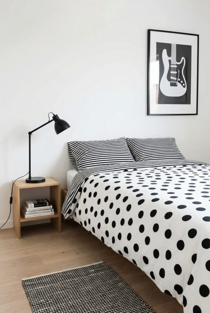
White sheets, textured white duvet, two standard pillows, two big euros, one skinny black lumbar. Black becomes punctuation, not the whole sentence. Best for: people who want “grown up” without tons of color.
Grid gallery above the bed
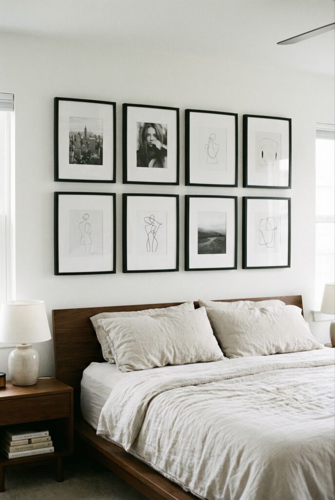
Six to eight black frames with white mats in a crisp grid. Fill with black and white photos, sketches, or line art. Best for: renters and sentimental photo hoarders.
Stripe and solid pillow mix
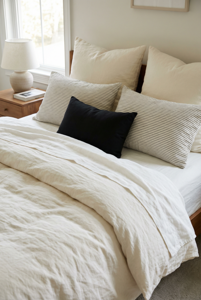
Two solid ivory pillows, two narrow striped pillows, one small black cushion. Rhythm without chaos. Best for: quick bedding update without replacing everything.
Wood bench, black legs
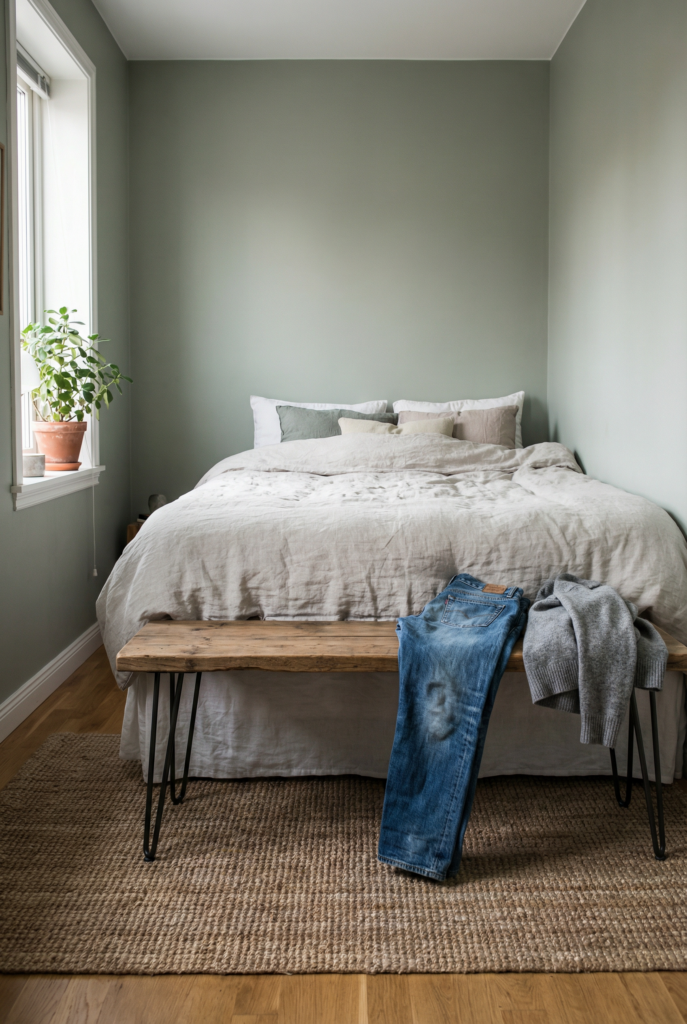
Simple wood bench with black metal legs at the foot of the bed. Grounds the bed and corrals the “I’ll wear this again” jeans. Best for: long narrow rooms and serial chair droppers.
Patterned rug as the star
Large ivory rug with a simple black pattern, everything else mostly solid. Pattern lives underfoot, so it feels cozy instead of loud. Best for: rooms that feel echoey or bland.
Minimal platform moment
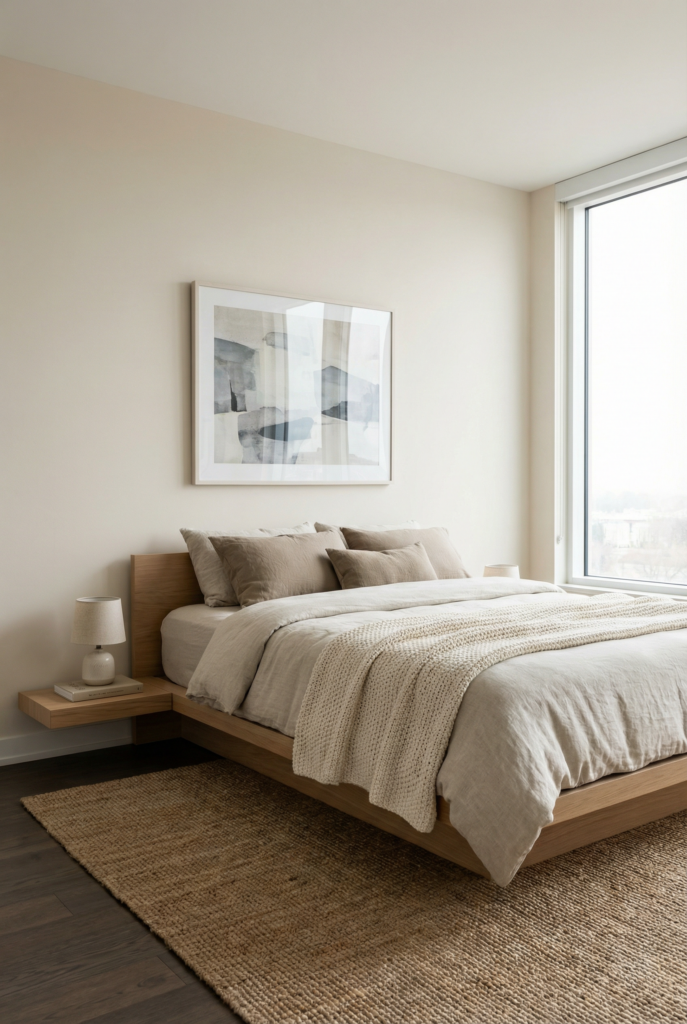
Low platform bed, one slim nightstand, one piece of art, tons of texture in bedding. Clean lines, snuggly materials. Best for: minimalist bedroom lovers who still want cozy.
Cozy reading corner
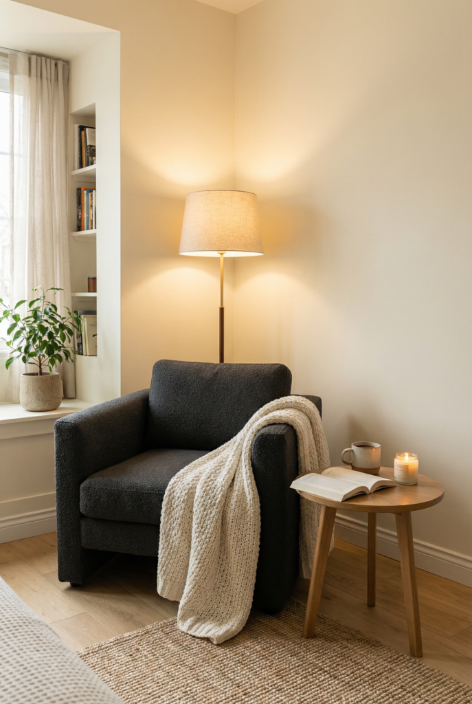
Charcoal chair, ivory throw, tiny side table, floor lamp. The contrast is contained in the chair, not splattered across the whole room. Best for: corners that feel empty and awkward.
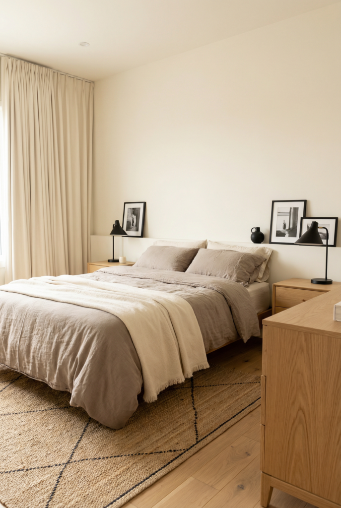
Warm neutrals with black pops
Taupe and cream on big pieces, black in lamps, frames, and one rug detail. Still graphic, but easier on the eyes. Best for: people scared of “too much white.”
Statement art, quiet everything else
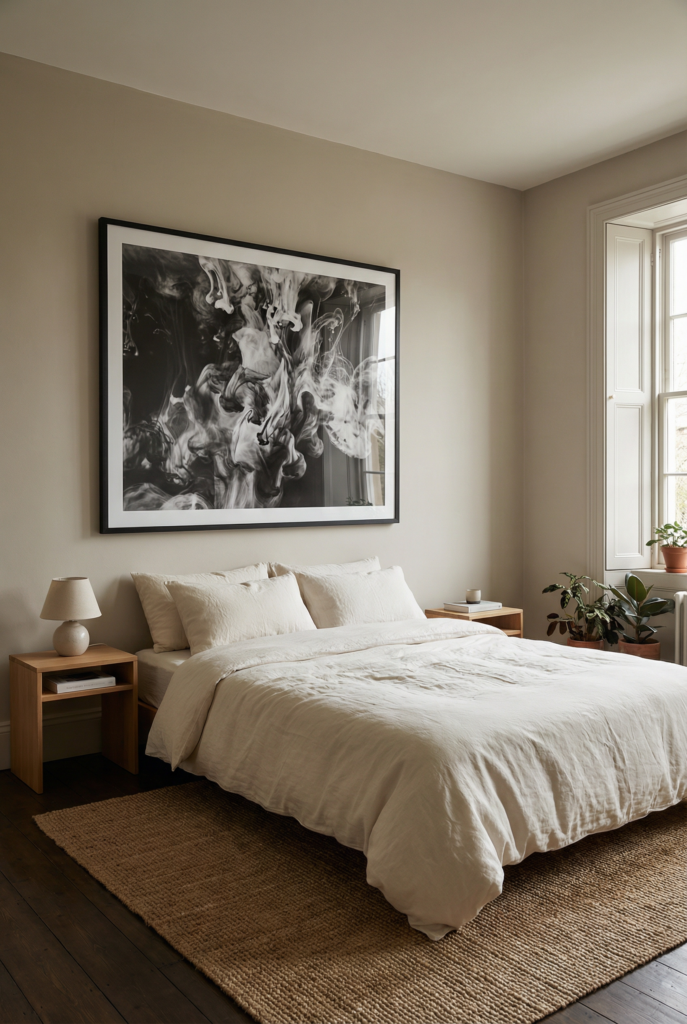
One big black and white artwork over the bed, simple bedding and accessories. Clear focal point, zero visual noise. Best for: overthinkers who need one strong moment.
Asymmetrical nightstands
One wood nightstand, one slim black metal table, matching lamps on top. Function for you, storage for your partner, balance for the room. Best for: shared rooms with different needs.
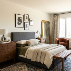
Dark headboard, light bedding
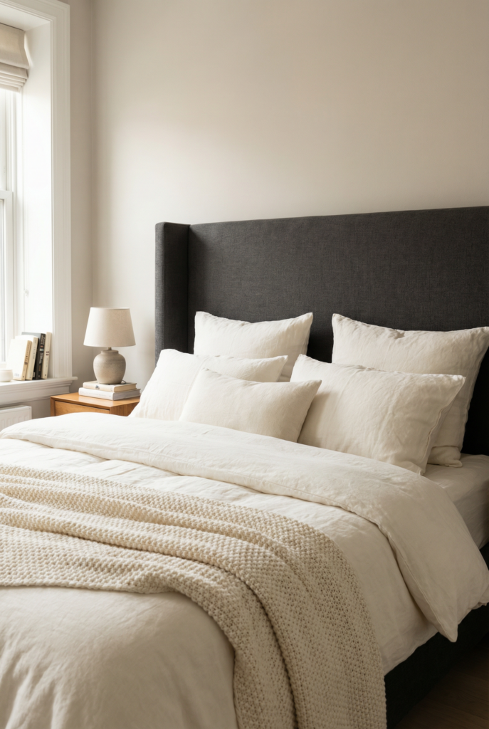
Charcoal or black headboard, ivory bedding layered in front. The bed feels like a nest instead of a black hole. Best for: tall headboards and small rooms.
Black doors, soft walls
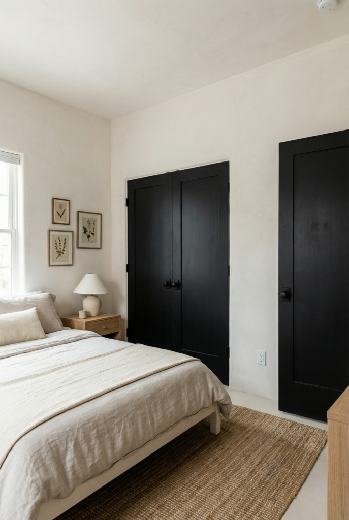
Walls stay pale, doors and closet doors go black. Frames the room and suddenly your white feels intentional. Best for: plain builder grade rooms that need character.
Playful guest or teen room
Spotted duvet, striped pillowcases, simple black lamp. All pattern stays in the black and white family, so it is fun but not chaotic. Best for: teens, guests, or your own inner teenager.
Soft curtain envelope
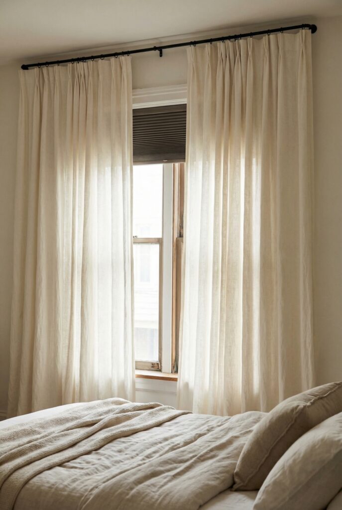
Long ivory curtains with a slim black rod hung wider than the window. Hides weird trim and softens corners. Best for: awkward windows and bad blinds.
Mirror with black frame
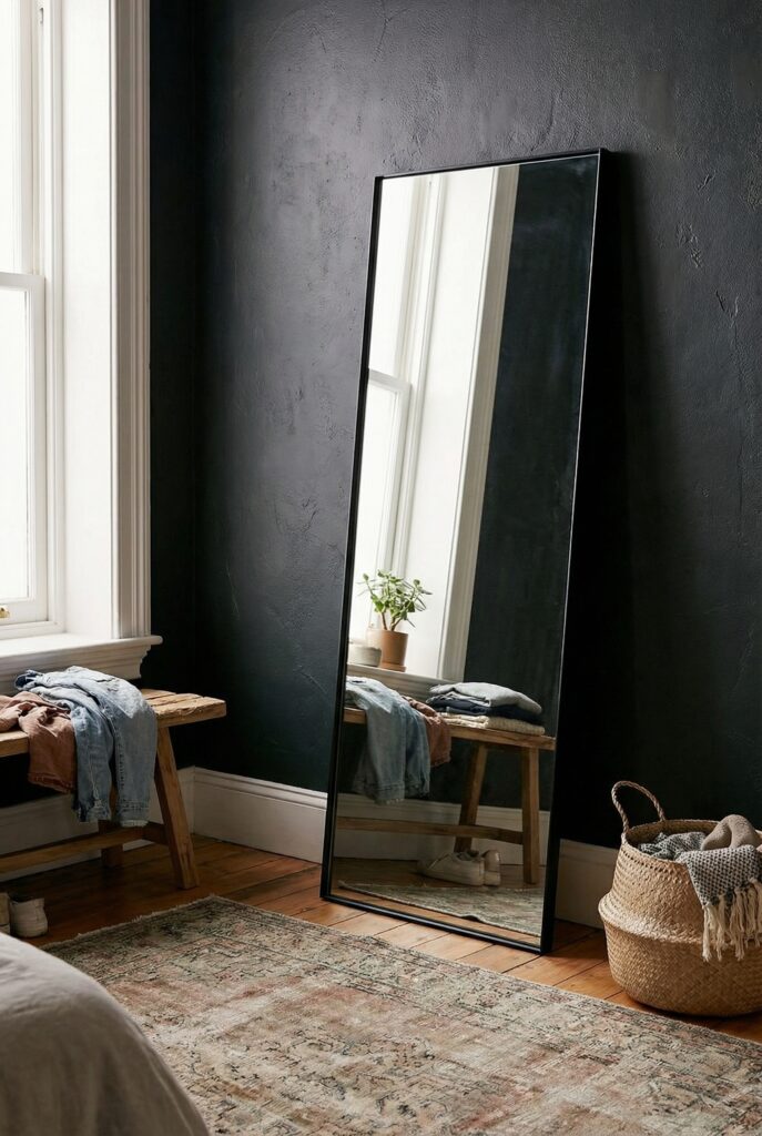
Tall mirror with a thin black frame leaning on a wall. Bounces light, anchors the corner. Best for: dark rooms or anyone who gets ready in the bedroom.
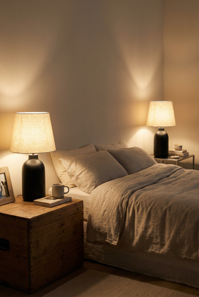
Bedside lamp twins
Matching black lamps with fabric shades on both sides, even if nightstands do not match. Lamps are the calming twins that pull everything together. Best for: mismatched furniture situations.
Plant plus pedestal
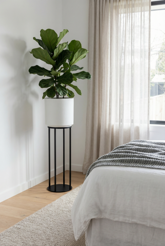
Plant in a white pot on a little black stool or stand. One hit of life, one more hit of black. Best for: corners that feel dead and flat.
High Contrast Color Balance
Now that you picked a ratio above, this is where we decide where that light, dark, and warm actually live. Same ingredients, different placement.
Using your chosen ratio, start with walls, bed, and floor. If you already have dark floors, you probably do not also need a big dark bed, dark rug, and dark dresser.
If your walls are bright white, it helps to keep most of the deepest black lower in the room or around the bed, not scattered at eye level like little exclamation points.
I like to choose two or three “black zones” and commit. Bed area, rug, maybe doors. That is enough. Everything else stays light or warm so your room feels intentional, not busy.
Do:
- Group dark pieces into a few calm zones instead of dotting them everywhere.
- Repeat black at least twice in each zone so it feels planned.
- Put something warm next to every major black item, like wood, rattan, or brass.
Do not:
- Let your only black object be the TV. Your eye goes straight there.
- Mix pure optic white walls with lots of jet black and no warmth.
- Forget that your ceiling color also affects how harsh everything feels.
Black Accent Walls That do not Make the Room Feel Smaller
When they are done right, they are stunning. When they are done wrong, it feels like the wall is leaning toward your face.
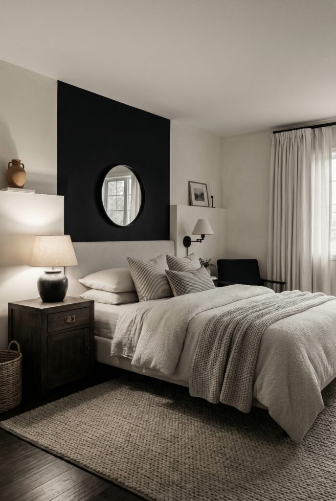
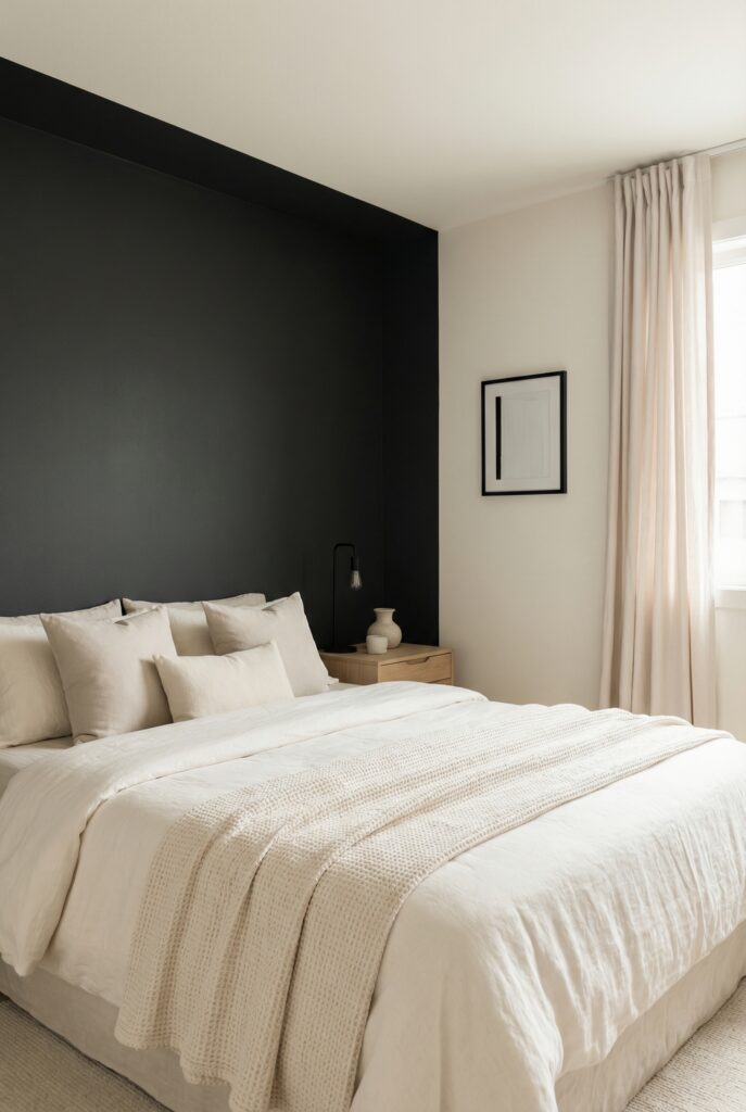
Best wall: usually the one behind your headboard. It frames the bed like a big headboard and keeps the darkest color in the coziest spot.
Avoid painting the shortest wall in a very small room. That can make the room feel stubby.
Finish: matte or eggshell. Glossy black shows every bump and fingerprint. Matte quietly recedes, which is exactly what you want when you are staring at it while falling asleep.
What to pair with it:
- Warm wood nightstands or a wood bench at the foot of the bed
- Soft, light bedding with texture instead of shiny white
- Warm bulbs in your bedside lamps so the wall glows instead of glares
If you are renting, peel and stick panels or a large dark textile hung behind the bed can fake the look without risking your deposit.
Clean Lines and Modern Textures
Clean lines are about shape, not temperature. You can have the simplest furniture in the world and still feel cozy if you layer texture properly. If everything is smooth and flat, your brain reads “minimal,” but your body reads “cold.”
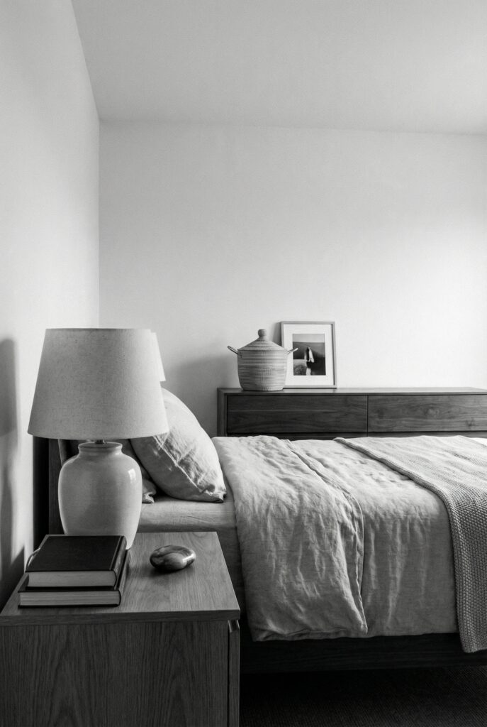
I like calm rectangles for the big pieces: simple bed, straightforward nightstands, basic dresser. Then I go wild in the touchable layers.
Crinkled linen duvet, soft wool rug, one boucle pillow, maybe a chunky knit thrown casually over the bench. On a random afternoon around 3.40, when the sun slants in and hits all those little fibers, your room suddenly looks way more expensive than it actually is.
Texture ladder to climb:
- Smooth painted walls and simple metal or lacquer furniture
- Lightly textured cotton bedding
- Linen duvet or pillow shams
- Nubby wool or boucle pillows
- Chunky knit throw or faux sheepskin
- Thick wool or high pile rug underfoot
Do:
- Aim for at least three distinct textures on the bed alone.
- Balance sleek items with something soft close by.
- Keep shapes simple so texture can do the talking.
Do not:
- Buy everything in the same velvet. It can feel like a costume set.
- Skip the rug and then wonder why the room feels echoey.
- Forget curtains. Even basic ones soften corners and frame the bed.
Graphic Patterns and Accents
We already played with pattern in the twenty ideas section, so I will not re teach the whole “hero pattern, sidekick pattern” concept. Let’s talk about something new instead: where the pattern lives.
In black and white, pattern is automatically very graphic. The safest move is to put the most dramatic pattern as low as possible. Floor first, bed second, walls last. A bold rug settles under your feet. The same pattern slapped behind your headboard can feel intense.
Zone by zone:
- Floor: best place for the strongest pattern. Think large scale geometrics, broken lines, soft grids.
- Bed: medium pattern. Stripes, tiny dots, or simple checks that support the rug.
- Walls: quiet pattern or line based art. Let this layer be softer and a little more airy.
If you want art that feels graphic without shouting, look for line drawings, ink washes, or photography with soft edges. Mix curves and straight lines so the room does not feel too rigid.
Do:
- Put your boldest pattern on the floor if you are nervous.
- Repeat pattern type in at least two zones, like stripes on pillows and on a throw.
- Leave at least one big area mostly solid for your eye to rest.
Do not:
- Stack heavy patterns vertically, like bold rug plus bold curtains plus busy wallpaper.
- Forget that tufting and quilting also read as pattern.
- Panic buy ten patterned cushions. Choose one or two, then stop.
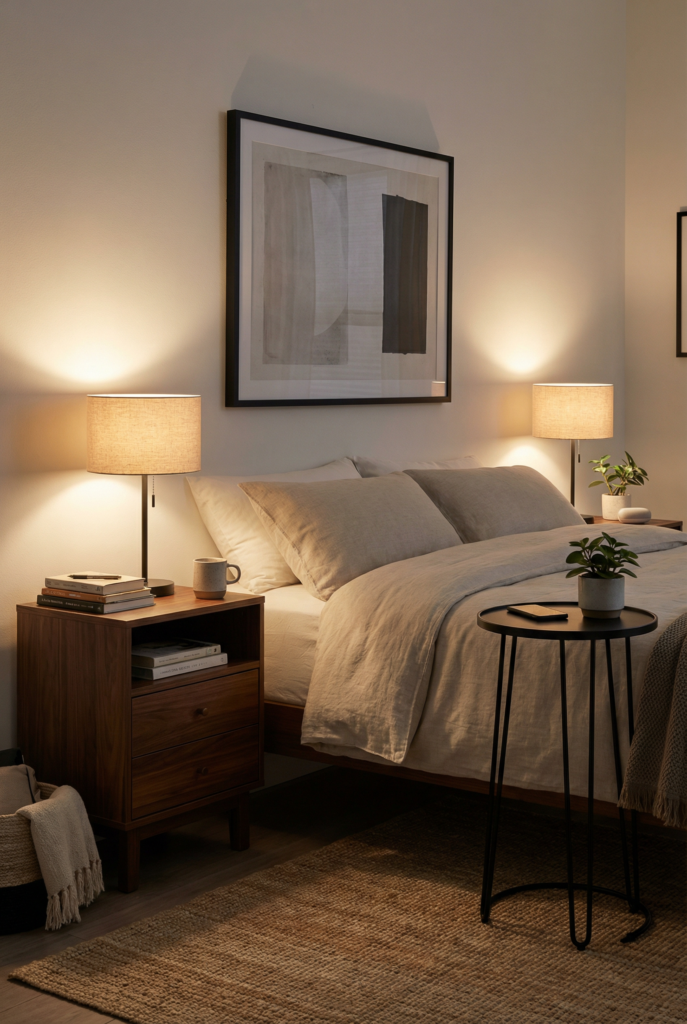
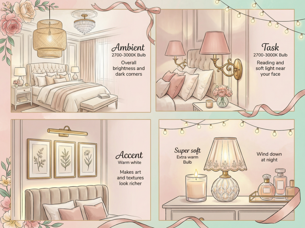
Lighting to Soften the Contrast
Lighting is the quiet boss of your bedroom. It decides whether your black and white color scheme feels cozy or clinical, especially at night when you actually use the space.
The same room can feel wildly different at 7.12 am vs 9.30 pm purely because of bulbs and lamp placement.
You want layers and warmth, not one blazing ceiling light. Think of four possible layers: ambient, task, accent, and super soft. You do not need all four, but you definitely need more than one.
And please, for all of us, no icy “daylight” bulbs right above the bed.
Here is a little map to steal:
In my own room, I stalled on replacing the builder boob light for two full years. One random Thursday I snapped, clipped on a big paper shade, and swapped the bulb.
Between that and the bedside lamps, my “too sharp” black and white suddenly felt like a hug instead of a conference room. The rug is still a bit crooked, but emotionally we are in a much better place.
Do:
- Keep all bulbs in a similar warm range so the room feels cohesive.
- Use light at different heights: overhead, eye level, and low.
- Turn off the ceiling light once you are in full evening mode and live in lamps.
Do not:
- Mix harsh “daylight” bulbs with warm ones in the same small room.
- Rely only on recessed lighting.
- Underestimate a tiny lamp on a dresser or shelf. It is magic.
Minimal Accessories That Still Feel Cozy
Minimal here does not mean empty. It means everything out on a surface actually has a job, even if that job is “make me smile when I walk in.” In a black and white bedroom, clutter shows up very quickly because every tiny object interrupts all that clean contrast.
I like to treat each major surface like a tiny stage: one little scene, then stop. Nightstand, dresser, maybe a bench. That is it.
On a good morning, around 7.08 am when I shuffle in with coffee, I see one calm vignette on the dresser instead of a chaotic pile of skincare, chargers, and random coins. The madness still exists, it is just in a drawer where my eyes cannot panic.
One surface formula:
- Base: tray, shallow bowl, or small stack of neutral books
- Height: lamp, candle, or small vase with branches or greenery
- Personality: one organic or personal object – shell, stone, framed photo, tiny sculpture
Do:
- Repeat your metal or wood tone at least twice in the room.
- Hide ugly necessities in drawers, boxes, or baskets.
- Give yourself at least one mostly empty surface. Your future self will thank you.
Do not:
- Line the back of the dresser with tiny objects like a little decor army.
- Buy “filler” decor just to take up space.
- Forget you can hang art on the wall instead of adding more things to the top.
Quick win: clear one surface completely, wipe it down, and restyle it with only three things using the formula. Stop when it looks “almost too empty.” That is usually perfect.
Fix it fast: harsh, flat, or just weird
Sometimes you step back, look at your room, and the only word that comes to mind is “weird.” Not terrible. Just not right. Before you decide to change everything, do a quick little diagnosis. Almost every problem falls into one of three buckets.
- Too harsh: big blocks of pure white and pure black, very little warmth or texture.
- Too flat: everything is mid tone, nothing stands out, no real focal point.
- Too busy: pattern on pattern, accessories everywhere, no negative space.
Fast fixes:
- Too harsh → add one warm textured blanket, one wood piece, and warmer bulbs.
- Too flat → add one graphic pattern and repeat black in at least two spots.
- Too busy → clear one whole wall or surface and keep it very minimal for a week.
Rough spacing cheats:
- Art above the bed often looks best when the bottom of the frame is about 6 to 8 inches above the headboard.
- Bedside lamps usually feel right when the bottom of the shade is near your seated eye level.
- Layouts vary, so always measure your own anchor points instead of copying numbers blindly.
Tiny chaotic side note: if you notice kids’ toothpaste on the pillowcase in your phone photo, welcome to the club. I swear it migrates on its own.
FAQ
What colors go with a black and white bedroom?
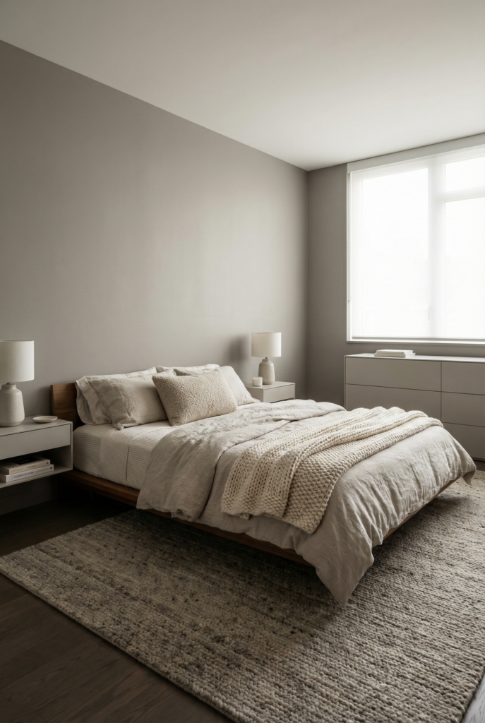
Warm neutrals are your best backup singers: oatmeals, camel, tan leather, natural wood. A muted green or smoky blue can sneak in as a tiny accent through pillows, art, or a throw. Keep anything colorful in pieces that can move so you can change your mind later.
Is black and white good for a bedroom?
Yes. It is calm, timeless, and surprisingly flexible if you handle contrast and texture well. Problems show up when everything is glossy, cold, and lit with blueish bulbs. Focus on soft materials, warm lighting, and a few natural elements and it becomes very restful.
How do you make a black and white room look good?
Pick a contrast ratio, group your dark elements into a few zones, then layer texture and warm light. Aim for at least three different textures on the bed, add wood or woven pieces near big black items, and use more than one light source at night. Edit accessories until the room feels calm but still like you live there.
What kind of art looks best in a black and white bedroom?
Line drawings, simple photography, and softer abstract pieces all work beautifully. Black or wood frames with white mats keep everything cohesive. If your furniture has a lot of straight lines, choose art with more curves or movement so the room does not feel too stiff.
How many colors should a bedroom have?
Three “families” is usually perfect: a light, a dark, and one warm accent. In a black and white bedroom that might be white, black, and warm wood or beige textiles. Little hits of green from plants feel almost neutral, so you can add those without overthinking it.
What color is considered most soothing for bedrooms?
Soft, warm off whites and muted nature inspired tones tend to feel the calmest. Creamy ivories are usually kinder than stark gallery whites. Smoky greens and blue greens can also be very soothing, especially when they are a bit grayed out instead of bright.
What color should you avoid in a bedroom?
I would skip very cool, bright whites on all four walls and super intense neon hues. Cool whites can make black feel harsh and will show every little mark, including that mysterious toothpaste smear. Highlighter colors in big doses feel fun at first but can be exhausting to live with.
What is the best color for a bedroom in 2026?
Pantone’s 2026 Color of the Year has been reported as Cloud Dancer, a soft, natural white that shows up a lot in interiors, fashion, and even tech. Designers are also leaning into warm off whites and earthy neutrals for bedrooms. For a mostly black and white space, I would use a warm off white like Cloud Dancer on the walls and keep deeper trend shades in textiles or one accent piece so you can pivot later without repainting everything.
One last little behind the scenes thing: when I save photos of my own room, I name them things like “black-and-white-bedroom-with-black-accent-wall-and-oak-nightstands” and give them alt text like “cozy monochrome bedroom with black wall, warm wood nightstands, and soft lighting.” Future me forgets every phase I went through, and this helps.