In this guide I’m breaking down how to use vintage wall decor to make your rooms feel layered, cozy, and a little bit storied. We’ll talk frames, mirrors, plates, and placement tricks so vintage wall decor feels doable in a normal, lived-in home.
It hit me at 10:37 pm on a Tuesday.
Dishwasher humming, dog snoring, phone face-down for once, and my living room looked like I had just moved in that afternoon. The sofa was cute. The lamps were cozy. The rug had not triggered my usual rug crisis.
But those big blank walls felt like a rental listing photo. No story, no personality, just beige.
That is when I fell down the rabbit hole of vintage wall decor, scrolling through old paintings, mirrors, and frames like it was my new part-time job.
For me, that means pieces with real or believable age cues: soft patina on metal, crackled paint, old fonts, traditional motifs, slightly imperfect finishes. Things that feel like they lived another life before they ever landed above a sofa. Not just “old-looking junk” that smells like a damp basement.
You want character, not chaos. Nostalgia, not clutter. Little bits of history on the wall that make your place feel like a home, even if the builder finished it last year.
Supplies Quick Checklist
If you are even mildly tempted to try one idea today, make yourself a tiny wall-decor kit. It lives in a basket or drawer and saves you from the “where is the tape measure” spiral every single time.
This does not need to be fancy. Just a small set of tools that lets you hang, edit, and tweak without turning your living room into a construction site. I keep mine in the hallway cabinet so I can fix one crooked frame while the coffee brews.
It also means when I drag home a frame from the thrift store, I can get it on the wall in twenty minutes instead of letting it sit in the trunk of my car for three weeks, which has definitely never happened to me. At all.
Wall kit basics:
- Assorted picture hooks in different weight ratings
- Adhesive strips and hooks for renters
- Tape measure and small level
- Painter’s tape for planning layouts on the wall
- Tiny nails, screwdriver, and a real hammer
- Museum putty for securing frames and decorative plates
- Microfiber cloths and glass cleaner
- Soft brush for carved details on ornate frames
- Replacement hanging wire, D-rings, and fresh backing board
Quick win: Before you even buy new decor, gather these supplies so future-you can hang things quickly instead of overthinking every hole.
20 Vintage Wall Decor Ideas You Can Copy
This is your fast inspiration section. Scroll, steal, tweak, repeat. Each idea has a quick “why it works” and a renter or budget-friendly swap so it is not just Pinterest fluff.
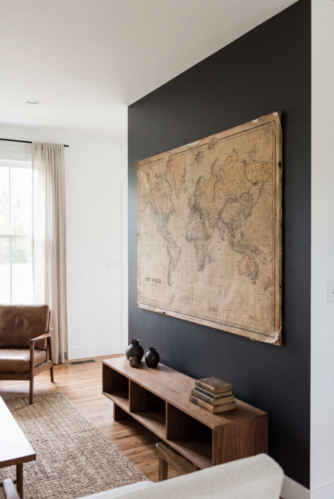
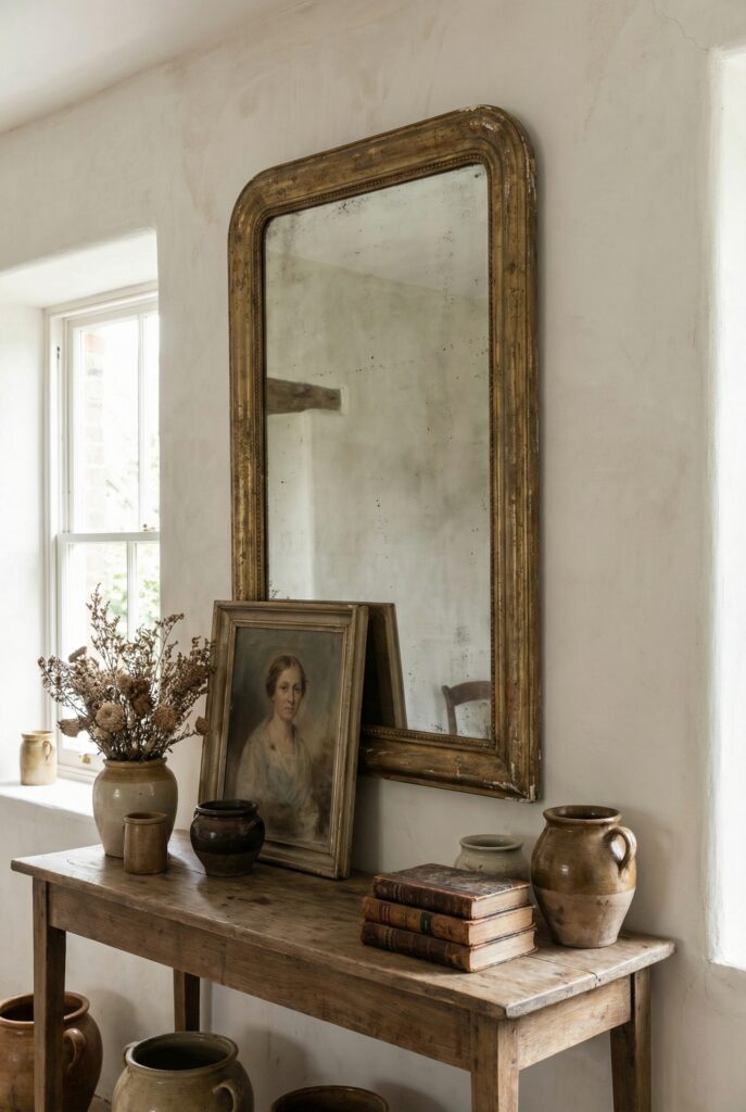
Simple antique moment over a console
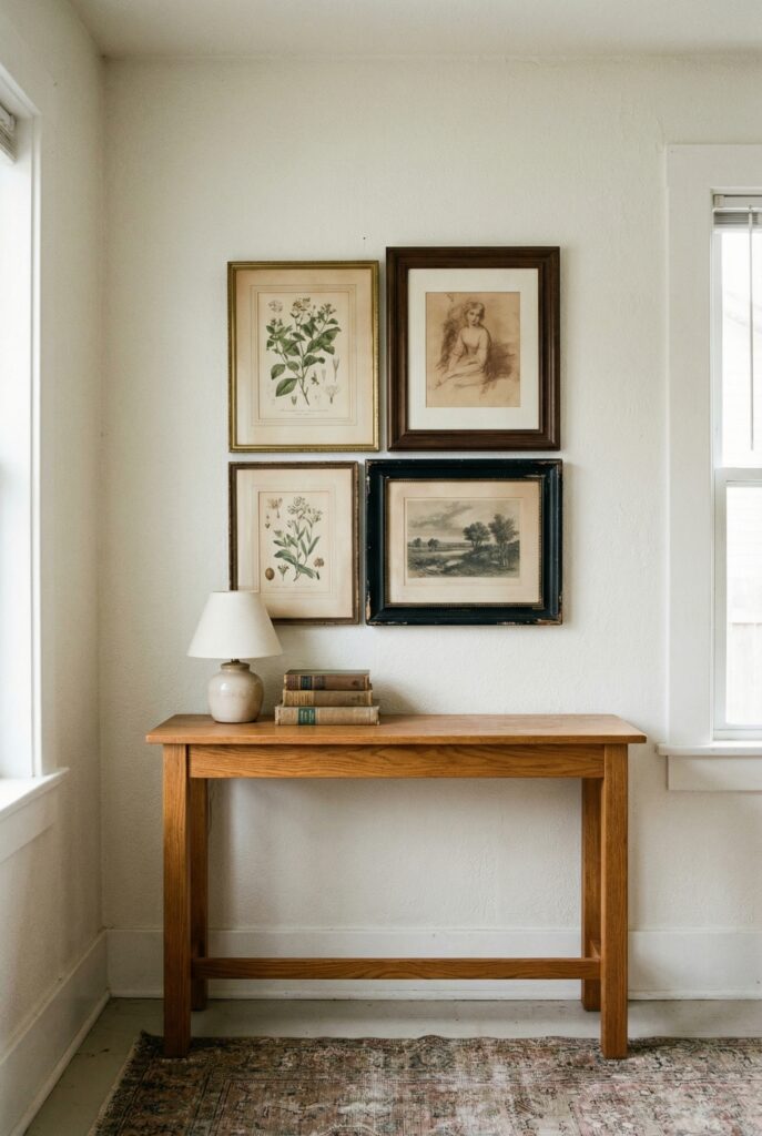
Layer two or three framed pieces above a console in a tight rectangle so it reads as one unit.
Why it works: A single visual block feels calm and considered.
Budget / renter swap: Use thrifted frames with printable art instead of originals.
Cluster of vintage mirrors in the dining room
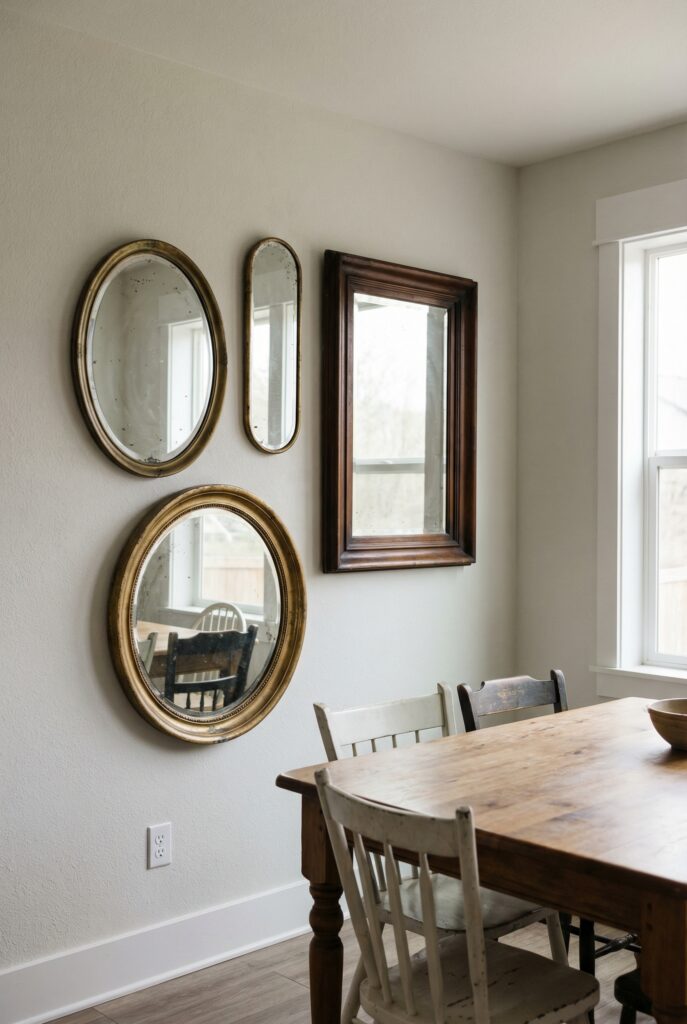
Group three old mirrors of different shapes on one wall, keeping their frames related.
Why it works: Light bounces around and patina softens the reflections.
Budget / renter swap: Mix one truly old mirror with two newer ones in similar tones.
One big antique-style clock in the kitchen
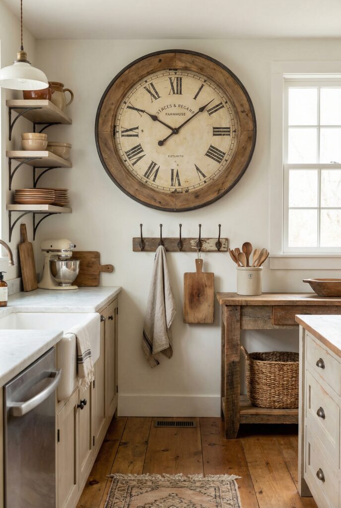
Center a large clock above a small table or peg rail.
Why it works: The bold circle anchors the room and feels old-world useful.
Budget / renter swap: Paint a simple clock in a warm neutral and lightly sand edges.
Hallway of botanical prints
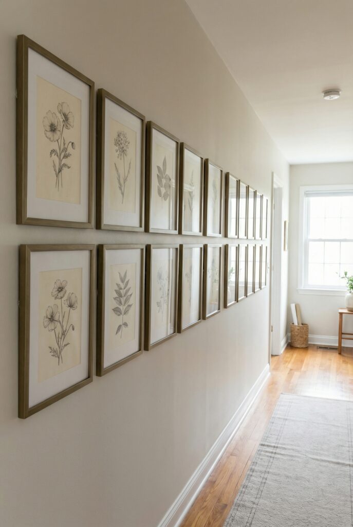
Hang a neat row of small floral or leaf illustrations in matching frames.
Why it works: Repeating nature motifs create rhythm without feeling busy.
Budget / renter swap: Print free public domain botanicals and frame them yourself.
Rustic wall signs in the breakfast nook
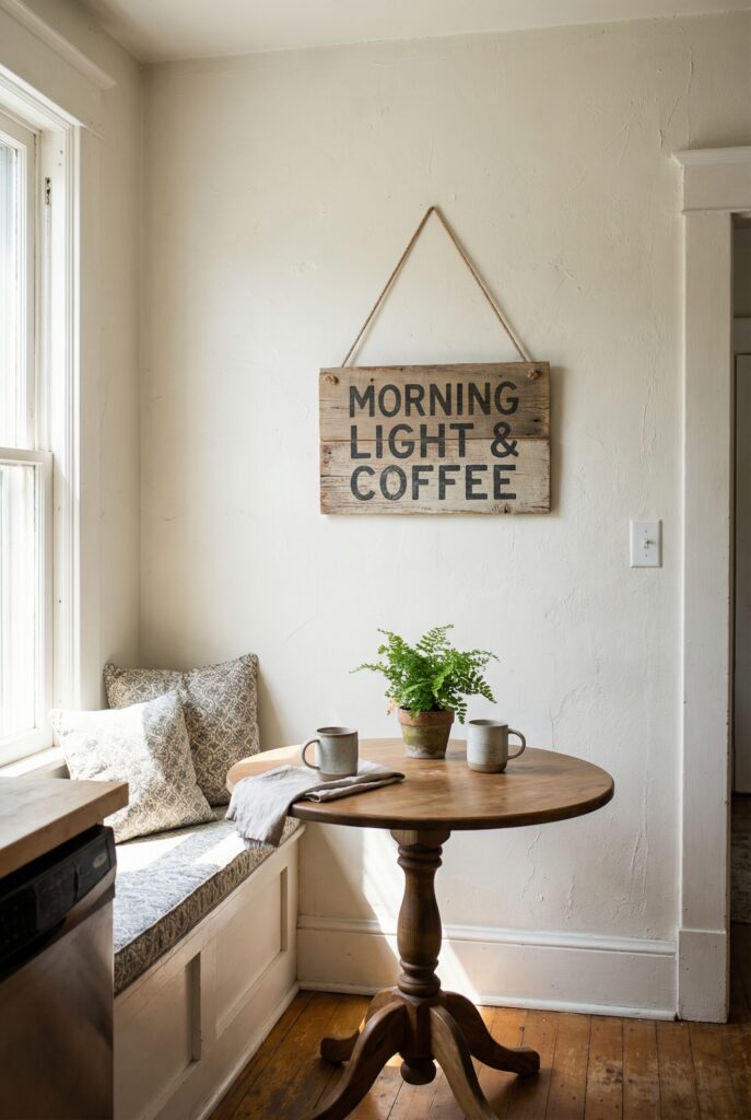
Hang one wooden sign with short, classic wording above a tiny table.
Why it works: Text adds personality while keeping everything simple.
Budget / renter swap: Stencil your own phrase on scrap wood and distress lightly.
Three framed art prints over the sofa
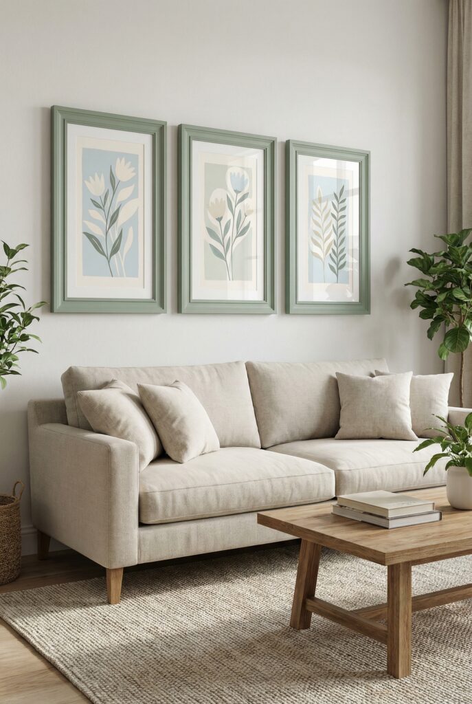
Line up three pieces in the same color family, hung at eye level.
Why it works: Repetition feels grown up and instantly pulled together.
Budget / renter swap: Use downloadable art in budget frames dressed up with paint.
Decorative plates in a soft cloud shape
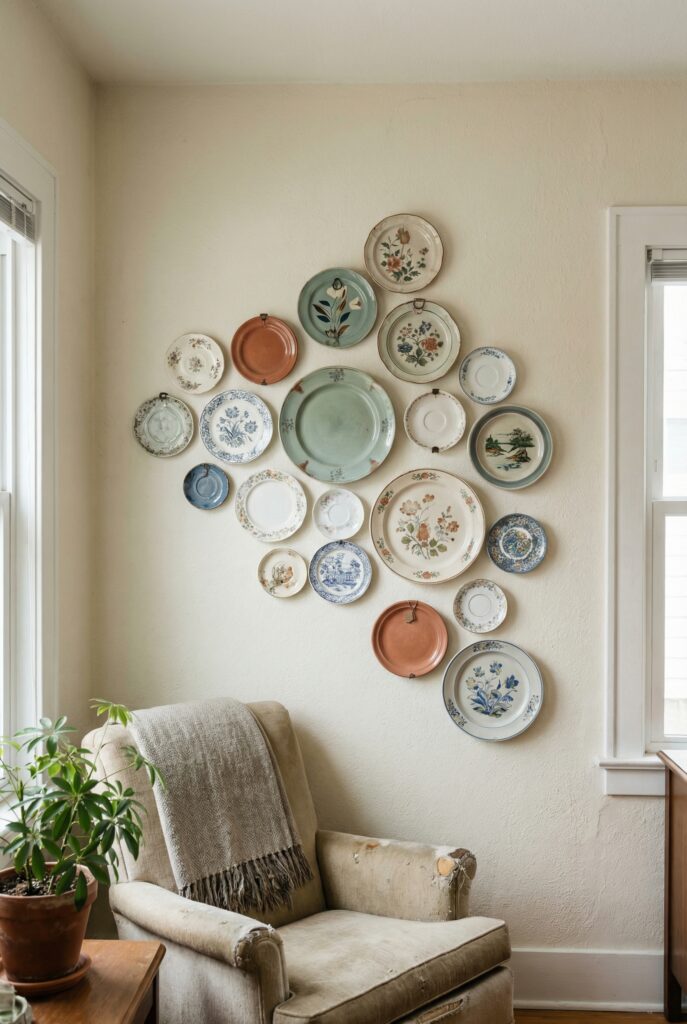
Arrange plates in a loose cluster near a corner, not perfectly centered.
Why it works: The organic shape feels collected, not staged.
Budget / renter swap: Mix thrifted china with a few new plates in matching colors.
Vintage sconces framing the bed
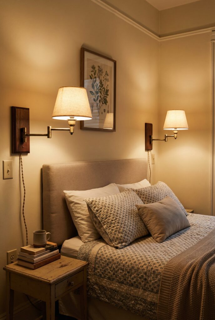
Mount a pair of pretty wall lights on each side of the headboard.
Why it works: The bed suddenly feels like a cozy little hotel corner.
Budget / renter swap: Use plug-in or battery-powered sconces instead of hardwired ones.
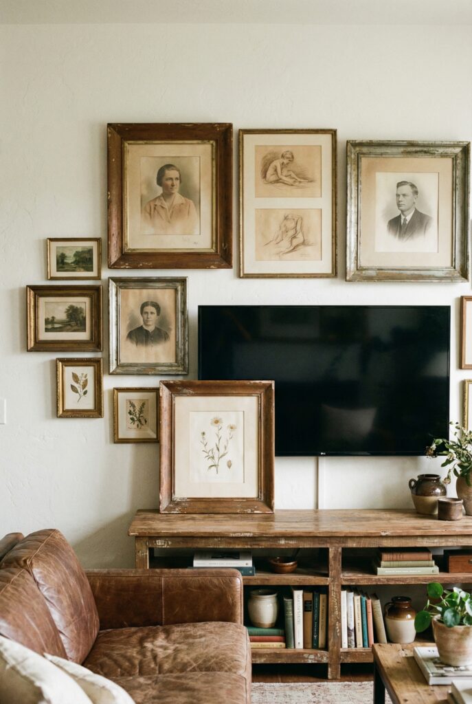
Gentle gallery wall decor around the TV
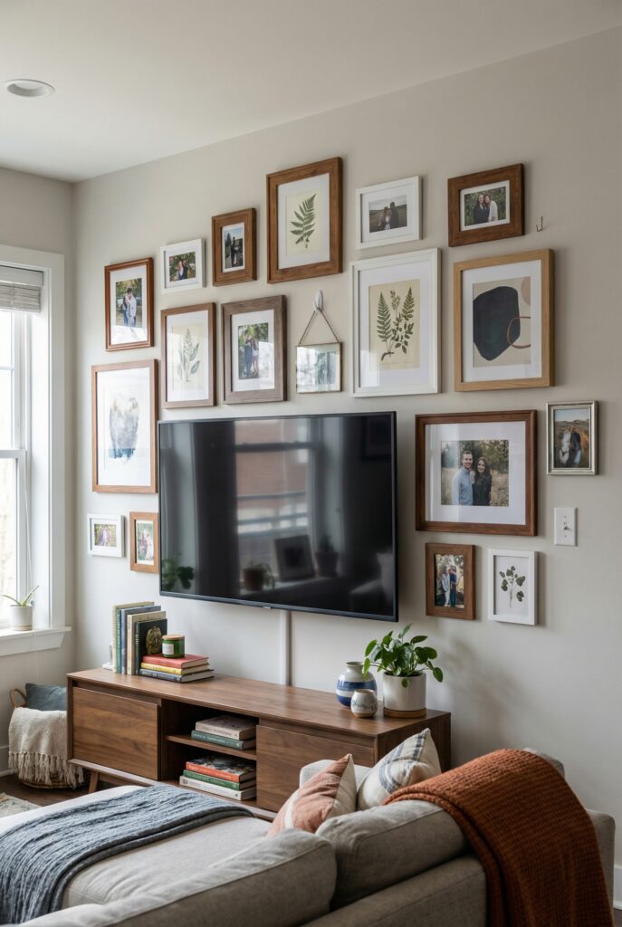
Wrap your TV with art and photos so it is part of a bigger story.
Why it works: The black rectangle becomes one element instead of the main event.
Budget / renter swap: Start with four pieces you own and build slowly.
Strip of distressed wood decor above a doorway
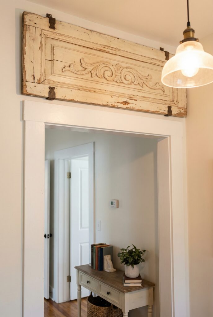
Hang an old carved panel or chippy piece above a door.
Why it works: It mimics original architecture in newer homes.
Budget / renter swap: Faux it with a new board painted, then softly sanded.
Vintage typography in the home office
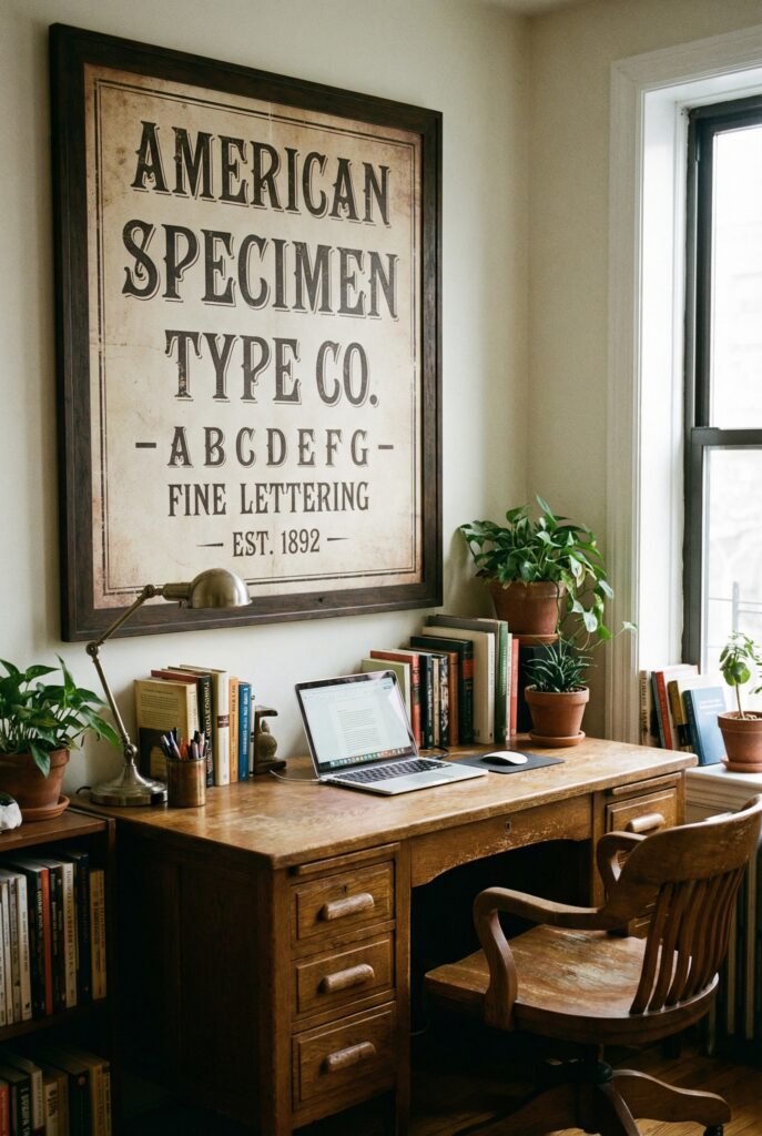
Use an old chart, alphabet, or sign as your main wall piece.
Why it works: Graphic letters make the space feel smart and intentional.
Budget / renter swap: Frame a printable letter specimen or type poster.
Farmhouse wall decor in the entry
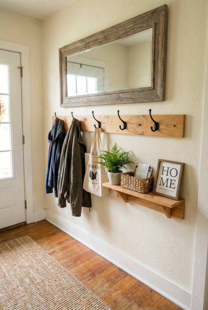
Combine a mirror, hooks, and a small shelf in warm wood and black metal.
Why it works: Function becomes charming when finishes stay consistent.
Budget / renter swap: DIY a simple hook rail from pine and basic hooks.
Petite cluster of ornate frames
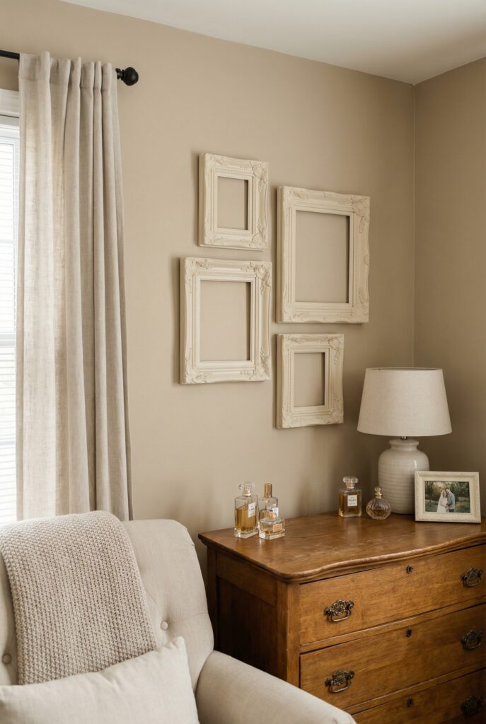
Group small, heavily detailed frames above a vanity or dresser.
Why it works: Dense detail in a tiny area feels luxe, not overwhelming.
Budget / renter swap: Spray paint mis-matched frames the same color.
Vintage-inspired accents around a modern print
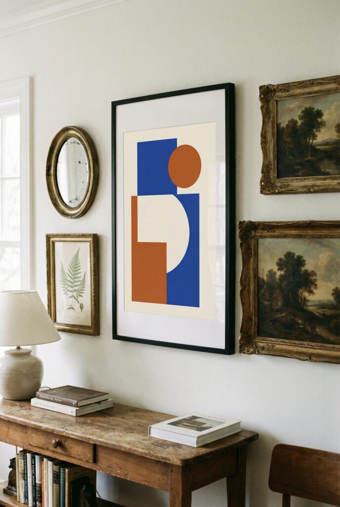
Surround one crisp contemporary piece with two or three older companions.
Why it works: The contrast makes both the modern and old elements pop.
Budget / renter swap: Look for secondhand frames that echo a color from the main art.
Seasonal wall decor on a peg rail
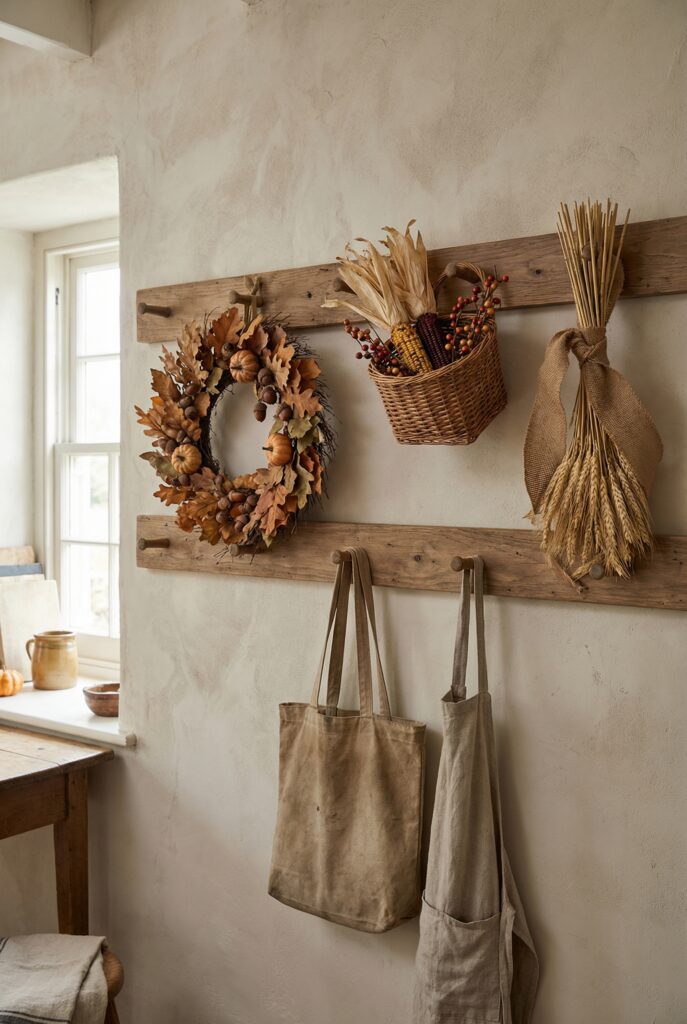
Swap a wreath, hanging basket, or ribboned ornament on a small rail.
Why it works: You get seasonal charm without redoing whole rooms.
Budget / renter swap: Use simple greenery, fruit, or fabric scraps.
Soft coastal moment in the bathroom
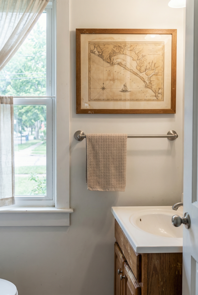
Hang one seascape or shell sketch over a towel bar.
Why it works: Water themes belong near water and feel quietly vintage.
Budget / renter swap: Frame a page from an old atlas that shows the coast.
Romantic wall above the nightstand
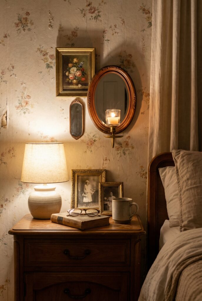
Layer a tiny floral painting, a small mirror, and maybe a candle sconce.
Why it works: Soft shapes and glow make the corner feel dreamy.
Budget / renter swap: Use thrift-store frames and a simple glass candle holder.
One strong vintage home decor story on a blank wall
Commit to a single, larger arrangement instead of lots of mini moments.
Why it works: A clear focal point beats scattered “almost finished” spots.
Budget / renter swap: Build over time, starting with your favorite piece.
Rustic farmhouse decor in the dining area
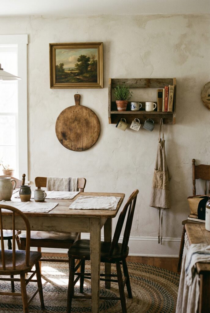
Combine a landscape, a cutting board, and a small shelf on one wall.
Why it works: Everyday objects feel special when treated like art.
Budget / renter swap: Use thrifted boards and secondhand frames.
Soft decorative wall hangings near kids’ rooms
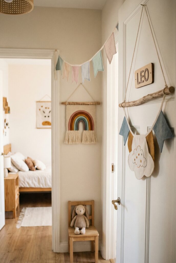
Hang fabric banners or lightweight weavings by their doors.
Why it works: Texture and color without heavy glass or sharp corners.
Budget / renter swap: Make fabric flags from leftover cloth.
Antique Frames and Classic Prints
If you only tweak one category, make it the frames. Antique frames and classic art are the fastest way to make a basic room feel layered and grown up.
Think old portraits, sketches, little landscapes, botanical prints, and vintage wall art that looks like it has seen a few decades of sunlight. Pair those with frames that feel substantial and suddenly your basic sofa wall has a point of view.
This is also the easiest place to start when you are decorating on a budget. You can find good frames almost anywhere if you know what to look for, then swap in art over time.
The pieces do not have to be truly old. They just need age cues: wood instead of plastic, metal with a little wear, paper that is not pure white, proportions that feel slightly traditional.
Once you have a few, you can build a gallery, float one piece above a console, or wrap them around a TV so the screen stops shouting.
Related: Simple Tips for Mixing Vintage and Modern Decor
How to source frames without losing your mind
Skip the loud big-box aisles for a minute. The best frames hide in thrift shops, estate sales, flea markets, salvage yards, and the dusty corners of antique malls.
I like to do one slow lap with coffee in hand, just scanning for profile and material: carved wood, slim black rectangles, gently curved metal.
Look for:
- Solid wood or substantial metal
- Corners that are tight, not splitting
- Glass without deep scratches
Skip:
- Frames that smell musty or have visible mold
- Pieces warped beyond repair
- Anything you would not want to touch with bare hands
Choosing frame “eras” that play nicely
You do not need to know exact decades. Just think in three buckets: ornate gold, simple wood, and slim black or metal. Ornate feels formal and glam. Simple wood feels cozy. Black or metal leans more graphic.
Most walls feel calmer when you pick one or two of these and repeat them. Maybe your gallery around the TV is mostly simple wood with one small gold accent.
Or your bedroom art is black frames plus a single carved piece above the dresser.
Quick win: Take the most random frame in a grouping and either move it elsewhere or repaint it so it matches one of your main categories.
Mixing Art and Building Your Gallery Blueprint
To keep things from looking like a jumble sale, choose one repeating thread for your art: color, subject, line style, or mood.
For example, you might mix botanical prints, a sketch of a building, and one piece of vintage typography, but keep most of them in greens and browns.
When you are ready for a gallery:
- Choose one larger anchor piece
- Limit yourself to two frame finishes
- Repeat one motif, like faces, plants, or architecture
- Keep mats mostly the same color
- Lay everything out on the floor first
- Hang the center of the grouping at eye level
Frame rescue micro-guide:
- Clean glass and dust details with a soft brush
- Replace crumbling backing with fresh board
- Swap gross mats for clean white, cream, or tan
- Add new hanging wire if the old one feels brittle
Patina Textures and Wallpaper Accents
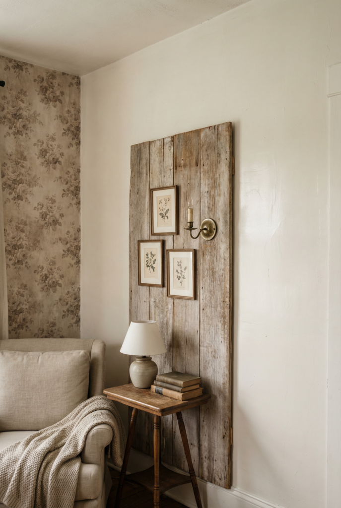
This is where your walls get their “oh, this feels old in a good way” moment.
Authentic vintage character on walls usually shows up as patina and texture: metals that are not super shiny, painted wood with tiny chips, linen and cane, plaster-ish finishes that catch the light.
Even if your home is brand new, you can fake that lived-in feeling with the right surfaces and a little restraint.
The trick is to choose one or two big gestures instead of trying to distress everything. A single old wood panel behind a grouping of art, or a soft textured wallpaper on one wall, can do more than fifteen tiny distressed pieces.
You are aiming for relaxed, not haunted-house. Think “charming old apartment” and not “the set of a period drama that forgot to dust.”
What good patina actually looks like
Patina is the soft aging that makes surfaces feel cozy rather than grimy. A slightly cloudy mirror, brass with darker spots around the details, paint that is not perfectly flat. On walls, it might mean a limewash look, plaster texture, or panels of old wood hung almost like art.
Do:
- Mix smooth walls with a few textured or aged pieces
- Put aged metals near light sources so they glow
- Let wood grain show instead of hiding it under thick paint
Do not:
- Distress every single surface
- Confuse actual dirt with charming wear
- Forget that one or two patina moments are enough
Wallpaper routes that make sense
Wallpaper is a big commitment emotionally, even if it is removable. Here are three routes that almost always work with vintage-style walls:
- Full accent wall behind a sofa or console, in a gentle stripe or floral
- Papered inset above wainscoting or inside a bookcase
- Removable panels on boards that you lean or lightly secure, perfect for renters
When not to use wallpaper: if the room is tiny and already visually busy with tile, open shelves, or too many doors, skip heavy prints.
Tiny, fussy patterns in cramped spaces can feel like the walls are inching toward you. In those rooms, rely on art, decorative plates, and one textured item instead.
The texture ladder if you are nervous:
- Smooth paint in a soft color
- Limewash or faux plaster effect
- Grasscloth or linen-texture paper
- Aged wood, metal panels, or distressed wood decor as accents
Quick win: If your walls feel flat, add just one rung from the ladder, then live with it for a week before changing anything else.
Placement for Old-world Charm
Now the nerdy part that changes everything: where things go. You can own the prettiest vintage mirrors and art and still feel weird in the room if they are hung at the wrong height or in odd proportions.
Placement is what makes your walls feel calm, charming, and expensive in that “I casually know what I am doing” way.
Think of this as your little guidebook for height, spacing, and balance. Once you get these rules in your muscle memory, hanging new pieces stops feeling like surgery and starts feeling like styling.
Eye level, furniture rules, and simple math
For single pieces, aim to hang the center around eye level. For most adults, that is roughly 145–155 cm from the floor.
If you are much shorter or taller, average your household and stick close to the numbers rather than your instincts in the moment.
Above furniture, keep art visually connected. A good guideline is to hang pieces about 20–25 cm above sofas, consoles, and headboards so they are not floating away.
Size-wise, art usually looks best when it is around two thirds the width of the furniture underneath. Too tiny and it feels like a postage stamp. Too huge and it overwhelms.
Do:
- Use painter’s tape to mark out sizes on the wall
- Step back several meters before deciding
- Snap quick phone photos to spot weird gaps
Do not:
- Creep art up toward the ceiling “for drama”
- Hang so low that kids can smack frames daily
- Forget sconces, doors, and lamps when planning
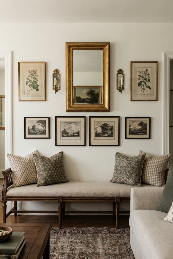
Old-world composition rules and special pieces
Old houses often feel naturally balanced because they lean on two simple moves.
Use symmetry when you want calm: two vintage sconces flanking a mirror, matching frames above nightstands, a pair of prints side by side.
Use asymmetry when you want that “collected over time” feeling: plates drifting upward, one large piece balanced by two smaller ones, a mirror offset with art.
Specific bits:
- Plates: keep 5–8 cm between pieces and imagine a gentle S-curve through the arrangement.
- Mirrors: place them where they bounce light from a window or lamp, not where they reflect the messiest corner.
- Sconces: aim for the bulb or center of the shade at standing eye level. Wiring-free or battery options are perfect if you are not doing electrical work.
Small or contemporary homes do best with fewer, larger pieces and a calmer palette. Let one old mirror, one architectural salvage piece, or one functional wall decor moment carry the vintage story instead of twelve tiny things.
Fix it fast: Troubleshooting your vintage walls
Even with all the formulas, sometimes you step back and think, “This still looks wrong.” I have stood on a chair in socks, holding a frame, whispering why, while the dog squeaked a toy every four seconds. So here is the quick triage.
If it feels too cluttered
- Swap eight small pieces for two bigger anchors
- Move tiny art to shelves or tabletops
- Leave clear space between groupings so your eye can rest
If it feels too theme heavy
- Add one modern contrast, like a simple abstract or plain metal mirror
- Avoid farmhouse on every single wall
- Let at least one wall stay almost bare
If it feels flat
- Add one more texture from the ladder, not five
- Repeat a darker frame color in one or two spots
- Bring in something with depth, like a shallow shelf or plate rack
If hanging things scares you
- Start with leaning art on consoles, mantels, or dressers
- Use adhesive strips on light pieces
- If there is tile involved, trust me, my fear of drilling tile is real too. Work around it with leaning pieces or non-drill hooks.
Tiny chaotic confession: there is still one frame in our hallway that is definitely too small and a bit too high. I know every rule I just wrote. I still have not fixed it because the little sketch inside makes me happy, and I have not found its perfect companions yet. Some corners stay unresolved for a while. That is allowed.
FAQ: Vintage style walls, answered
What defines vintage wall decor?
It is any wall piece with real or believable age cues: patina on metal, worn edges on wood, traditional motifs, older fonts, or art that looks like it predates your Wi-Fi. It does not have to be expensive or truly antique, but it should feel like it has a story.
How do I choose wall art that fits a vintage aesthetic?
Start with the mood you want, then pick art that supports that story. Cozy cottage calls for florals and landscapes. Elegant apartment leans into portraits and architecture. Rustic farmhouse decor might use animals, barns, or old signage. Keep colors softened and frames substantial.
What colors and finishes work best?
Soft whites, creams, warm grays, muted greens, and gentle blues play nicely with older pieces. For finishes, think brushed brass, aged bronze, black metal, and natural or stained wood rather than high gloss. Let one or two darker accents repeat across the room so everything feels tied together.
How can I mix vintage decor with modern interiors?
Treat old and new like friends at a dinner party. Your modern sofa or clean-lined dining table can sit in front of a wall full of antique wall decor. Balance sleek pieces with older art and mirrors. Repeat one color or metal across both worlds so the mix feels intentional, not random.
What materials add authentic character to walls?
Wood, aged metals, linen, canvas, paper, plaster, cane, and woven fibers all help. Even one panel of textured paper, a linen pinboard, or a cane-front cabinet with art above it can shift a room. Materials that feel slightly imperfect or hand-touched usually read as more nostalgic wall decor.
How do I decorate walls with salvaged pieces?
Treat big salvaged items like art or architecture. An old door can become a backdrop behind a bed. A carved panel can live over a doorway. Smaller finds like hooks, brackets, and small plaques can join a grouping. Just make sure heavy pieces are anchored properly into studs.
Can vintage wall decor work in small or contemporary homes?
Yes. In tight or very modern spaces, focus on fewer, larger pieces, a calmer palette, and one or two strong vintage-inspired accents. A single vintage mirror, one framed textile, or a quiet gallery above a sofa is plenty. Let patina be the accent, not the wallpaper of your whole life.
How do I decorate vintage-style walls on a budget?
Thrift stores, flea markets, online marketplace listings, and family attics are your best friends. Hunt frames first, then art. Use printable images, paint basic frames, and build slowly over time. One or two thoughtful moves will always beat a quick haul of random “vintage-inspired gifts” that do not actually feel like you.