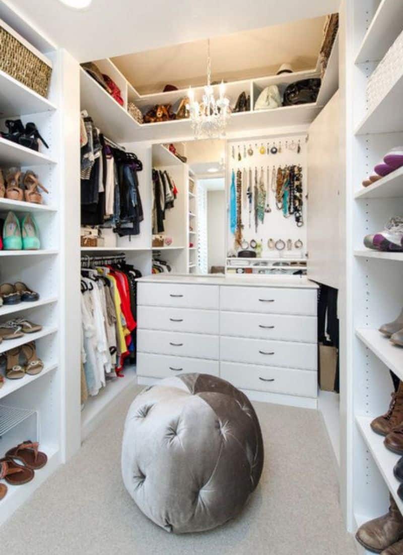
I have a folder on my phone called “Someday Apartment” and it is 95% calm, uncluttered spaces with soft sofas and absolutely zero mystery cords. Then I look up from my screen and see… three mugs, half-built cardboard fort from yesterday’s delivery boxes and a charger octopus on the coffee table.
If you’re the same, this is for you. I’ve been deep-diving beautiful, simple apartments lately, from moody little lofts to bright cream clouds in the sky. They all do that magic trick where nothing feels random, but it also doesn’t feel like a rental staging. Just intentional, relaxed, real-life ready.
So here are the things I keep noticing in all that minimalist apartment decor I’m saving, plus how I’m trying to steal the ideas for my own space.
Decluttering Essentials
The calmest spaces are ruthless about what’s out, not about how much you own.
That long, low grey sofa in the Kiev apartment by Yodezeen Architects is basically a giant mattress in the middle of the room, but everything around it is edited: one slim side table with a magazine, a neat row of pendants, and a console that’s more architecture than “furniture.” Same thing in the Warsaw open-plan space by Hilight.design (you will see later on) that Decor shared—the dining table is almost completely bare, the counters are cleared, and the shelves hold just a few thoughtful pieces.
At home, I’ve started doing a “clear the surfaces” sweep before bed: coffee table, dining table, kitchen counters. Not styling, just clearing. In the morning I add back one or two things—a candle, a bowl, a plant—so the room feels intentional, not staged. Everything else gets a bin, a drawer, or (on very real days) a laundry basket shoved into the bedroom until I have energy to sort it.
Neutral Tones and Natural Light
The spaces that make me exhale all stay within a very tight palette, then let the light do the decorating.
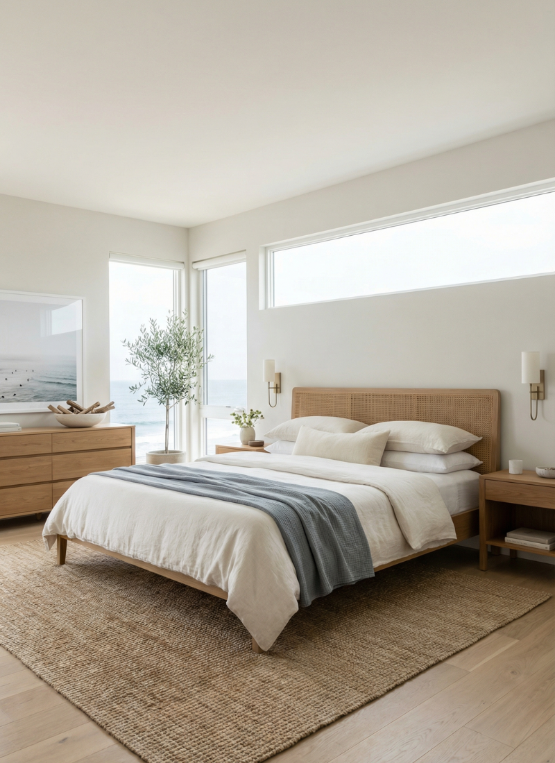
That soft living room in Tirana by BYRID Architects is basically fifty shades of beige, but it’s never boring: pale wood floors, a sand-colored sofa, a slightly deeper rug, and warm light washing over everything.
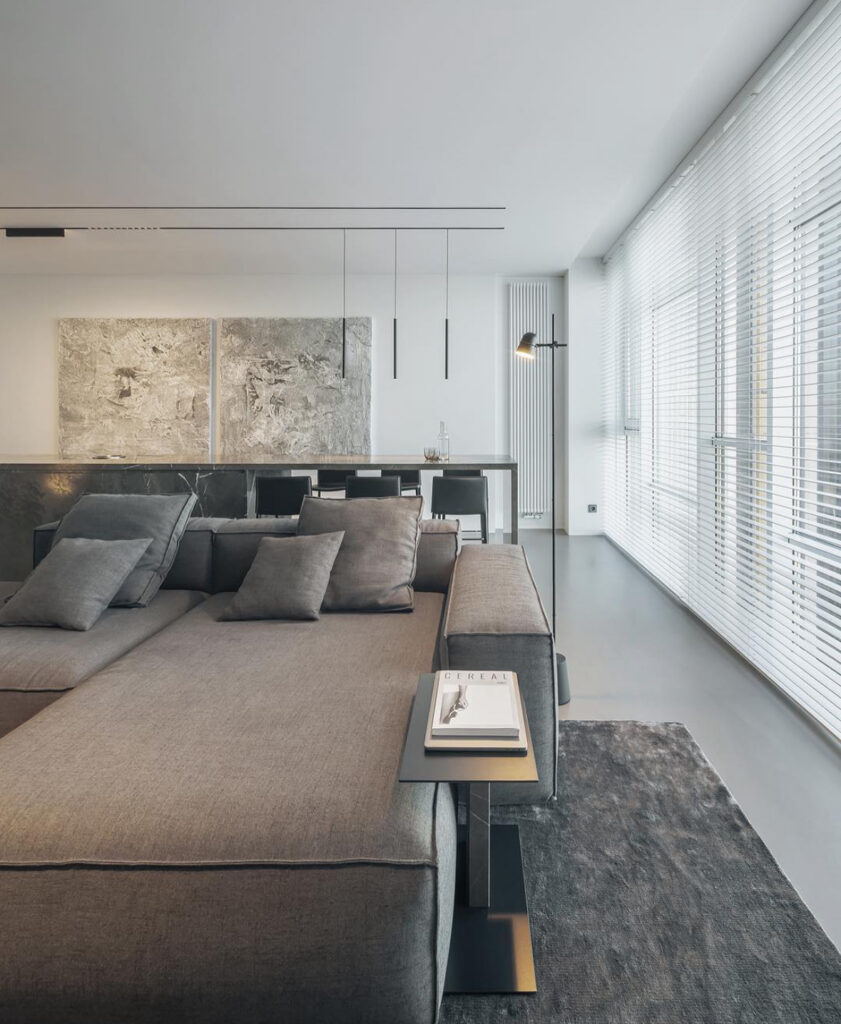
The long grey sectional and black blinds in the apartment by Art Alekseev pull the same trick—warm wood underfoot, gentle greys everywhere else, and a full wall of windows keeping it from feeling heavy.
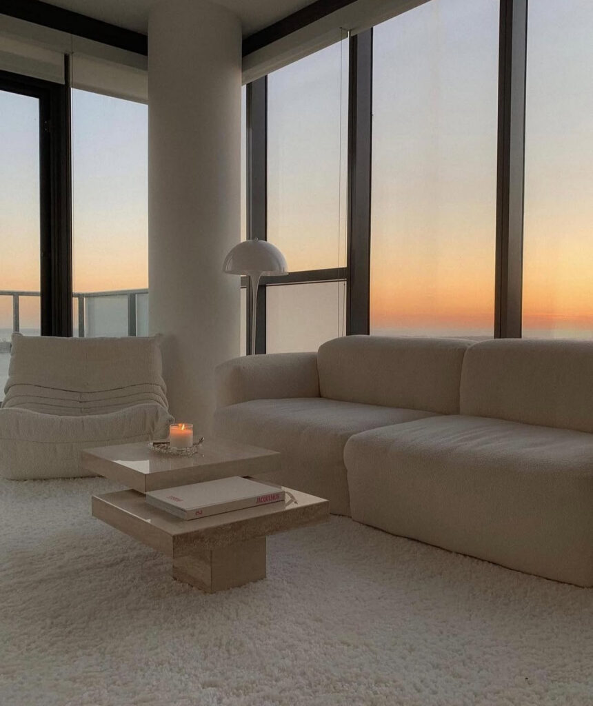
Then there’s the Toronto sunset corner from Nitsan Raiter’s apartment that Haute Sweet Home posted: fluffy white rug, creamy sofa, little layered stone coffee table, and that insane orange-pink sky doing half the work. Nothing in the room competes with the view; the palette just supports it.
If you’re stuck, pick 2–3 neutrals (for me it’s warm white, oat, and soft grey and tiny bit of black details) and let those be your baseline. Everything you bring in has to play nicely with that team.
Furniture with Sleek Lines
Minimal rooms rely so much on the shapes of the big pieces. If the sofa and table are right, you barely need decor.
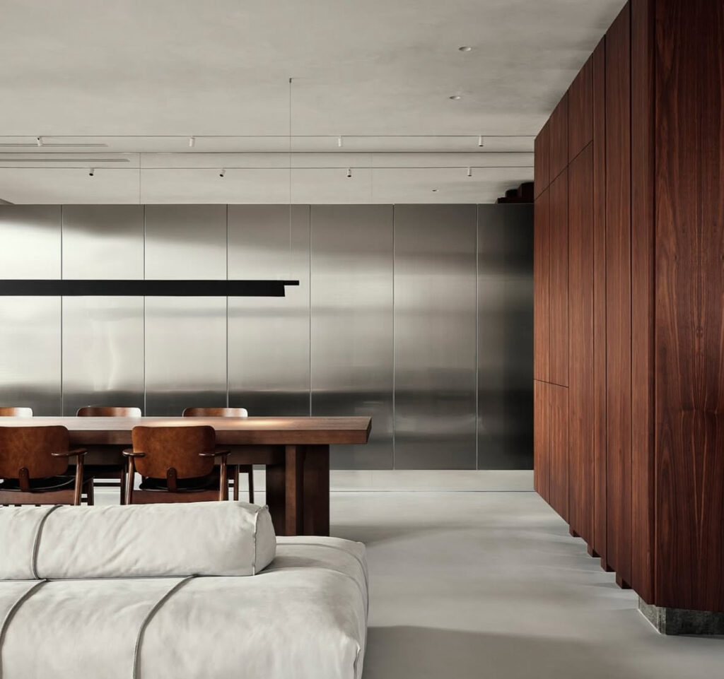
The V8 apartment in St. Petersburg from DA Bureau is basically a love letter to straight lines: a massive walnut table, simple brown dining chairs, a wall of stainless-steel panels, and a low, squishy sofa in the foreground. No frills, just really good proportions.
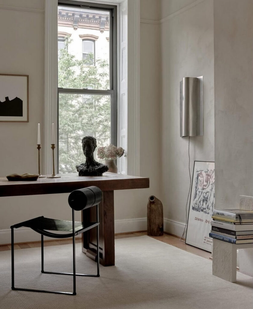
In that New York space designed by Daniellonnstrom and photographed by Sean Davidson that Design Art Object shared, the sculptural black chair at the wood table looks like a little modern art piece—again, no extra clutter needed.
When I’m shopping now, I literally squint at furniture. If the silhouette is clean enough that I could doodle it in three lines, it passes the test. If I’m mentally tracing a million curves and flourishes, it’s probably going to fight with everything else.
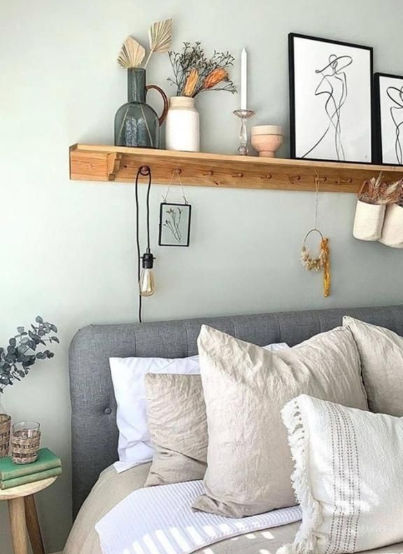
Minimal Accessorizing for Serenity
The apartments that feel truly peaceful are not empty—they’re just very, very edited.
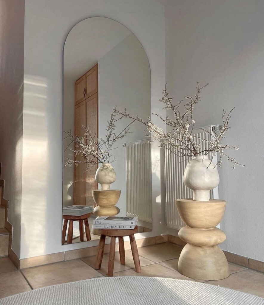
That little entry moment with the sculptural vase and stool, styled by k.groops and shared by Boheim Studio, is such a good example: one tall organic vase with branches, one small stool, two pretty coffee table books, a big mirror catching the light. Done.
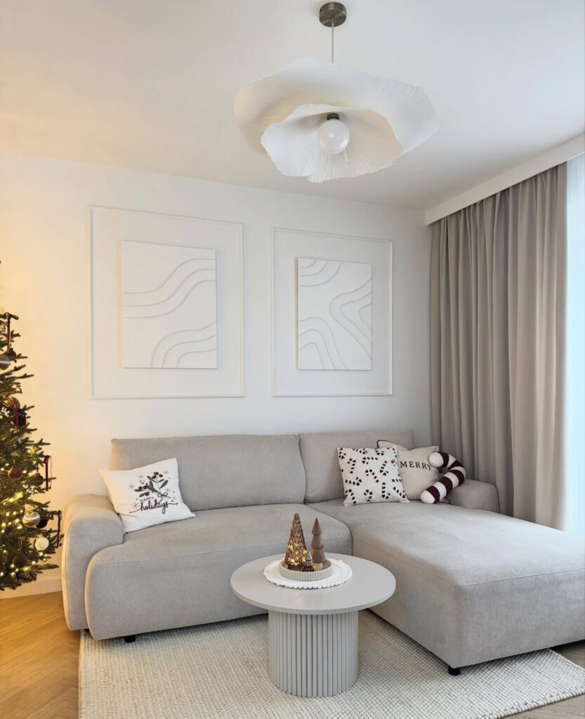
Even the winter minimalism living room from Karolina stays restrained: a neutral sectional, three small holiday trees on a fluted coffee table, and a simple tree glowing in the corner. No tinsel avalanche, no twenty cushions that all say “JOY.”
Related: The “Wait, That Was Cheap?” Guide: 23 Inexpensive Home Decor Ideas That Totally Elevate A Room
I’ve started giving each surface a “decor allowance”: usually one larger thing and one smaller thing. If I want to add something new (the random little vase I bought at 9 p.m. on a Target run), I make myself put something else away first. It keeps the room from slowly turning into a souvenir shop.
Moody Minimal for Night People
Not every minimalist space is bright and white. Some of my favorites are dark, cocoon-y little boxes.
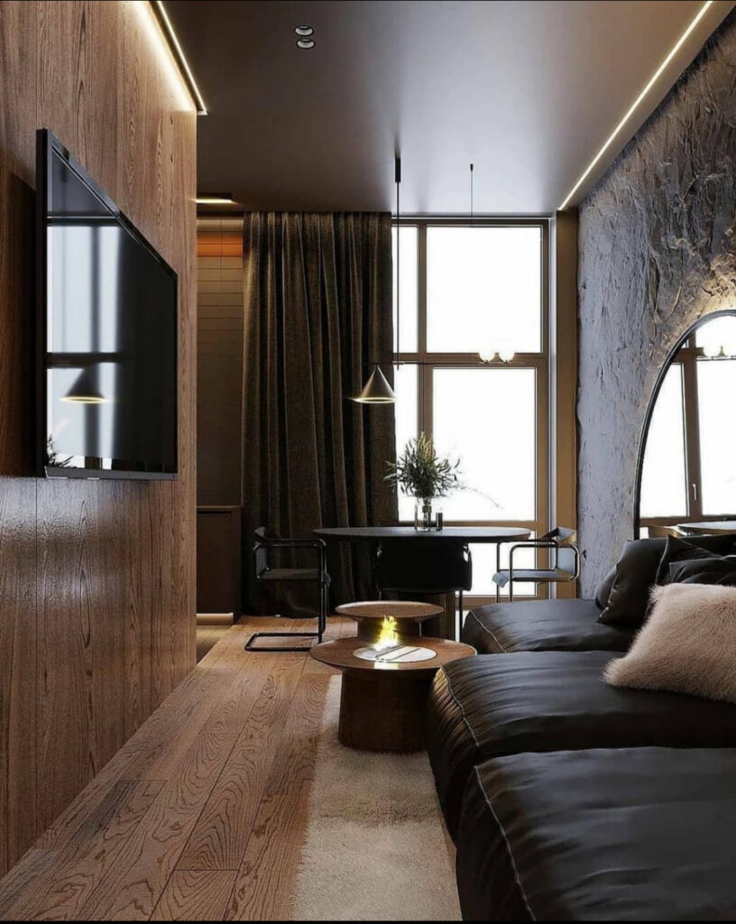
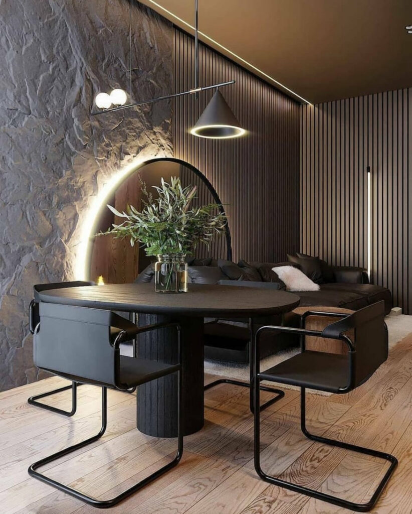
The loft-style apartment by b.pro.interior is all deep browns, black metal, and a stone wall that looks like it’s been carved out of a cliff. The arched halo of light behind the dining area and that slim pendant over the table are basically doing all the “decor.” There aren’t stacks of knick-knacks—just strong textures and good lighting.
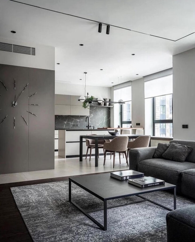
The grey-and-black open-plan living room by cg.visualization on Vray Masterclass leans the same way: big grey sofa, black coffee table, muted rug, dark marble backsplash in the kitchen. It’s moody but still simple, and the plant over the island is all the greenery it needs.
Sofas that Double as Islands of Calm
One thing I keep noticing: in almost every space, the sofa is basically an island you can flop onto from any direction.
In that Kiev apartment by Yodezeen Architects, the sectional is almost the width of the room—deep enough that you could sleep on it sideways. The BYRID Architects living room has a similarly low, inviting sofa that feels more “daybed” than “formal seating.”
My own sofa is currently doing triple duty as nap spot, laundry-folding zone and “oops, I brought my laptop to the living room again” desk. So I’ve stopped fighting that and started treating it like the main event: big, comfortable, neutral, and everything else in the room arranged to support it instead of competing.
Open-plan Calm Instead of Open-plan Chaos
Open layouts look dreamy on Instagram and then in real life you’re like, “Why do I see my dirty dishes from the couch?”
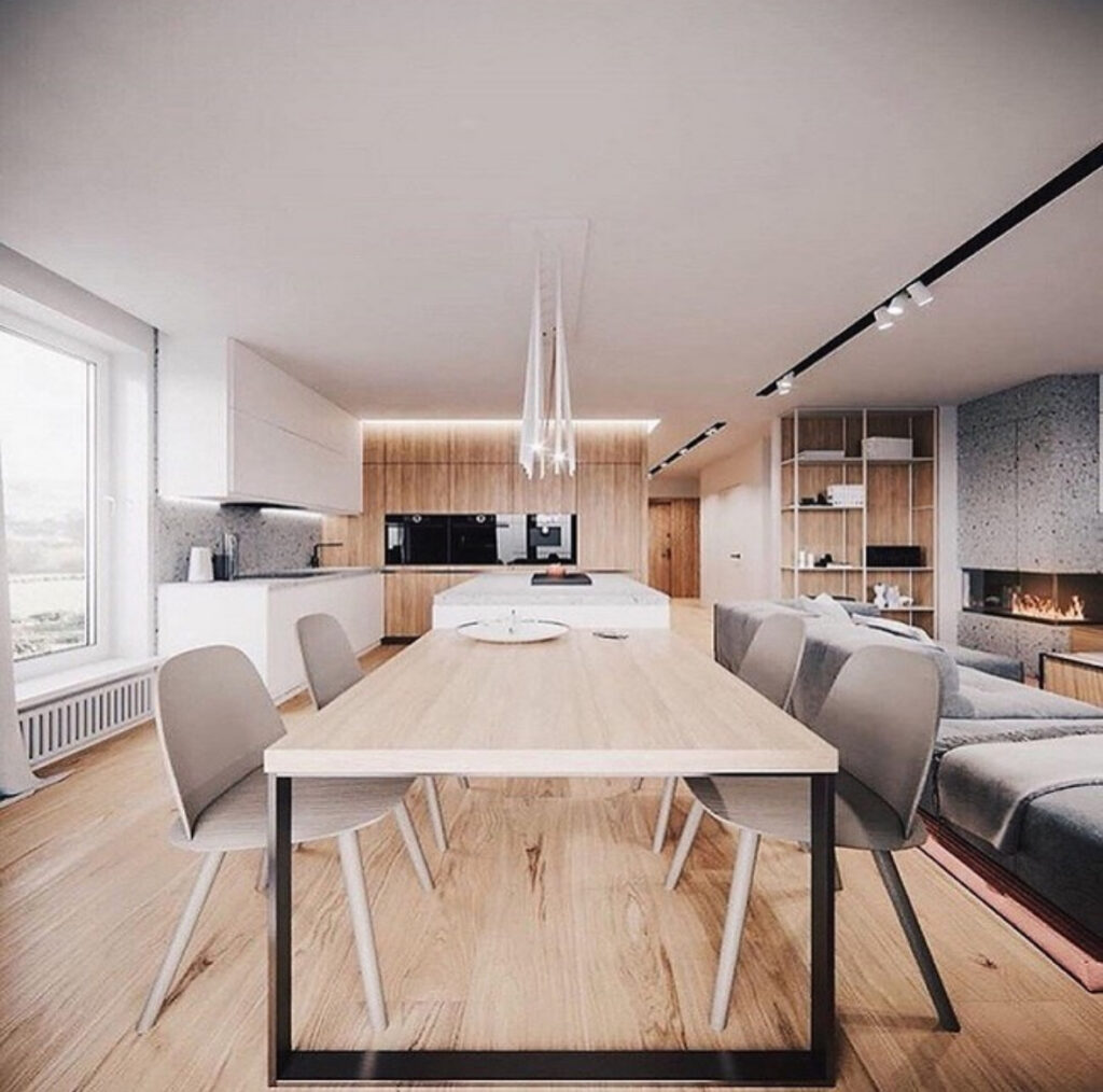
The Warsaw apartment by Hilight.design is a good antidote. The kitchen, dining and living areas are all in one line, but they share the same wood tone, soft grey upholstery and matte finishes. The dining chairs are simple, the table is light, and the kitchen wall is one big, flat plane of wood with practically no visual noise.
What I’m copying: picking one “hero” material (for us it’s oak) and repeating it through the whole open space—table, shelves, a frame or two—so the eye reads it as one room. I’m also trying to keep the kitchen counters as clear as the coffee table… which is a work in progress every time I abandon the mixer out for “just one more batch of cookies.”
Related: How to Arrange Living Room Furniture with a TV: Optimal Placement and Layout Tips
Sculptural Lighting as the Quiet Extra
Lighting is where a lot of these apartments sneak in personality without adding clutter.
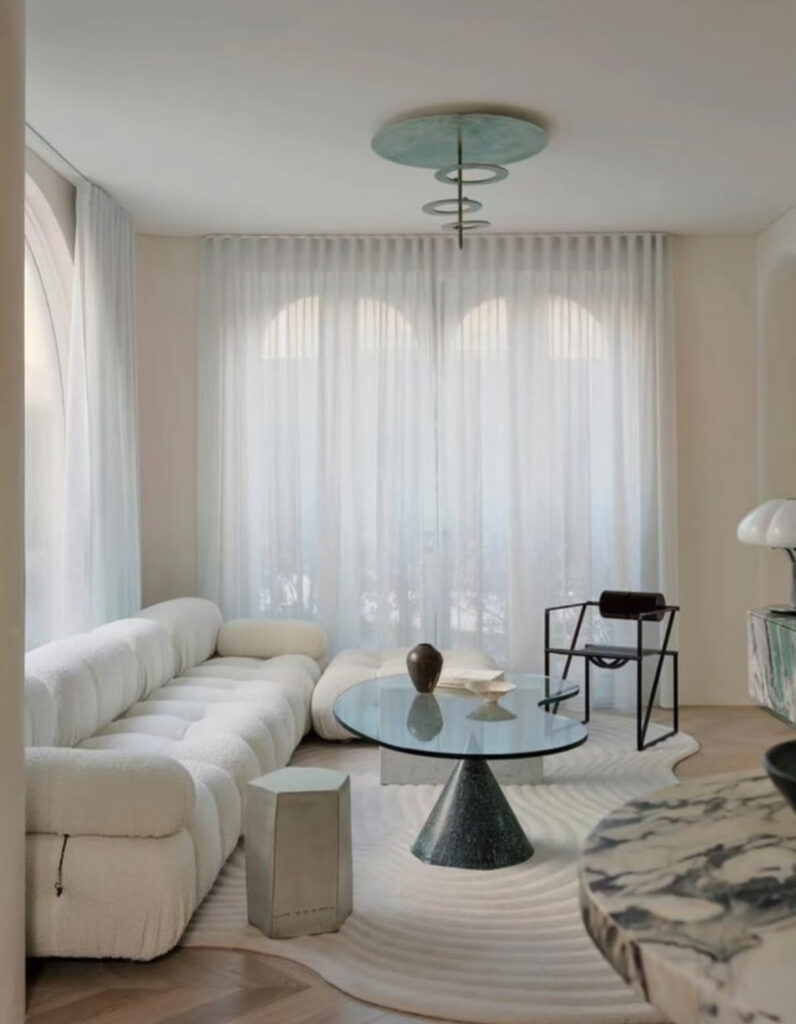
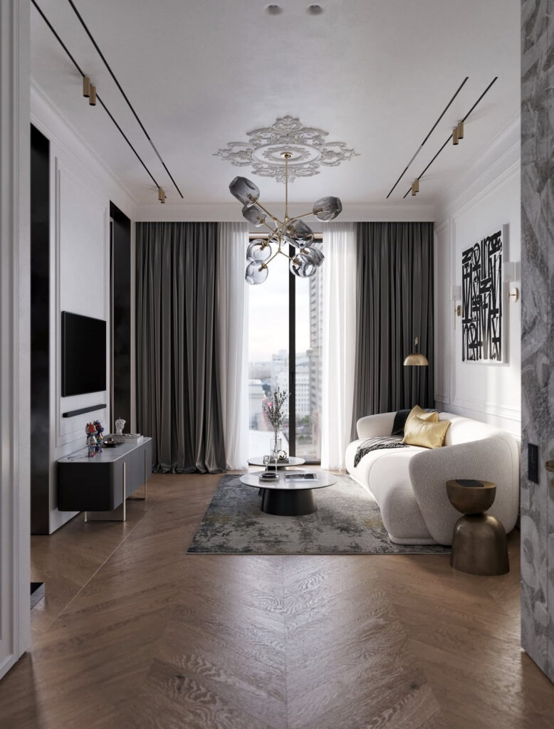
In the Sydney European minimalism space from The Decorholic, there’s that minty ceiling disc with rings hanging down over the coffee table—it almost feels like jewelry for the room. The modern chandelier in the Studio.av (you’ll see below) living room hangs from an ornate ceiling medallion, and it’s such a cool contrast: classic bones, super minimal furniture.
At home, swapping one builder-basic ceiling light for something with a sculptural shape has made a huge difference. I still keep the rest of the room really simple, but that one piece makes it feel designed instead of “we just moved in and gave up.”
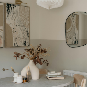
Books, Color and Still Pretty Minimal
Minimal doesn’t have to mean “no books, no color, no fun.”
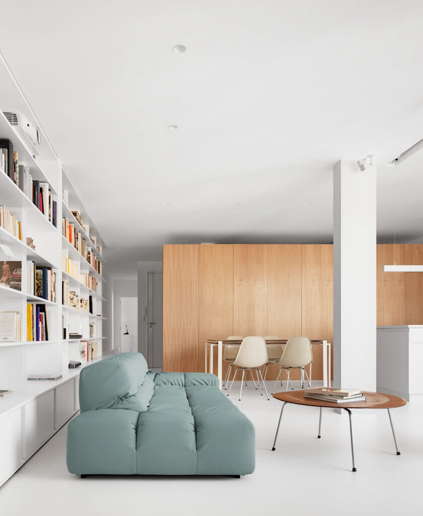
Apartment S by Heros Architecture is proof. The shell of the space is very simple—white walls, white floor, a box of light wood around the kitchen—but then there’s that seafoam green sofa and a full wall of open bookshelves. The coffee table is a simple round wood top on slim legs, and the dining chairs are quiet little shells, so the books and sofa can be the stars without the room feeling busy.
In the New York apartment by Daniell we saw earlier, the color is even more restrained: mostly wood, cream, and black, but the art, the sculptural chair and the little stacks of books on the chunky stone stool keep it from feeling too serious.
A Tiny Landing Strip that Actually Stays Tidy
Minimalism really shows up in the small spaces: the entry, the bit of wall near the stairs, that awkward corner where everything usually piles up.
That little corner styled by k.groops is my current obsession. There’s a simple arched mirror, a sculptural stacked vase with branches, a tiny stool, and two stacked books.
The morning light hits the wall and bounces around, and it honestly looks like a gallery installation instead of a spot where someone probably dumps their keys.
Meanwhile, my own entry is usually where mail and reusable shopping bags go to die. So I’m trying to give it the same rules as that photo: one surface for pretty things (a tray, a small vase), one hook for actual daily stuff, and a closed basket for everything else. It’s not perfect—there is always at least one rogue sneaker—but it feels calmer, and I don’t lose my keys as often.
FAQ
How to decorate a minimalist apartment?
Start with subtraction, not shopping. Clear every surface you can, choose a simple color palette (2–3 neutrals plus maybe one accent), and then bring items back slowly. Keep only what really earns its spot: a comfy sofa, a decent rug, good lighting, and a couple of meaningful objects per surface. Think “clean lines, natural materials, intentional clutter” instead of “I must own nothing.”
Is there a downside to minimalist style?
There can be if you treat it like a rulebook. If you strip away every photo, book, and quirky object that feels like you, the space can start to feel a bit like a hotel lobby—pretty, but not warm. The sweet spot is a clutter-free room where you still see signs of life: a stack of books you’re actually reading, a throw blanket you actually use, and that one odd little vase you love for no logical reason.
Is minimalism still popular in 2026?
I’d say yes, but it’s softer and cozier than the early “all white everything” era. The strict, super-cold version is fading, and what’s sticking around is the mindset behind it: editing, buying less but better, and using neutral palettes and natural materials. In 2026 it’s more about “comfortable minimalism” or “quiet luxury” vibes—calm backgrounds, warmer woods, soft curves, and a few personal pieces layered in so it feels like a home, not a showroom.
What is the 70 20 10 rule in decorating?
It’s a simple way to balance color in a room. Roughly 70% of the space is your main color (often a neutral: walls, big furniture, large rug), 20% is a supporting color (another neutral or your wood tones), and 10% is your accent (pillows, art, a standout chair). In a minimalist apartment, that last 10% can stay tiny—a couple of cushions and one piece of art—and the room will still feel calm but not flat. I have a full article on how to decorate using only 3 colors you can check!
What decor style is popular in 2026?
Everything leans toward “cozy but edited.” You see a lot of warm woods, earthy tones, curved furniture, and styles like Japandi, quiet luxury, soft modern, and this sort of minimalist-maximalist mix where people keep clean backgrounds but layer in a few bolder pieces. In other words: less stark gallery, more lived-in, mood-calming spaces that still show some personality.