Hey all! My name is Julia, former college student and a home decor enthusiast who loves DIY home improvement projects and finding creative ways to decorate any living spaces on a budget. Recently moved from my dorm to my new apartment which I renovated from scratch and I am here to help you with tips & tricks about home decor/college and more 🙂
Turn a big, echo-y living room into a cozy, intentional space by zoning it first—walkways, rugs, and furniture placement that actually makes sense. Then lock in scale, layered lighting, and warm textures so it feels like a home, not a lobby.
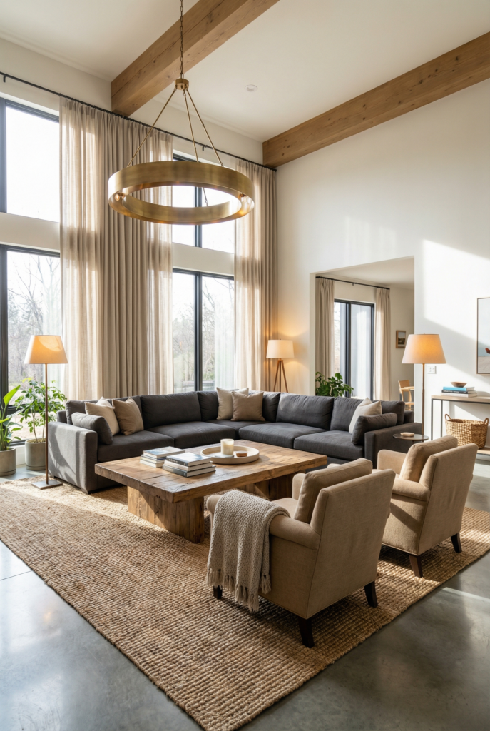
You know that special kind of panic where your living room is technically massive, but somehow it still feels… empty? Like a hotel lobby that forgot to add the humans? That was me. For months. I kept buying “one more” cute thing, then standing back like, why does this look like I staged a waiting room at a dentist office in 2009.
So today I’m giving you my actual, real-life approach to large living room decorating ideas that doesn’t rely on “add a throw” (I did add the throw, obviously), but starts with what goes where, why it goes there, and how to make the whole thing feel warm instead of floaty.
And yes, I will talk about rugs with the seriousness of a courtroom drama. Because that is, unfortunately, who I am.
Here’s the roadmap so you don’t get lost in the big-room swirl: I always start with walkways, then build zones, then check scale, then fix lighting, then add warmth.
Walkways → zones → scale → lighting → warmth. If you do it in that order, the room stops feeling like a giant blank page and starts feeling like a real place to live.
Supplies Quick Checklist
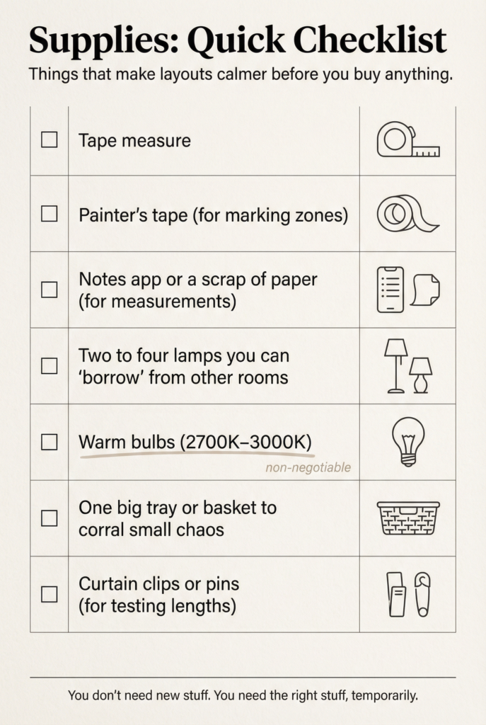
- Tape measure
- Painter’s tape for marking zones
- Notes app or a scrap of paper for measurements
- Two to four lamps you can “borrow” from other rooms
- Warm bulbs (2700K to 3000K is my happy place)
- One big tray or basket to corral small chaos
- Curtain clips or pins if you’re testing lengths
Zoning and Defining Separate Areas
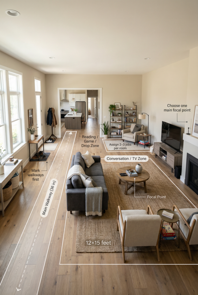
Zoning is how a big living room stops feeling like one giant blank rectangle. You’re not “filling space,” you’re assigning jobs. Once the room has a few clear zones, everything suddenly feels intentional, and you stop wandering around with a pillow like it’s a life decision.
Here’s the method I use when I’m doing living room layout ideas in my own house.
First, measure the room and mark your main walkways before you place a single piece of furniture.
I like a minimum of about 36 inches for the main path, and I try not to force anyone to shimmy sideways with a laundry basket.
Next, pick the main focal point. It might be the fireplace, a big window, or the wall behind the TV. Then decide on two or three “jobs” the room must do. Conversation, TV lounging, reading corner, game table, entry drop zone. That’s it. Related: The Guide To Hiding (And Highlighting) The TV – Smart Living Room TV Wall Ideas
Concrete example: if I know I need a 36-inch walkway from the entry to the kitchen, I tape that path first, then I build the main seating zone around a 10×14 or 12×15 rug so it feels like an actual “room” inside the room. It’s the fastest way to make the layout feel calm instead of chaotic.
Step 1: Mark walkways first (yes, before the sofa)
This is the unsexy part, but it changes everything. Use painter’s tape to mark:
- The path from entry to hallway
- The path to the kitchen or dining area (if it connects)
- The path to doors, stairs, or that one outlet you always need
If you do nothing else tonight, do this. You’ll instantly see where furniture can float without turning your room into an obstacle course.
Step 2: Pick your “zones” by job, not by furniture
Think in zones like little neighborhoods. Each one needs:
- A rug (or a boundary)
- A main piece (sofa, chairs, table, desk)
- One light source (lamp, sconce, pendant, anything)
That’s how you avoid the “everything is scattered evenly across the perimeter” look, which reads like you’re afraid of the center of the room. (I get it. The center feels vulnerable.)
Also, this is where a big area rug becomes the hero, because it does the zoning job without adding visual clutter.
Mini Layout Templates with Quick Sketches
These are the layouts I keep coming back to, because they solve the “what goes where” panic without requiring you to buy new walls.
Template A: Open-concept rectangle (the classic “why is it so long?” room)
This is the room where you feel like you have to choose between a good seating area and not blocking the walkway.
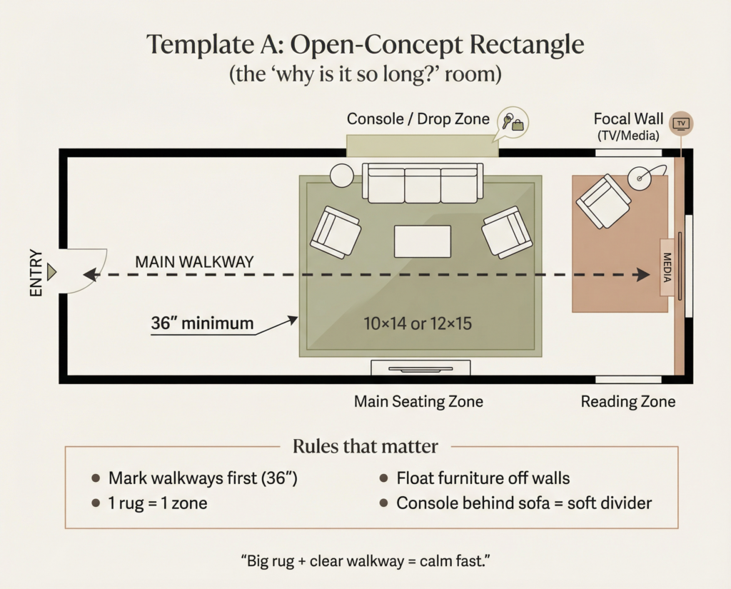
How I make it work:
- Put the main seating zone closer to the focal wall, not shoved back.
- Use a large rug (think 10×14 or 12×15) so the seating group looks like a “room within the room.”
- Add a console table behind the sofa if the back faces the walkway. It acts like a soft divider and gives you a landing spot for keys, lamps, or the mail pile you swear you’ll sort.
Template B: Square room with two focal points (fireplace + TV, aka the drama)
This is the room that makes you stare into space and whisper, “but where does the TV go…”
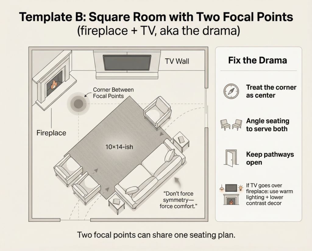
How I make it work:
- Treat the “corner between focal points” as the center of gravity.
- Angle seating slightly so it can serve both. Not fully turned like a swivel chair convention, just gently.
- If the TV must go over the fireplace and you hate it, you’re not alone. (I still have unresolved feelings about mounting anything on brick. It feels permanent, like naming a baby.)
Template C: Vaulted ceiling + skylights zone plan (the “beautiful but loud” space)
This is when the ceiling is doing the most, and the room still feels empty because everything below is too small.
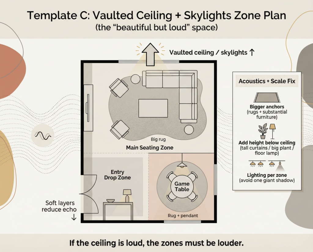
How I make it work:
- Your zones need bigger visual anchors because vaulted ceilings make small furniture look like dollhouse props.
- Add height somewhere besides the ceiling, like tall curtains, a big plant, or a floor lamp with presence.
- Plan lighting per zone so the room doesn’t turn into one giant shadow at night.
Template D: “Multifunctional but still pretty” room (TV + play + adult life)
This is the multifunctional living space that has to be cozy and flexible, and also survive kids, pets, and real life.
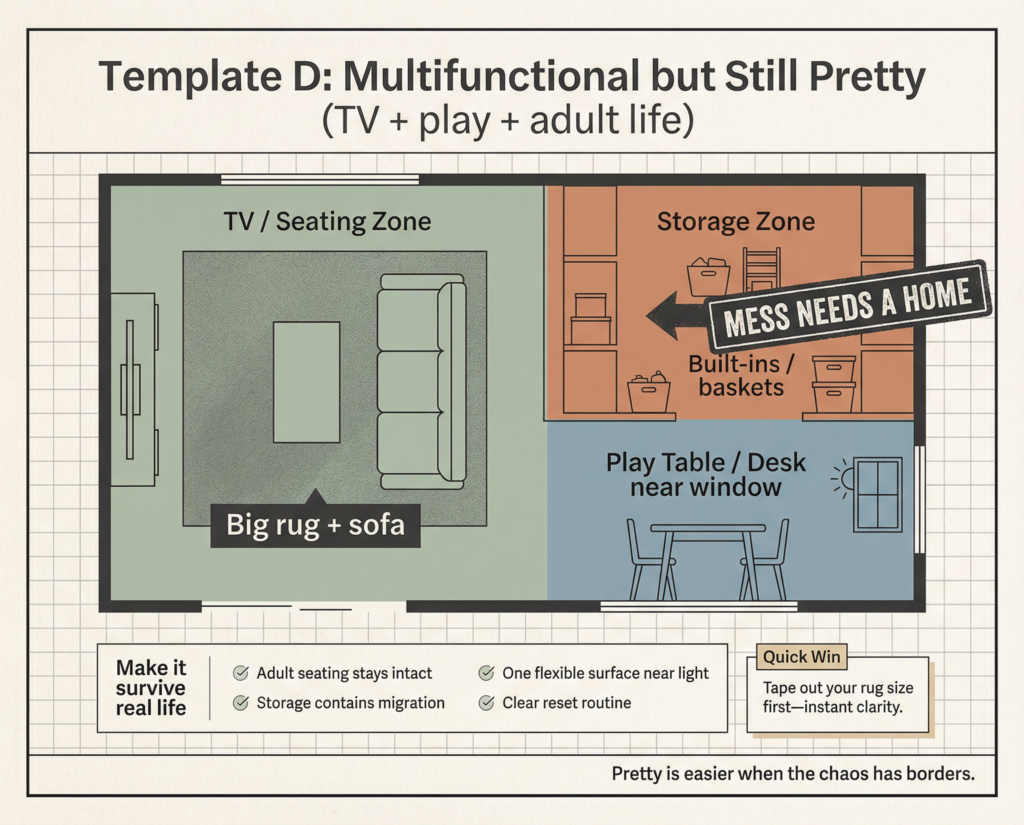
How I make it work:
- Give the “mess zone” a home. A bench, cabinets, baskets, something. If it doesn’t have a home, it will migrate.
- Keep the adult seating zone intact. Even if toys exist, your sofa area should still feel like a place you want to sit.
Quick win: Tape out your main seating rug size tonight and you’ll instantly know if your layout is too floaty.
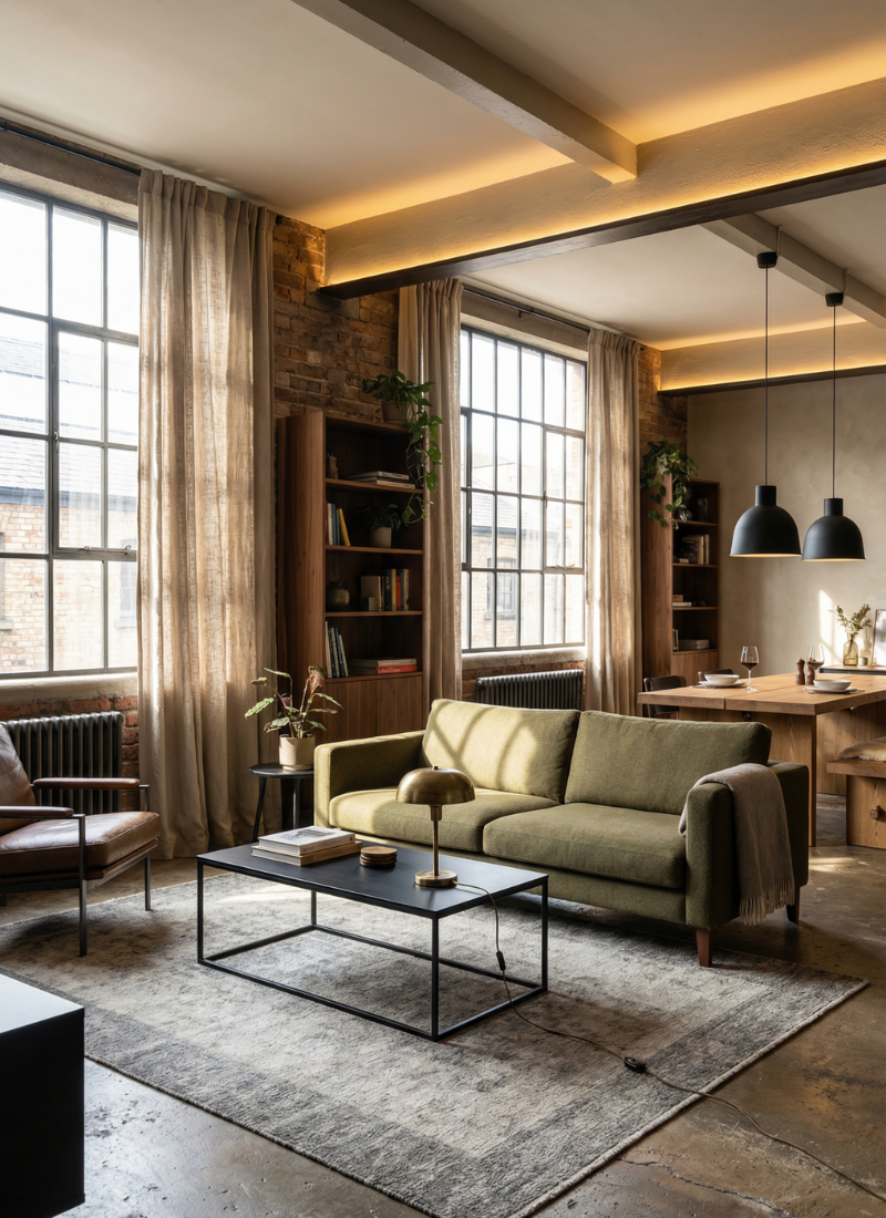
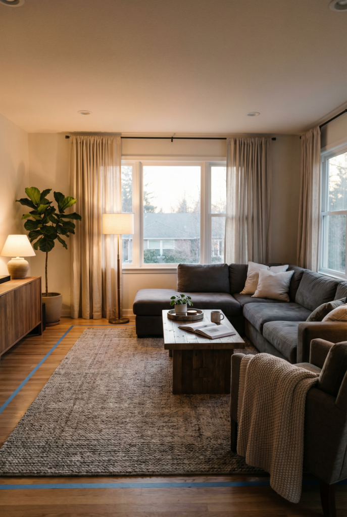
Oversized Lighting and Anchored Furniture
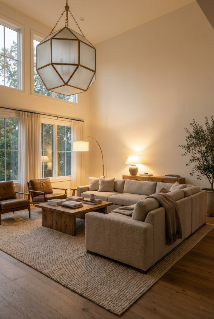
Oversized lighting is the secret weapon in a big room, because it adds structure without adding clutter.
And anchored furniture is what keeps the room from feeling like everything is drifting apart emotionally. Together, they make a large space feel designed, not accidental.
If you take one thing from this section, let it be this: big rooms go cold and flat when you rely on a single overhead fixture.
You need layered light the way you need seasoning. And your furniture needs to live in a “group,” not along the walls like it’s waiting for a dance to start.
Concrete example: in my main seating zone, I aim for at least three light sources right away, one overhead plus two lamps, then I keep the bulbs in that 2700K to 3000K cozy range so it doesn’t feel like a dentist office at night.
Step 1: Choose a statement fixture that doesn’t look lost
A quick rule I use: your main fixture should feel like it belongs to the room, not like it belongs to a hallway.
- Over a seating area, I love a big pendant or chandelier that visually “hangs over” the zone.
- If you have high ceilings, don’t be afraid of a larger diameter fixture.
- Hang it so it feels connected to the furniture below, not floating in ceiling-land.
If you’re stuck with a boob light, I see you. Replacing one fixture can change the whole mood, even if you do nothing else.
Step 2: Use the layered lighting recipe per zone
Here’s my lighting recipe, and yes I’m dramatic about it:
- Ambient: overall glow (ceiling fixture, recessed, or a big pendant)
- Task: for actual life (reading lamp, table lamp near the sofa, desk lamp)
- Accent: for mood (picture light, small lamp on a console, candle glow, art lighting)
A big living room often needs at least two or three lamps in the main seating zone alone. If that sounds like a lot, just remember: the goal is to avoid one bright overhead light that makes everyone look like they’re at a school fundraiser.
Bulbs: I stay in the warm range, roughly around 2700K to 3000K, and I put anything I can on a dimmer.
A dimmer is one of those unsexy upgrades that makes the whole room feel suddenly expensive.
Step 3: Anchor your furniture so it stops “floating”
This is where the room stops looking like a furniture showroom.
My non-negotiables:
- Front legs of the sofa and chairs go on the rug.
- Coffee table sits roughly 14 to 18 inches from seating, close enough to reach your drink without doing a crunch.
- Main walkway clearance stays generous, and you don’t force traffic through the middle of a seating group.
Also, resist the urge to park everything along the perimeter. I know it feels like you’re “making space,” but what you’re actually doing is creating a dead, empty center that reads like uncertainty.
Pulling furniture inward makes the room feel like it has a plan.
Tiny Chaotic Intermission: The Lamp Shuffle
This is the part where I admit I moved the same floor lamp three times in one night because the light was “wrong.” Not too bright. Not too dim. Not too cold. My dog watched me like I was doing a weird ritual.
Quick win: Add one lamp to your main seating zone and aim it toward a wall, not straight at your face.
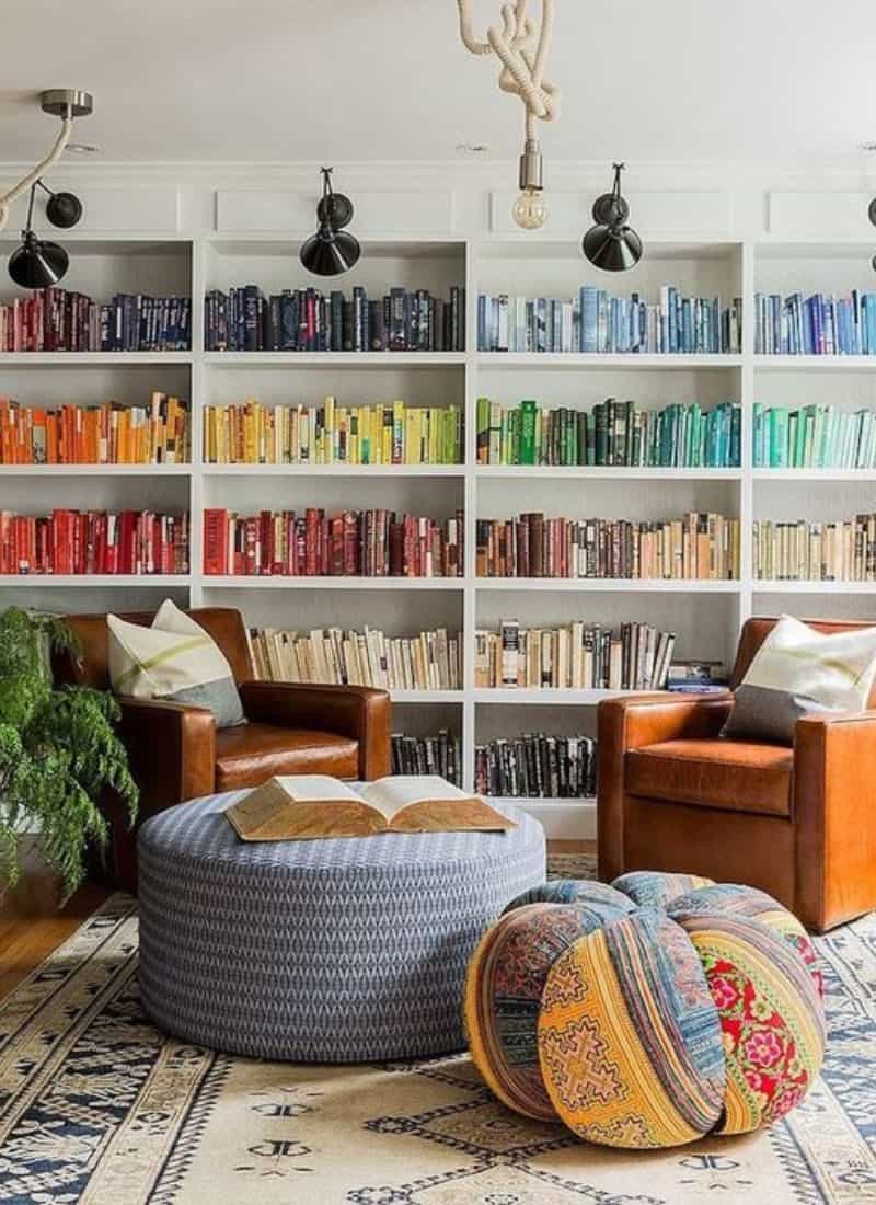
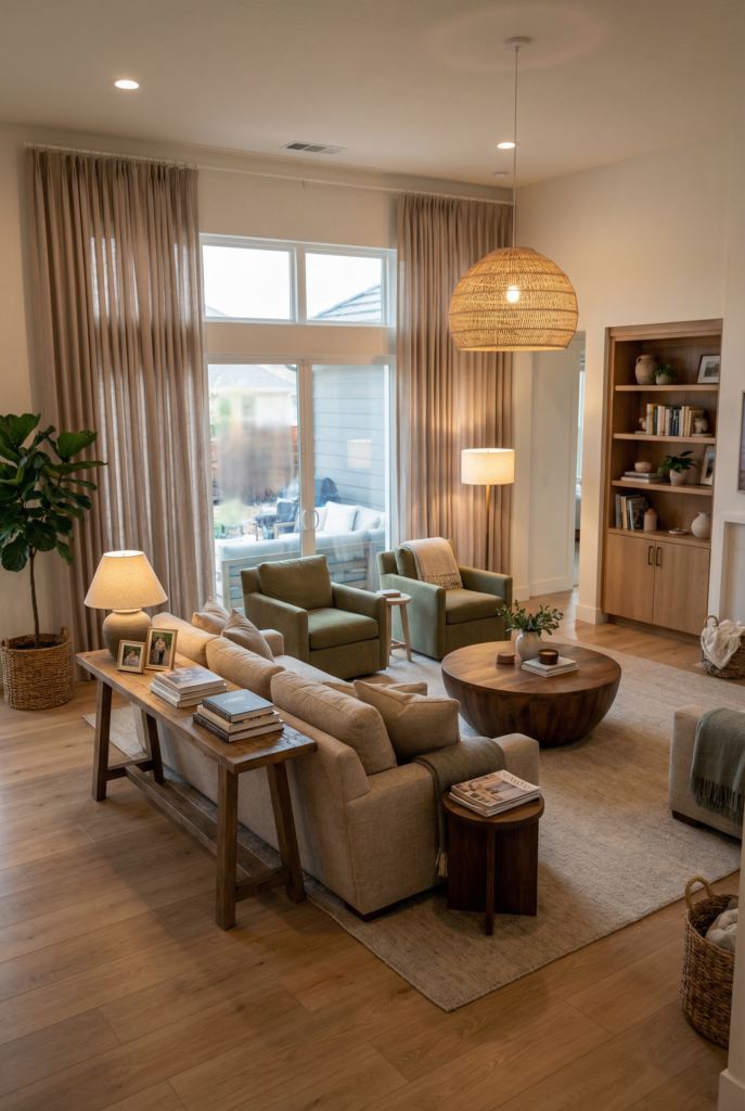
Balancing Scale with Textures and Layers
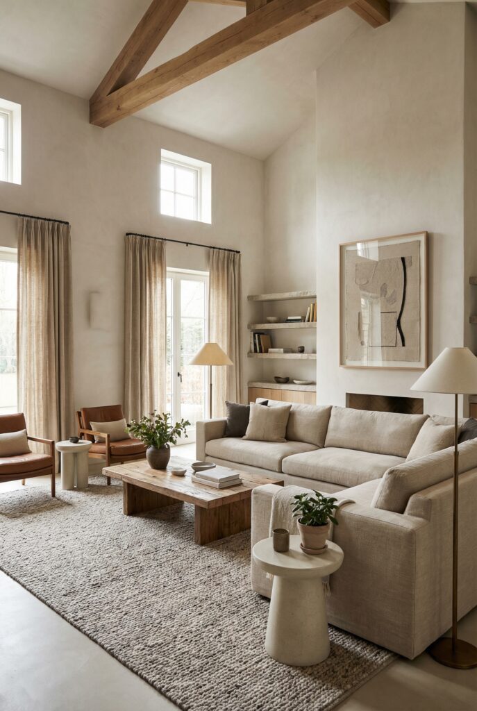
Balancing scale is how you avoid two terrible extremes: everything feels tiny and scattered, or everything feels huge and heavy and vaguely intimidating. The goal is a mix, plus texture, so the room feels layered and lived-in instead of flat.
Here’s the formula that saves me every time: big piece, medium piece, small piece.
When a room is large, you need at least one truly substantial anchor, then supporting pieces that keep it from feeling like a single furniture blob. I also think texture is the cheat code for making a big space feel warm without adding more stuff.
If your room is mostly smooth surfaces, it will feel echo-y and unfinished even if it’s “done.”
My favorite big-room trick is making the “boring basics” (rug, curtains, lighting) do the heavy lifting so the accessories can relax.
Concrete example: I’ll do two textures per zone (like linen and wood), then repeat one material across zones so it feels cohesive, and I’m not buying ten random “cute” things that don’t talk to each other.
Step 1: Use the big-medium-small formula
Here’s what I mean in real terms:
- Big: a sofa that actually fits the room, like a large sectional sofa if your space can handle it
- Medium: a pair of chairs, a substantial coffee table, or a chunky ottoman
- Small: side tables, stools, poufs, little movable pieces that make the room flexible
The mistake is doing all “medium” pieces. Two small sofas, four skinny chairs, tiny side tables… it adds up to a room that feels like it’s whispering.
Step 2: Add one vertical “wow” so the room feels taller on purpose
Big rooms need something tall to balance all the horizontal furniture.
Options I love:
- Tall curtains
- A big art moment
- A tall bookshelf or cabinet
- A big plant that looks like it pays rent
This is where a single large artwork can do more than ten small frames sprinkled around. I’m not anti-gallery wall, I’m just pro-scale.
Step 3: Texture rules that keep it cohesive (not cluttered)
My simple rule: two textures per zone, plus one material repeated across zones.
Example:
- Seating zone: linen + wood
- Reading corner: wool + wood
- Entry drop zone: woven + wood
Suddenly your whole room feels connected, and you didn’t have to buy matching sets.
If you’re tempted to add more and more “small cute things,” pause and add texture instead. A chunky knit throw does more than another tiny vase. Trust me, I’ve tested this in the lab of my own bad decisions.
Quick win: Pick one repeated material for the whole room and commit. Wood, black metal, brass, whatever. One thread.
Creating Warmth in Big Open Spaces
Warmth in a big room comes from structure plus softness. It’s not just “add cozy stuff.” It’s creating moments that feel human, so the room stops reading like a cavern.
Big spaces need emotional fixes: places to land, places to gather, and places that feel like they belong to you, not to a listing photo.
I start with a calm base, then add controlled contrast so the room feels intentional. If everything is the same tone, it can feel bland. If everything is high contrast, it can feel busy. So I like a neutral color palette with a few deeper notes repeated around the room, like a warm wood tone, a muted green, or a soft black.
Then I add softness: curtains that actually reach the floor, rugs that actually fit the seating group, lighting that makes evenings feel like evenings. I also think big rooms need a few “anchor” moments where your eye can rest. A console behind the sofa. A cabinet that hides mess. A little vignette that isn’t precious, just grounded.
This is the part where a bright room can still feel cozy, because “bright” and “warm” are not enemies, they just need help after sunset.
Concrete example: I’ll do full-length curtains plus warm bulbs (2700K to 3000K) and a correctly sized main rug (10×14 or 12×15) before I buy one more “accent” thing, because that combo fixes the cold, echo-y vibe fast.
Step 1: Use softness at full scale
This is where people under-do it. If your room is big, your soft elements should be big too.
- Curtains should feel generous, and floor-to-ceiling curtains are basically therapy for tall walls.
- Rugs should fit the zone, not float in the middle like a postage stamp.
- Throws and pillows should look inviting, not like a staged hotel bed you’re afraid to wrinkle.
I will also admit: one corner of my rug still curls up a tiny bit. I’ve tried tape, weights, time, pleading. It is my unresolved annoyance. We move on.
Step 2: Choose symmetry or asymmetry on purpose
This is how you decide the vibe.
- If you want a more tailored, formal vibe, symmetry helps. Paired chairs, matching lamps, balanced sides of a console.
- If you want it relaxed, go a little off-center on purpose. One chair, one ottoman, a slightly mismatched side table, a casual stack of books.
Both are valid. The key is choosing, not drifting.
Step 3: The mistakes that make big rooms feel worse
I’m not judging, I’ve done all of these.
- A rug that’s too small for the seating group
- Tiny art floating on a big wall
- One sad ceiling light doing all the work
- Furniture pushed so far out that the center feels abandoned
- No closed storage, so clutter spreads like glitter
If you fix just two of these, your room will look twice as good, I swear.
What I’d do in your room if…
…you have tall ceilings
If you have vaulted ceilings, you need at least one big vertical element besides the ceiling itself. Tall curtains, a tall cabinet, or oversized art can keep the room from feeling bottom-heavy. If you’ve got ceiling beams, I’d let them be the star and keep everything else up there pretty calm.
…your space is open to the kitchen
In an open concept space, I like to treat the back of the sofa as an intentional “edge.” A console table behind it, a lamp, a bowl for keys. It creates a boundary without building a wall. And if you have built-ins around the fireplace or the media wall, I like to repeat one finish from those (wood tone, metal tone) somewhere near the sofa so the zones feel related.
…your room has gorgeous windows
Lean into natural light, but balance it. A bright room still needs layered lighting at night, or it will feel like two different spaces depending on the time of day. If one wall feels oddly blank, I’d rather do one large art moment or a pair of substantial sconces than scatter a bunch of smaller frames and hope they behave.
Shopping list by zone with realistic price bands
If you can only spend in one place: correct rug size first, then lighting, then the sofa.
These are the categories I’d budget for first, in roughly the order that moves the needle.
Main seating zone
- Large rug: $400 to $1,800
- Sofa or sectional: $1,200 to $6,000
- Coffee table: $250 to $1,200
- Two lamps: $150 to $800 total
- Curtain panels: $200 to $900
Reading corner
- Chair: $300 to $1,500
- Side table: $80 to $400
- Floor lamp: $120 to $600
- Small rug: $150 to $700
Entry drop zone
- Console or cabinet: $250 to $1,800
- Mirror or art: $100 to $900
- Basket or tray: $20 to $150
Media zone
- Large media cabinet: $400 to $3,000
- Cable management bits: $15 to $80 (unsexy, life-changing)
- Art or lighting for the wall: $100 to $700
And if you want one category that quietly saves your sanity: storage solutions. Closed doors hide a thousand sins.
Quick win: Pick one “warmth anchor” today, like curtains or a bigger rug, and let it do the heavy lifting.
The Gentle Ending, Because You’re not Doing This Wrong
If your big living room feels hard, it’s not because you lack taste. It’s because big spaces require decisions. They require zones, scale, and lighting, and the confidence to commit to a layout instead of decorating around the edges forever.
Start with the layout. Then anchor with a rug. Then add light. Then add softness. And if you only do one thing this week, make it something that changes the structure of the room, not just the accessories.
Also, leave the painter’s tape on the floor for a day. I left mine for a full week. It looked unhinged, but it worked.
FAQs
How do I decorate a large living room?
Start by zoning it into two or three clear areas based on what you actually do in the room. Mark your walkways first so the layout feels easy to move through. Choose one main focal point and build the biggest seating group around it, anchored by a correctly sized rug. Add layered lighting in each zone so the room doesn’t feel cold at night. Bring in softness at full scale with curtains, textiles, and a few larger accents instead of lots of tiny stuff. Finally, give clutter a real home, because mess spreads faster in a big space.
What size rug should I use for the main seating area?
Big enough that the front legs of your sofa and chairs can sit on it, minimum. In many large rooms, that means something like 10×14 or 12×15, but your exact layout matters. If you’re unsure, tape out the rug size on the floor and see if the seating group finally looks “contained.”
How far should my coffee table be from the sofa?
Close enough to actually use without leaning like you’re doing Pilates. I aim for roughly 14 to 18 inches between the coffee table and the sofa edge. If you have kids or a lot of traffic, go a little wider so you’re not bruising shins daily.
How many lamps do I really need in a big living room?
More than you think, and fewer than your partner fears. I like at least two lamps in the main seating zone, plus one more in a secondary corner. If your room feels gloomy at night, it’s almost always a lighting layers problem, not a “buy more decor” problem.
Where should I put the TV if the fireplace is the focal point?
If you can, separate them: let the fireplace be the mood focal point and put the TV on a different wall in the main seating zone. If they have to share, you can still make it feel intentional by centering your seating thoughtfully and adding balancing elements on the wall, like art or sconces.
How do I keep a big living room from looking cluttered?
Use fewer, larger pieces instead of lots of small ones. Create zones so items belong somewhere, and make sure at least one zone has closed storage so the everyday stuff disappears. Then edit the tiny stuff and replace some of it with texture, like a woven basket or a soft throw that isn’t trying too hard.
What’s the fastest fix if my big living room feels cold at night?
Add layered lighting first. One overhead light makes a big room feel flat, but two lamps plus a warm bulb can change the mood immediately. If you can pair that with curtains or a bigger rug, it gets cozy fast.
Do I need an accent wall in a large living room?
You don’t need one, but it can help your eye know where to land. I like a stronger wall moment behind the TV or behind the sofa, especially if the room feels visually “spread out.” Paint, paneling, or even just one oversized art piece can do the job without turning it into a trend parade.