Hey all! My name is Julia, former college student and a home decor enthusiast who loves DIY home improvement projects and finding creative ways to decorate any living spaces on a budget. Recently moved from my dorm to my new apartment which I renovated from scratch and I am here to help you with tips & tricks about home decor/college and more 🙂
How to decorate a long wall in living room is basically: stop “filling” and start anchoring. You’ll measure, tape it out, pick a lane, then hang from the biggest piece outward so it feels designed, not desperate.
You know the wall. The one that just… keeps going. You stand there with a tape measure and a hopeful heart and suddenly you’re adding seventeen frames to your cart like you’re about to open a gallery (you’re not). I’ve done it. I’ve also returned half of it. Twice.
Here’s my promise, coffee-stained and honest: this is how you decorate a very long wall in a living room without it looking stretched, cluttered, or like you tried to “fill” it by scattering tiny objects across a beige desert.
What long wall decor actually needs is not “more stuff.” It needs scale, rhythm (repetition that feels intentional), one anchor moment, and one functional layer so the wall is doing a job, not just wearing jewelry.
Long Wall Plan (the no-panic box)
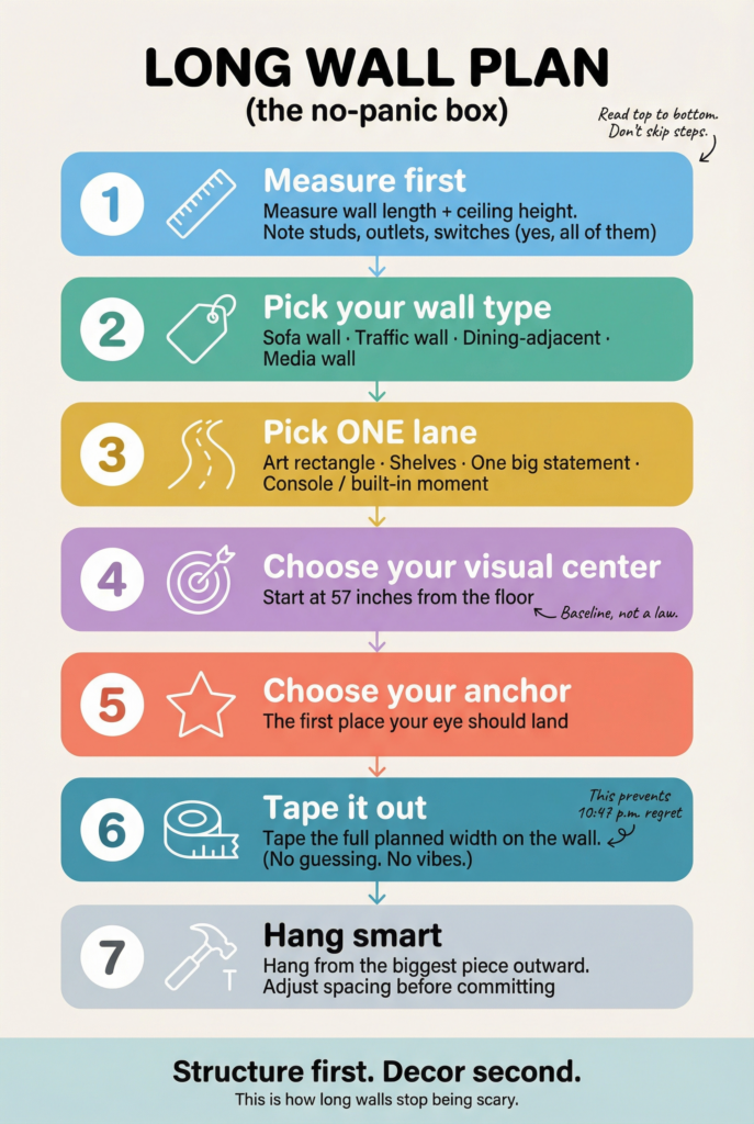
- Measure the wall length and ceiling height, then note studs and outlets (yes, all of them)
- Pick your wall type: sofa wall, traffic wall, dining-adjacent, or media wall
- Pick one lane: art rectangle, shelves, one big statement, or console/built-in moment
- Choose a visual center (57 inches from the floor is a solid starting baseline)
- Choose one anchor (the first place your eye should land)
- Tape the full planned width on the wall before you hang anything
- Hang from biggest outward, then adjust spacing before you commit
Before we start measuring anything, pick your wall type. This is the part where you feel seen and stop copying the wrong inspo photo.
- TV or media wall: cords, screens, and the “why does the router have to live here?” problem
- Sofa wall: comfort zone, eye level, and the “my cushions already take up visual space” reality
- Entry or traffic wall: people walking past, bags getting tossed, art getting bumped by a backpack at 8:04 a.m.
- Dining-adjacent wall: sight lines from the table, lighting reflections, and the “why does everything look crooked when I sit down?” effect
Supplies Quick Checklist
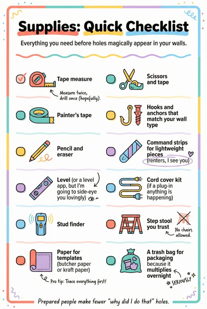
- Tape measure
- Painter’s tape
- Pencil and eraser
- Level (or a level app, but I’m going to side-eye you lovingly)
- Stud finder
- Paper for templates (butcher paper or kraft paper)
- Scissors and tape
- Hooks and anchors that match your wall type
- Command strips for lightweight pieces if you’re renting
- Cord cover kit if a plug-in anything is happening
- Step stool you trust
- A trash bag for packaging because it multiplies overnight
Measure + Map First (yes, before you buy anything)
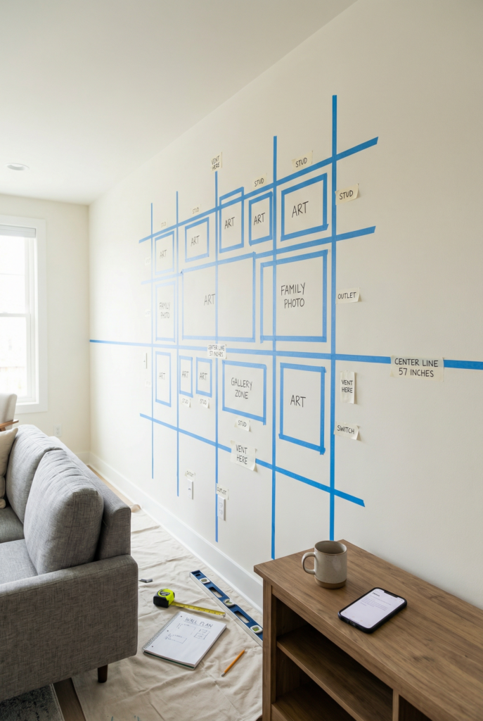
You decorate a long wall by planning the map first, then shopping to match the map. Start with wall length and ceiling height. Mark studs. Mark outlets. Mark switches and vents.
I use painter’s tape and little labels like I’m staging a crime scene (which is honestly accurate, emotionally).
Then pick your visual center. The “57 inches to the center of the art” guideline is a helpful starting point, especially if you’re trying to stop everything from creeping upward like it’s afraid of the sofa.
Now choose the anchor zone. This is the big moment your eye lands on first. If you skip this, your wall becomes evenly scattered minis and your brain reads it as clutter, even if it’s all pretty.
Quick win: Tape a horizontal line at your chosen center height so your wall has a boss.
Pick a Lane (because “a little of everything” is how you get chaos)
You decorate a long wall by choosing one main strategy, then adding controlled variation. Pick a lane: a grouped art moment, a shelf moment, one big statement, or a console/built-in situation that gives the wall purpose.
If the wall is behind a sofa, I usually want wide and calm. If it’s a traffic wall, I want things that can survive being bumped by a tote bag and a child with mysteriously sticky hands.
If it’s a media wall, I want to stop fighting the TV and make it part of the composition (begrudgingly). If it’s dining-adjacent, I want fewer tiny pieces, because sitting down makes small art feel like visual confetti.
Quick win: Write your lane choice down. You are not allowed to “just add shelves too” until you finish the first plan.
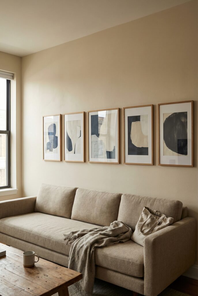
Gallery Layouts and Framed Art
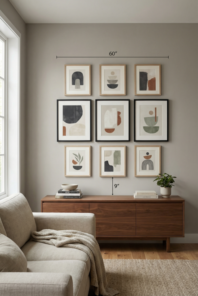
Best for: sofa wall or dining-adjacent wall (when you want it to feel collected, not cluttered).
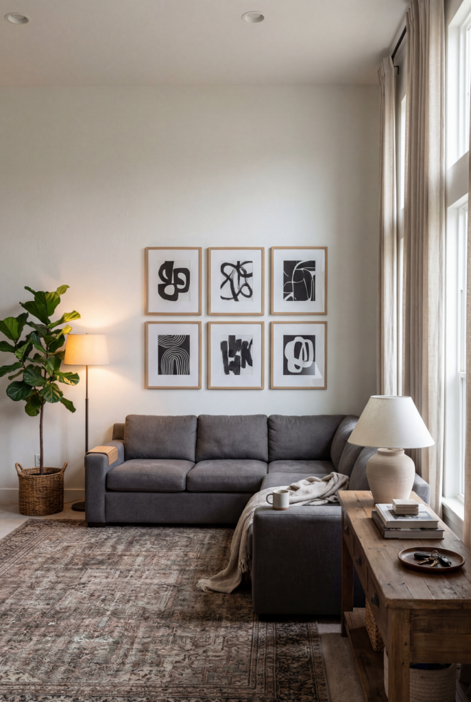
Do this: Build one big rectangle shape, not a scatter. Use the 57-inch center baseline to start, then relate it to furniture so it doesn’t float.
If the art is above a sofa or console, aim for the full grouping to span about two-thirds of the furniture width, and place the bottom edge of the lowest frame about 8–10 inches above the furniture.
Keep spacing consistent, usually 2–3 inches between frames for medium sizes. Limit yourself to two frame finishes max, and use one repeat element (same mat color, same frame tone, or a tight color palette).
Plan it on the wall with paper templates or painter’s tape outlines first, then hang from the biggest piece outward. If you want an easy combo: one 40×60 centered + two 18×24 as supporters, or a 9-frame grid with 2–3 inch gaps.
Tiny shopping cheat:
- Budget: downloadable print + thrifted frames (9 total), one mat color to unify
- Mid: one 40×60 print + simple frame, plus two 18×24 in matching mats
- Splurge: one oversized original or large reproduction + custom framing on the anchor piece
Quick win: Make the grouping one clear shape, then stop adding “one more” frame at 10:37 p.m.
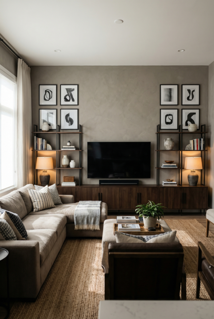
Floating Shelves and Mixed Decor
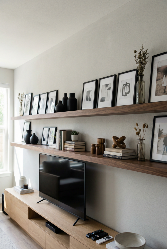
Best for: traffic wall or media wall (when you need flexibility and you don’t want 14 new nail holes).
Do this: Use two long shelves so the wall reads as intentional, not random. Keep the center of the whole shelf composition around that 57-inch baseline as a starting point, then adjust based on what’s below.
If shelves are above a console, still follow the “don’t float” rule by keeping the overall width near two-thirds of the furniture width. Style with repetition: repeat frame sizes, repeat a material (wood, brass, black), and repeat spacing.
Use a simple rhythm: one art cluster, one object cluster, one soft cluster, then repeat down the run. Add one “tall” object every 3–4 feet so the line doesn’t go flat.
Leave empty space on purpose, because shelves will try to become mail storage (ask me why I’m saying this in a haunted voice).
Tiny shopping cheat:
- Budget: two picture ledges + existing books + 2 printed pieces in matching tones
- Mid: two longer shelves + 3–5 frames in two sizes + one real plant you will not forget to water (maybe)
- Splurge: custom-length shelves + integrated sconces for that “I planned this” glow
Quick win: Repeat two frame sizes and leave one open gap per shelf so it can breathe.
Large-scale Statement Pieces
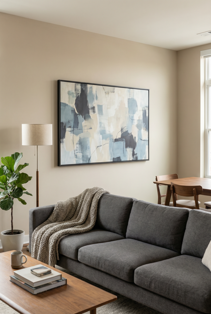
Best for: sofa wall or dining-adjacent wall (when your brain wants one big decision and then a snack).
Do this: Choose one oversized piece that matches the scale of the wall so you’re not trying to “fill” it with tiny things.
Start with the 57-inch center baseline, then tie it to furniture: if it’s above a sofa or console, the art should still span about two-thirds of the furniture width, and sit 8–10 inches above it.
If you’re supporting the big piece with smaller ones, keep them calm and close so the main piece stays the anchor (think two small supporters, not six).
If you’re tempted by a mural or textured finish, pick based on your reality: renter-friendly peel-and-stick if you need removability, more permanent texture if you own and you’re ready for commitment.
This is where an accent wall can shine, but only if you keep the decor layered lightly on top so it doesn’t turn into “pattern plus clutter.”
Tiny shopping cheat:
- Budget: one big affordable print + simple frame (hang it and walk away, seriously)
- Mid: one large canvas or framed textile + one supporting piece (small)
- Splurge: mural or custom-scale piece (measure roll count carefully, future-you is begging)
Quick win: Go bigger than you think, then support it with less than you think.
Symmetry vs Asymmetry (the choice that quietly decides everything)
Best for: symmetry for media walls and busy rooms, asymmetry for boxy rooms that need life.
Do this: If your room already has a lot going on (patterned rug, loud pillows, open shelving nearby), choose symmetry so your eyes can rest. A clean grid with 2–3 inch spacing reads calm fast.
If your room feels plain or overly structured, choose a balanced asymmetrical shape, but still keep rules: one clear anchor, a consistent spacing range, and an overall width that relates to furniture (yes, still that two-thirds guideline if you’re over a sofa or console).
Either way, start from the visual center near 57 inches, then adjust for your actual sight lines from the sofa or dining chair. The goal is “intentional,” not “everything perfectly lined up like it’s scared.”
Tiny shopping cheat:
- Budget: matching mats + mixed thrift frames (symmetry vibes without the cost)
- Mid: two large matching pieces for a paired moment (calm, fast, done)
- Splurge: custom framing for the anchor piece so the whole wall looks elevated
Quick win: Choose “orderly” or “loose” before you hang anything, because indecision creates holes.
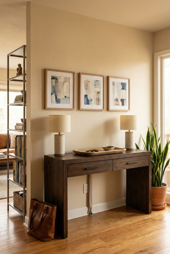
Function + Decor Hybrids
Best for: sofa wall or traffic wall (when the wall needs to earn its keep).
Do this: Add a functional layer under your decor so the wall feels grounded. A console is my favorite because it creates weight, storage, and a place for lamps so you’re not living under overhead lighting (boob light trauma survivors, I’m hugging you).
If you put art above the console, keep the decor tied together: the art grouping should span about two-thirds of the console width and sit 8–10 inches above it.
Then style the console simply so the wall remains the star: two lamps or one lamp plus a tall object, one tray or bowl, and something living (even if it’s a fake plant you lie to yourself about).
If you need to break up a very long run, add a divider moment, like a tall open shelf or slatted screen, to create zones. Mirrors are also a cheat code here, because they bounce light and add depth without adding visual clutter.
And yes, plug-in cords can be annoying. I bought cord covers for $17 and I still notice them. I have accepted this as my personal design tax.
Tiny shopping cheat:
- Budget: thrifted console + two secondhand lamps + one big print above
- Mid: new console + mirror moment on one side + a couple of framed pieces grouped
- Splurge: built-in storage or custom divider + hardwired sconces
Quick win: Add the console first, then hang the art to match it, not the other way around.
Lighting is the Finishing Credibility Move
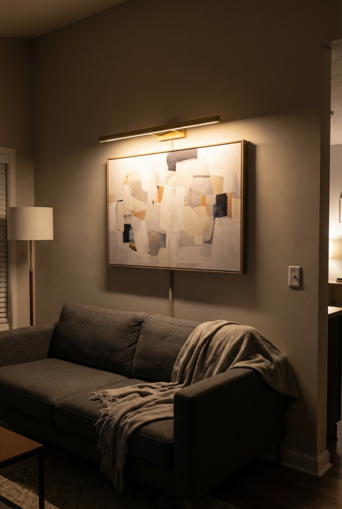
Best for: any wall type (especially dining-adjacent and sofa walls where nighttime matters).
Do this: Add lighting that highlights the wall so it feels designed, not just decorated. If you’re using a picture light, size it roughly one-half to three-quarters the width of the artwork so it looks proportional.
Keep your art placement rules consistent first (center baseline around 57 inches, art spanning about two-thirds of furniture width when it’s over furniture, bottom edge 8–10 inches above).
Then add the light as the finishing layer. If you’re renting, plug-in options are your friend, just plan for the cord path early so you’re not spiraling later with tape and regret.
If glare is an issue (hello, dining-adjacent wall), test the light at night before you commit to permanent mounting.
Tiny shopping cheat:
- Budget: plug-in picture light + cord cover kit (it’s fine, we’re fine)
- Mid: two plug-in sconces flanking the anchor + warm bulbs
- Splurge: hardwired picture light + dimmer so you feel fancy at 7:43 p.m.
Quick win: Add one intentional light and your whole wall will look more expensive than it was.
Two Room Walkthroughs You Can Copy
Walkthrough 1: Sofa wall with console + art + lamps (the “done in a weekend” setup)
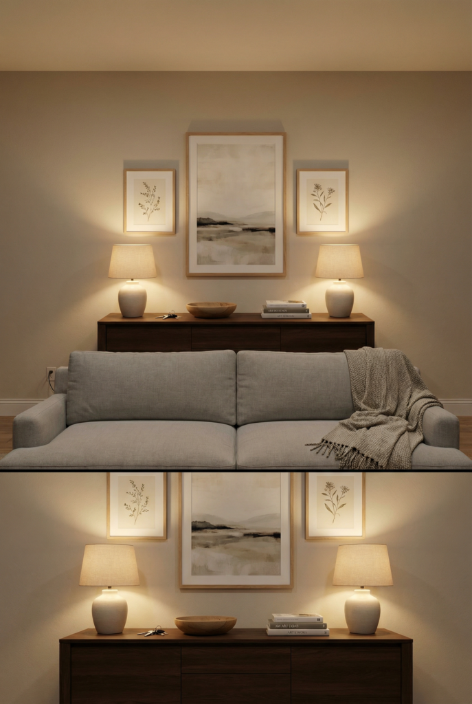
If you’ve got a wall that’s around 14 feet long, with a sofa around 84 inches wide, and you’re eyeing a 72-inch console, this is your play.
Choose a console that’s a little narrower than the sofa so it doesn’t feel like the two pieces are competing (because they will, visually). Center the console behind the sofa, then let the extra wall on both sides breathe. Do not try to “decorate all 14 feet.” That’s how long walls start looking longer.
Now do the art like one rectangle-shaped grouping that spans about two-thirds of the console width. Two-thirds of 72 inches is about 48 inches, so aim for a grouping that reads around 48–54 inches wide.
The easiest copy-able combo is one 40×60 as your anchor, plus two 18×24 pieces, with consistent 2–3 inch gaps. Hang it so the bottom edge of the lowest frame is about 8–10 inches above the console.
Then check your center line against the 57-inch baseline and adjust slightly if your sofa sits taller than average (fluffy cushions will absolutely trick your eyes, it’s rude).
Style the console simply: two lamps with warm bulbs (no harsh overhead), a bowl for keys, and one stack of books. And yes, real life will happen. A kid will try to put toothpaste on those books.
A dog will wag into the lamp cord. Unresolved annoyance you can emotionally prepare for: if you add anything plug-in later, the cord cover might be visible if you know where to look… and you will know where to look. Choose joy anyway.
Walkthrough 2: Traffic wall with a ledge + mirror moment (the “survives backpacks” setup)
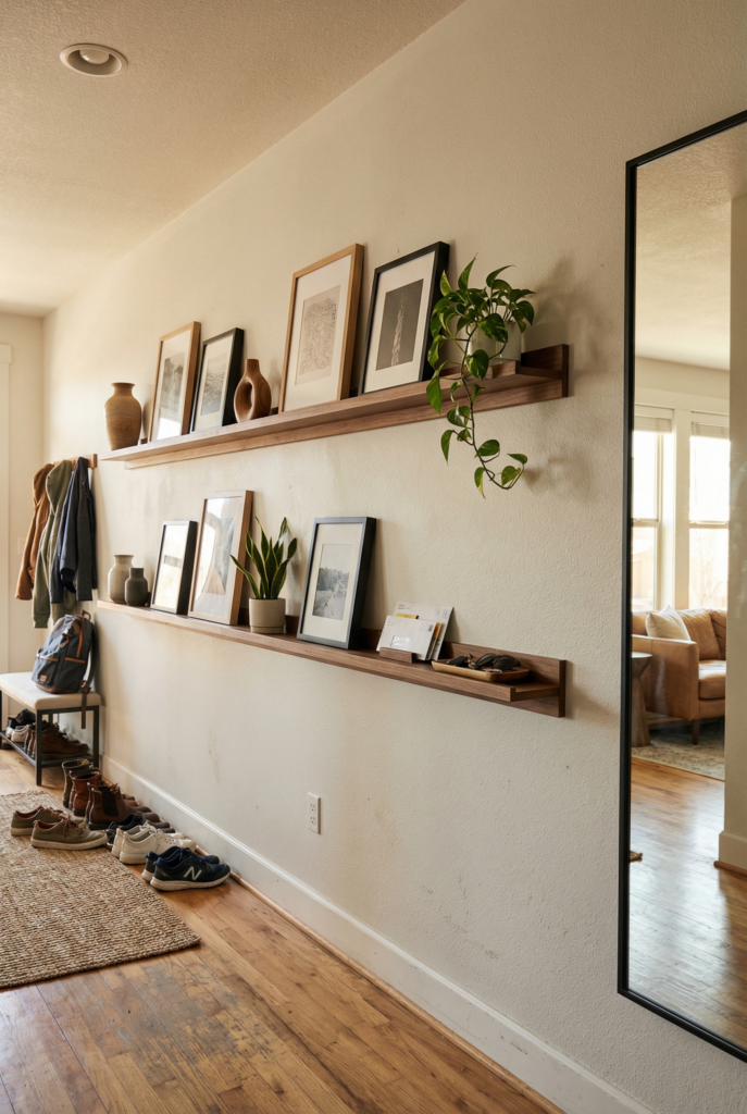
If your wall is around 12 feet long and it sits on a path between the entry and the living room, treat it like a high-traffic zone first and a “pretty wall” second.
This is the wall that gets brushed by coats, tote bags, and one wildly confident dog tail. So skip precious frames hung low. They will get bumped. It’s not a possibility, it’s a schedule.
Instead, install one long picture ledge at about chest height, then add another ledge above it, leaving enough spacing so the top ledge doesn’t feel like it’s wearing a hat. Center the overall composition roughly around the 57-inch baseline, but nudge it up a bit because this is a standing-and-walking zone, not a sit-and-stare zone.
On the ledges, keep it repeatable: use two main frame sizes, lean the art (don’t hang everything), and build a rhythm with objects.
Every 3–4 feet, add one taller object to break the line so it doesn’t go flat. Then anchor the far end with one big mirror to bounce light and break up the long run. That mirror will do so much work it deserves a tiny paycheck.
Unresolved annoyance to expect: the lower ledge will try to become a mail shelf. If you’re not careful, it becomes a paper parade.
So plan your “mail sweep” like it’s part of your routine. Sunday morning, coffee, five minutes, you’re a person with a system (even if you’re kind of pretending).
Shopping reality (with actual price bands, because I like receipts)
- Thrift frames: $5–$25 each
- Oversized affordable prints: $20–$80
- Larger reproductions or custom-scale pieces: $150–$600
- Peel-and-stick wallpaper: $40–$120 per roll
- Picture lights: $40–$200+
- DIY art supplies: $15–$60
Where I actually look: Etsy downloads, Facebook Marketplace frames and consoles, IKEA ledges, and the hardware store for tools when I get brave.
Also, I always buy extra painter’s tape. Every time. Because it disappears like socks.
Quick diagnostic block (when your wall looks “off” and you’re about to blame yourself)
Problem → Why it happens → Fast fix
- Too small art → the wall is winning the scale battle → go bigger, or group into one rectangle shape
- Everything feels floaty → nothing is tied to furniture → add a console, or lower the whole arrangement to relate to the sofa
- Evenly scattered minis → your eye reads it as clutter confetti → cluster pieces and keep 2–3 inch gaps consistent
- Art is too high → you anchored to the ceiling, not the room → use the 57-inch center baseline, then adjust down
- Too many finishes → your brain can’t find the pattern → cap it at two frame finishes and repeat one mat color
- Looks great in daylight, weird at night → lighting and glare are sabotaging you → add a lamp and a picture light (size it 1/2–3/4 art width)
FAQ
How to decorate a very long wall in a living room?
I use a simple framework: one anchor, a rhythm of repeated elements, and one functional layer. I measure first, choose my wall type, pick one lane, then hang around a visual center (57 inches is a helpful baseline). If the decor sits above furniture, I aim for the arrangement to span about two-thirds of the furniture width and sit 8–10 inches above it. Consistent spacing, usually 2–3 inches for frames, makes everything look intentional fast. Then I add lighting as the finishing move.
How to break up a long wall in a living room?
I break it up by creating zones instead of trying to fill the entire length evenly. One grounded zone (console plus art, or ledges plus mirror) gives your eye a place to land. Then I let the rest breathe, or I create a second smaller zone down the wall. The goal is purposeful pauses, not a continuous line of stuff.
The last thing I’ll say before you start taping paper to your wall
Long walls are not asking for more decor. They’re asking for a plan. If you measure, choose one lane, commit to an anchor plus repetition, and keep your numbers steady (57 inches, two-thirds width, 8–10 inches above, 2–3 inch gaps), you’ll skip the panic-buy spiral.
And if you still end up holding a frame at 9:12 p.m. muttering “why is this crooked,” just know I’m right there with you, trying not to drill into something I shouldn’t, and stepping around a rug that has seen too much.