If you’ve been staring at paint chips and wondering why your bathroom still feels “off,” this article walks you through bathroom decor color ideas that actually work in real life lighting. We’ll bounce from soft neutrals to earthy greens, jewel-tone drama, muted pastels, and bold modern moments, plus how I pick a color palette without fully losing my mind (no promises).
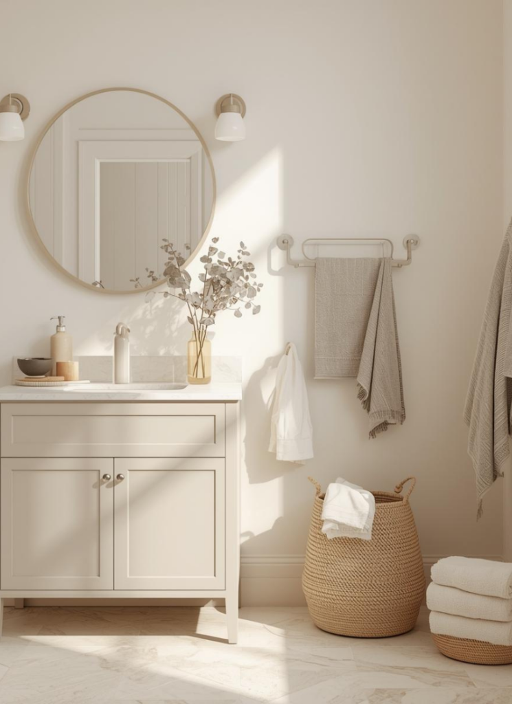
It’s 10:22 pm, I’m standing in my hallway bathroom in socks, holding a paint fan deck like it’s a legal document, and I’m having the kind of decor spiral where you whisper, “What even IS white?” and your dog looks at you like you’ve lost the plot (fair).
If you’re here for bathroom decor color ideas, I get it. Bathrooms are small, shiny, and brutally honest. They have mirrors. They have overhead lighting that was probably chosen by someone who hates us. They also have water spots and toothpaste and that one towel you swear you washed but it still smells vaguely like “pool.”
So let’s talk color the way we actually pick it: by vibe, by light, by what you’re willing to clean, and by how chaotic your household is on a Tuesday morning.
Soft Neutrals that Still Feel Like You Live There
Soft neutrals are having a moment, but not the bland “sad greige box” version. I’m talking warm off-white, putty, sand, mushroom, and that gentle creamy tone that makes your skin look alive when you catch yourself in the mirror and go, “Oh. She’s… moisturized?”
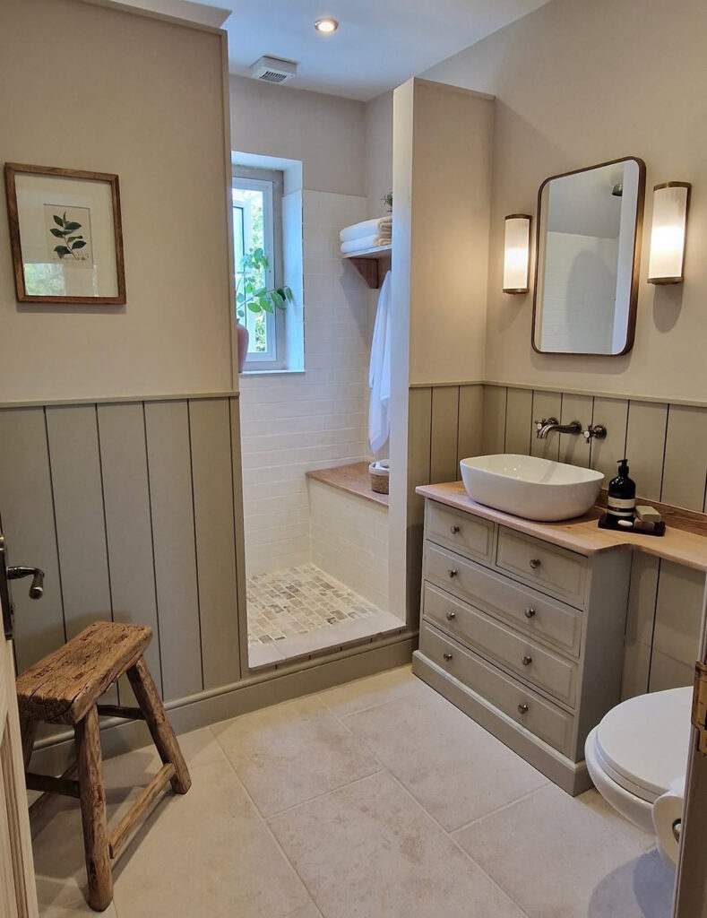
One of my favorite examples is this tiny shower room where the upper walls are a cozy beige and the lower half is paneled in a green-gray that feels like wet river stone. The wood countertop is warm, the white tile is clean, and the whole thing quietly whispers “spa-like bathroom” without being precious.
I first clocked it on Hayley From Wales and it’s such a good reminder that neutral does not have to mean flat, it can be layered and soft and a little earthy.

Another neutral that hits different is the creamy, stone-washed bath setup with the textured walls, the little stool, and the candle that makes you think you’re the kind of person who takes baths on purpose. The palette is basically “biscuit, linen, oat milk,” and the plants make it feel alive instead of showroom-still. I saw this floating around Kristina Evans and immediately wanted to swap my harsh white bulbs for something warmer and pretend my grout has never met hair dye.
If you’re trying to do this in a small bathroom, the trick is choosing a neutral with an undertone you actually like. Warm neutrals look amazing with brass, walnut, and creamy tile.
Cooler neutrals can be gorgeous too, but they need help, like warm lighting and wood, otherwise the room starts feeling like a dental office and nobody wants that.
Also, neutral does not mean you have to paint everything the same. Half-wall paneling, a slightly deeper tone on painted cabinets, or a ceiling that’s one step warmer than the walls can give you a whole “designed” feeling without a dramatic color commitment.
(And yes, I am the person who buys sample pots, tapes them to the wall, and then forgets they’re there. The samples were like $7 each and I bought five. I regret nothing.)
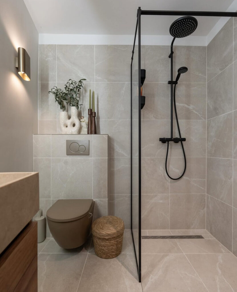
One more neutral moment that feels quietly fancy: a small bathroom in big pale tile, matte black shower fixtures, and one little woven stool that somehow makes the whole thing feel intentional.
The shapes are clean, the lines are crisp, and it’s the kind of look where you can hide clutter by simply… not owning clutter. I spotted this via Yourtailormate and it’s proof that bold bathroom colors aren’t the only way to look modern, sometimes it’s the contrast and the finish that does it.
Earthy Tones that Make Your Bathroom Feel Like a Little Retreat
Earthy tones are the colors I pick when I want my bathroom to feel like a calm place where I am definitely not stepping on a rogue Lego. Warm clay, olive, espresso, sandstone, muted terracotta, all of it.
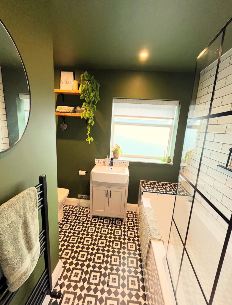
That olive-green bathroom with the graphic black-and-white floor is basically a full personality, in the best way. The walls and ceiling are deep green, the shower has that black grid situation (very modern bathroom design), and the patterned tile is doing the most without feeling messy.
I first saw it from Georgia (@ourchilternshome) and it made me want to paint a ceiling, which is how you know I was emotionally compromised.
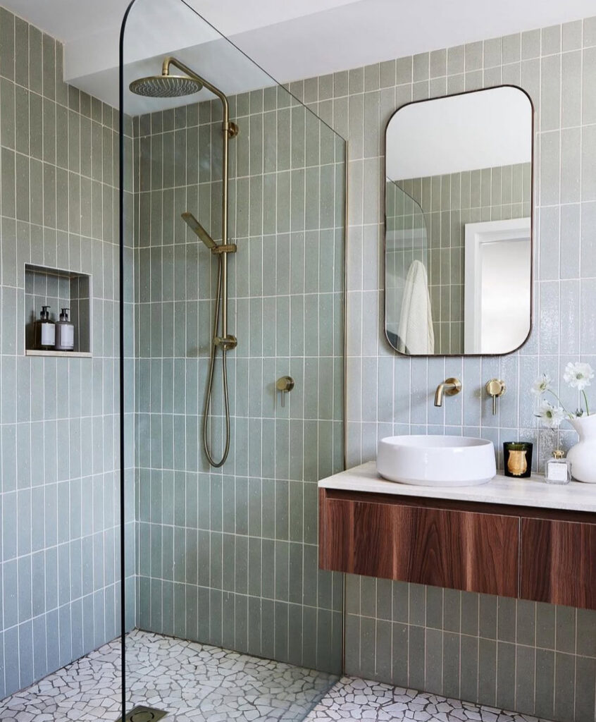
Sage and green tile also hit that “relaxing green” sweet spot, especially when it’s paired with wood. There’s this bathroom wrapped in muted green tile with a floating walnut vanity and warm brass fixtures, and it somehow feels both crisp and cozy, like a really expensive robe.
The vibe is calm, but not boring, and the stone floor keeps it grounded. I caught this one through Livingprecisely and now I’m thinking about green tile more than I think is healthy.
And then there’s brown. Brown is back. Brown is the new neutral. Brown is the color that makes you feel like you own matching loungewear.
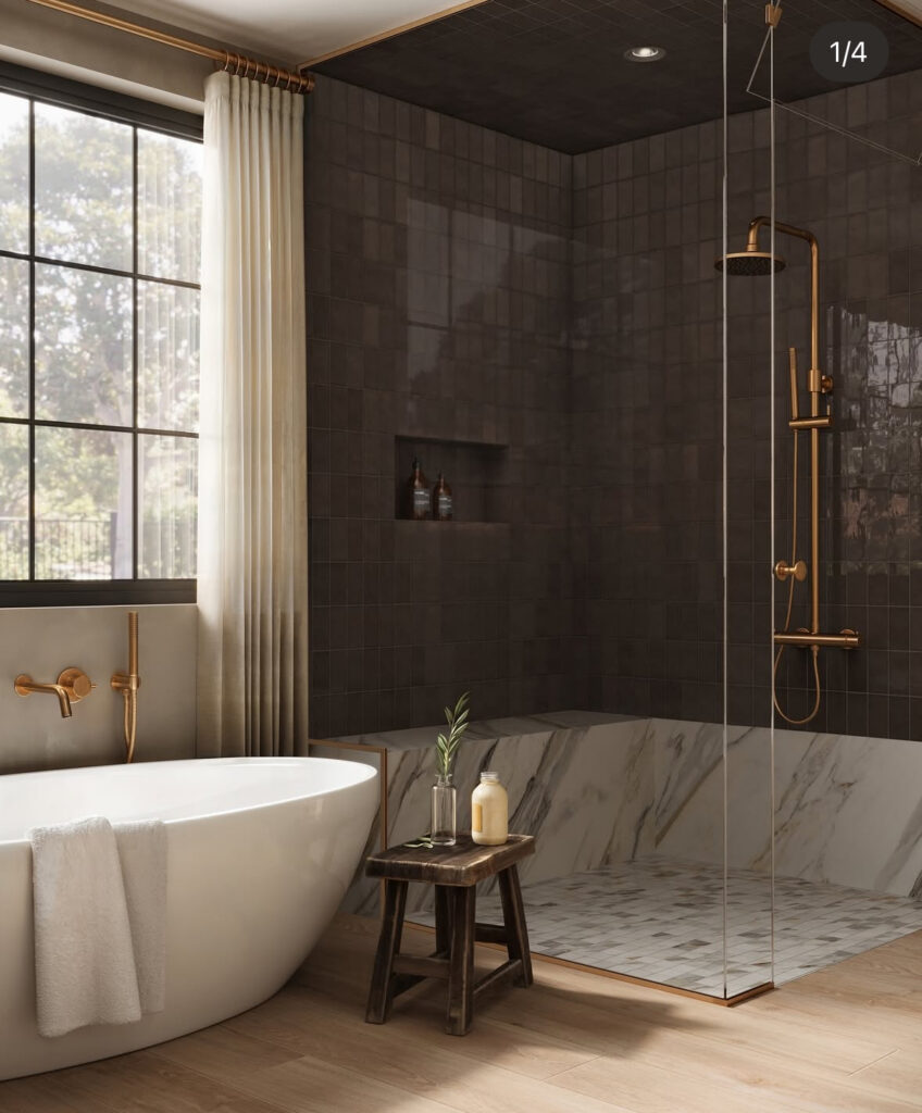
I’m obsessed with that dark espresso-tile shower with the marble band and the warm wood-look floor. It’s moody but still welcoming, especially with the brass fixtures catching the light like jewelry.
I saw it from Edward Martin and it made me realize how much a “dark hue” can feel rich instead of heavy when you balance it with pale stone and warm metals.
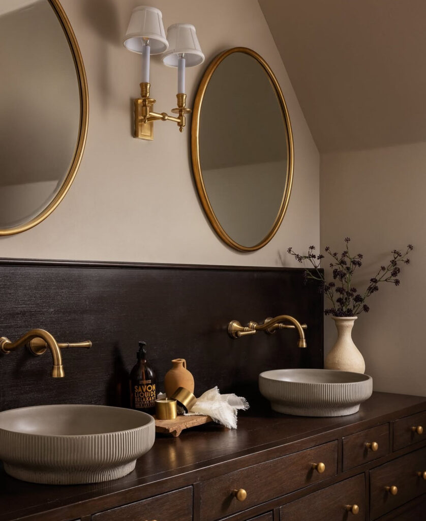
If you want earthy without going full cave, rich wood does so much work. There’s a bathroom vanity moment with espresso stained wood, unlacquered brass, and those ribbed bowl sinks that feel like pottery you’d find in a fancy little shop you can’t afford. It’s cozy, it’s grown-up, it’s textural in a way that feels delicious, and it popped up on Lindye Galloway like a quiet flex.
One thing to keep in mind with earthy tones: they love texture. Natural bathroom colors look best when there’s something to catch the light, like a satin paint finish, stone tile with variation, or a soft plastery wall. If everything is the exact same smooth tone, the room can go a bit “paint chip,” especially in low light.
Related posts: 27 Budget-Friendly Bathroom Decor Ideas You’ll Absolutely Love
Deep Jewel Colors When You Want Drama in the Most Satisfying Way
Okay. Deep jewel colors are not for the faint of heart, but they are for the people who have looked at a navy bathroom and felt their soul leave their body, in a good way.
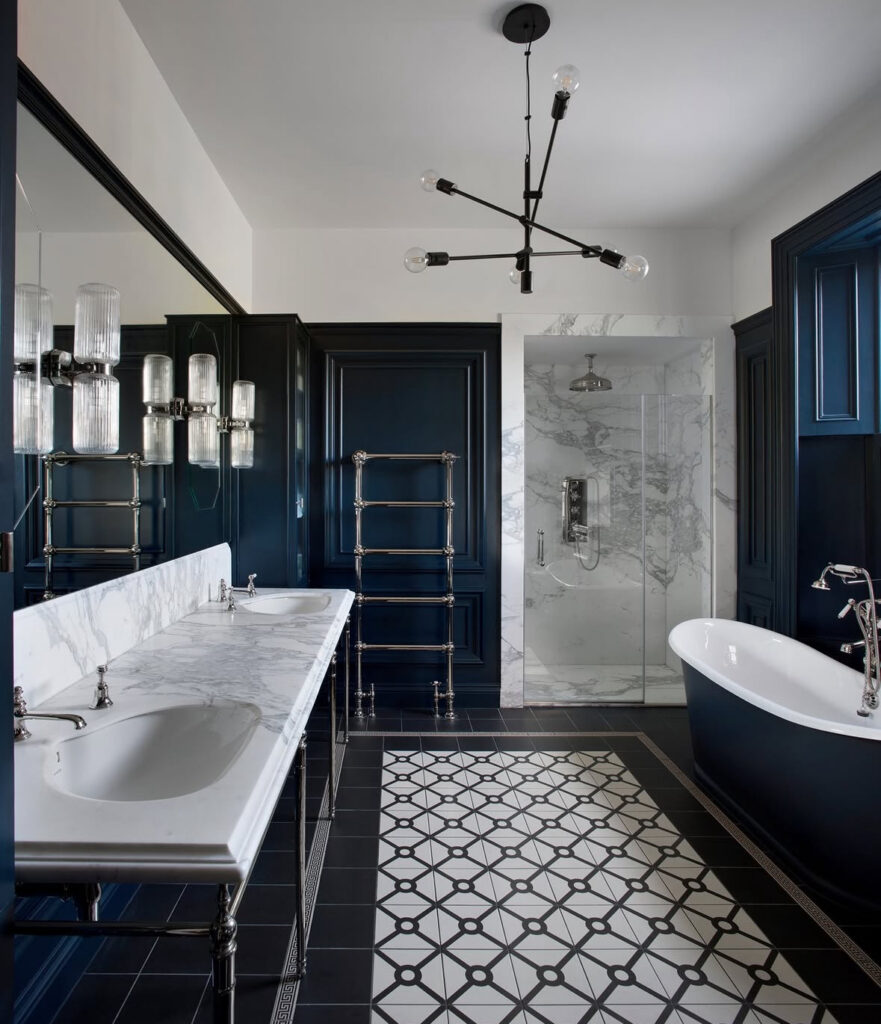
There’s this elegant bathroom wrapped in deep navy, with a marble-topped double vanity and that crisp black-and-white floor that feels like an old Paris apartment.
The marble shower is bright and clean, and the dark walls make all the white and nickel pop like a magazine spread. I saw it via @timesproperty and you can totally feel Kingston Lafferty Design’s hand in it, with Róisín Lafferty keeping it classic but not stuffy.
Jewel tones are my favorite “powder room color” move, too, because powder rooms can handle a little drama without you living in it every single day. If you’re nervous, start small. A jewel-toned paint on one wall, or a vanity in deep green or inky blue, can give you the vibe without turning your morning routine into a gothic novel.
Also, jewel tones look expensive when the lighting is right. If you have a boob light, I am begging you to at least try a softer bulb.
Muted Pastels that Feel Grown-up, not Babyish
Muted pastels are sneaky. They sound like they’ll be sweet and safe, and then suddenly you’re standing in front of a pink tile wall like, “Oh. I’m in love. I’m in trouble.”
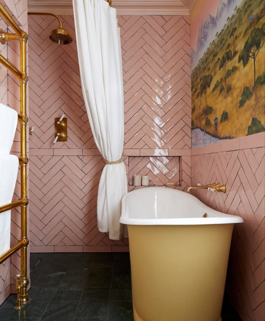
That candy-pink herringbone tile bathroom with the brass fittings and the mustard-yellow tub is the perfect example of pastel done with backbone. The mural makes it feel like a tiny jewel box, and the brass keeps it from going too sugary.
I saw it on @drummonds_bathrooms and the design by Naomi Astley Clarke is exactly the kind of “playful but timeless” balance I always think I want.
If you want pastel without the commitment, you can do it through paint instead of tile, like a soft pink above wainscoting or in a powder room where you don’t have to stare at it while brushing your teeth at 6:40 am. Pastel colors are especially cute with warm metals and vintage shapes, like round mirrors and little sconce lights.
One practical note: pastel in bathrooms looks best when it’s not fighting your fixtures. If you’ve got warm brass, go warm pastel. If you’ve got chrome, a cooler pastel can work.
And if you have mixed metals because you’re slowly updating things and life is expensive, you’re not alone, I’m literally typing this with a mismatched towel bar behind me.
Bold Modern Hues and High-contrast Moments that Make the Whole Room Feel Intentional
Bold doesn’t always mean neon. Sometimes it’s just “I chose a color with confidence,” or “I used contrast on purpose,” or “I put terracotta tile in my shower and now I’m emotionally attached.”
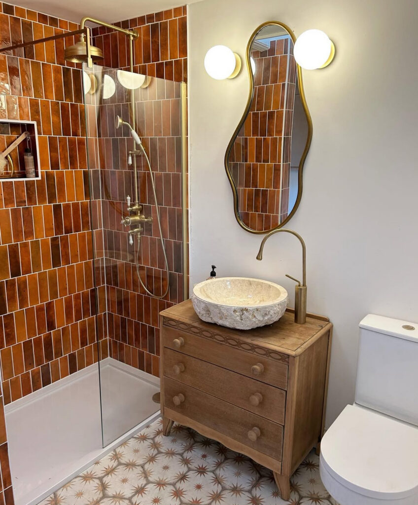
That warm terracotta tile bathroom with the wavy mirror, brass fixtures, and the vintage wood vanity is bold in the happiest, sunniest way.
The color is rich and warm, and the little pattern on the floor is like the room is quietly winking at you. I found it through @hitchinhome_ and it made me want to thrift a dresser and turn it into a vanity like I have the patience for that project (I do not, but I want to want to).
Bold also shows up in details. A dark ceiling with lighter walls can feel insanely chic, especially in a master bathroom paint situation where you want the room to feel like a little cocoon at night.
Matte black fixtures can feel modern and sharp, but also, and I say this with love, they show water spots like it’s their full-time job. If that will annoy you, it’s okay to choose something else.
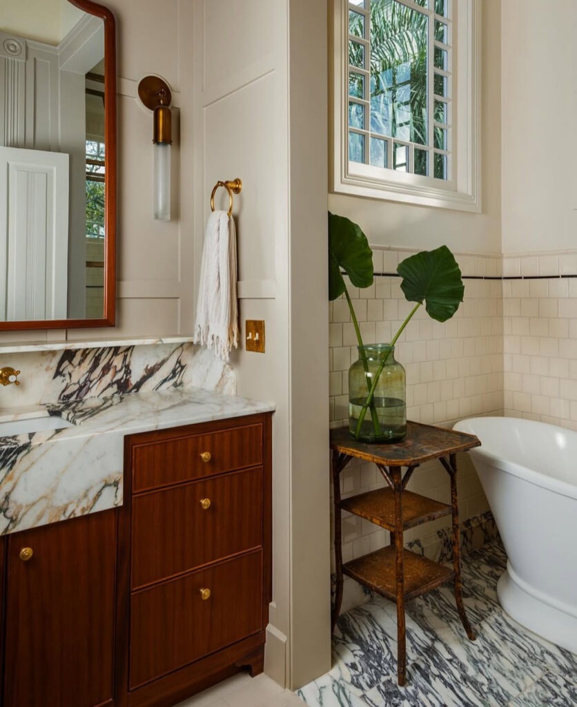
And then there’s the “classic materials, graphic edge” look. That bathroom with the mahogany vanity and the dramatic marble, where even the little corner of the tub area feels like a styled moment, is a masterclass in bold without being loud.
The giant leafy stems in the glass vase are doing that effortless thing where it looks like you casually have museum-level taste. I saw it on @logankilleninteriors and it’s such a good example of color flow, how the warm wood and the cool marble can coexist if the rest of the room stays calm.
Quick Chaotic Detour: Grout is a color too
This is me, gently shaking your shoulders. Grout color can make your tile look expensive or make it look like it’s sweating. It can soften a pattern, sharpen a pattern, or make you suddenly notice every single line.
If you’re doing a busy tile, sample grout. If you’re doing white tile, consider an off-white grout so you’re not cleaning it with a toothbrush at 9:13 pm while muttering threats to your past self. Ask me how I know. (Do not ask me how I know.)
So how do you actually pick a color without losing your mind?
Here’s my honest rule for bathroom color schemes: pick your anchor first. Is it the tile? The vanity? The fixtures? The floor? Choose the thing you’re not changing, then choose a color that makes that thing look good.
Then do a little color sampling in your actual bathroom light. Morning light, nighttime light, the weird blue light from your phone when you’re scrolling, all of it. Bathrooms are liars. Paint is a liar. Together, they are a crime duo.
And allow yourself one imperfect thing. Maybe you love the color but you still haven’t hung the art because you’re afraid of drilling tile. Maybe your towels don’t match yet. Maybe the “temporary” mirror has been there for two years. That is still a real home. That is still a win.
The takeaway I keep coming back to
Neutrals can be warm and layered. Earthy tones can feel modern, not rustic. Jewel tones can be elegant without being heavy. Pastels can be grown-up. Bold can be a tile choice, a ceiling choice, or just a decision you make with your whole chest.
And if you change your mind later? Welcome to the club. I have changed my mind about bathroom paint colors more times than I’ve changed my hand soap. (And I change my hand soap a lot.)
FAQs
What is the latest color trend for bathrooms?
Warm neutrals and earthy greens are everywhere right now, especially when they’re paired with wood and softer metals. I’m also seeing more brown and clay tones sneaking back in, which feels both new and weirdly comforting.
What is the most relaxing bathroom color?
For me it’s always a tranquil blue or a soft green, the kind that makes the room feel quieter the second you walk in. If your lighting is warm, those tones get even calmer.
What color looks good in a small bathroom?
A soothing off-white with a warm undertone is the easiest win, because it bounces light without feeling sterile. If you want more personality, a mid-tone color on the lower half of the wall (paneling, wainscoting, whatever) gives you depth without shrinking the whole space.
What color not to paint a bathroom?
Anything that turns muddy in your specific light. Some grays and some beige shades can go green or purple fast, especially under cool bulbs, so test first and trust your eyes more than the paint name.
